Building Brainfish
- Role
- Founding Product Designer
- Duration
- 3.5 years · Dec 2022 – May 2026
- Site
- Visit Brainfish
- Focus
- Product, growth, brand & marketing
A look back at my first three and a half years as a product designer.
This isn’t a case study. It’s a story about building my first startup…
This isn’t a timeline of everything I worked on.
It’s a reflection on three and a half years of helping build Brainfish from its earliest days, shaping its product, brand, and design culture while growing from a self-taught designer into a product designer.
More than anything, it’s a collection of lessons, decisions, experiments, and stories that changed how I think about design.
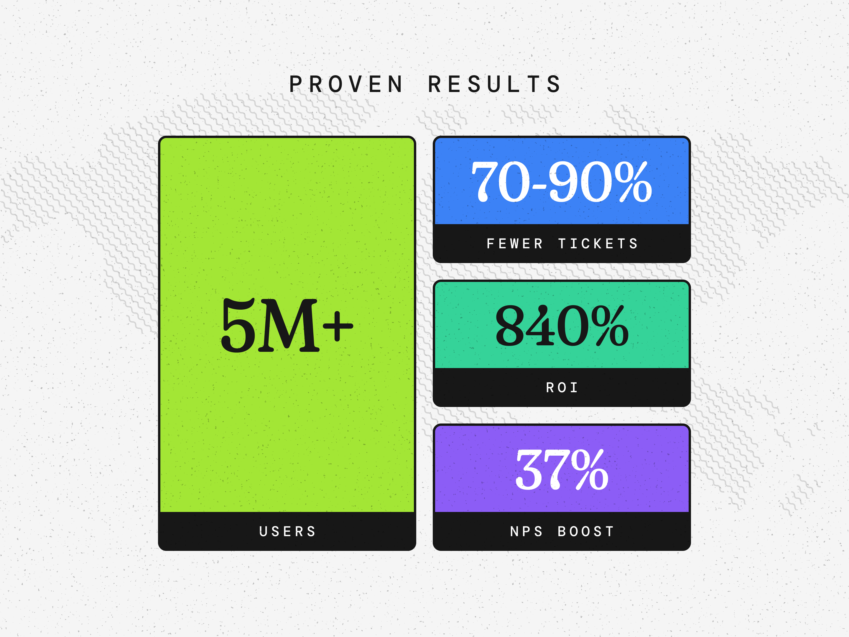
- 10M+ customer questions answered.
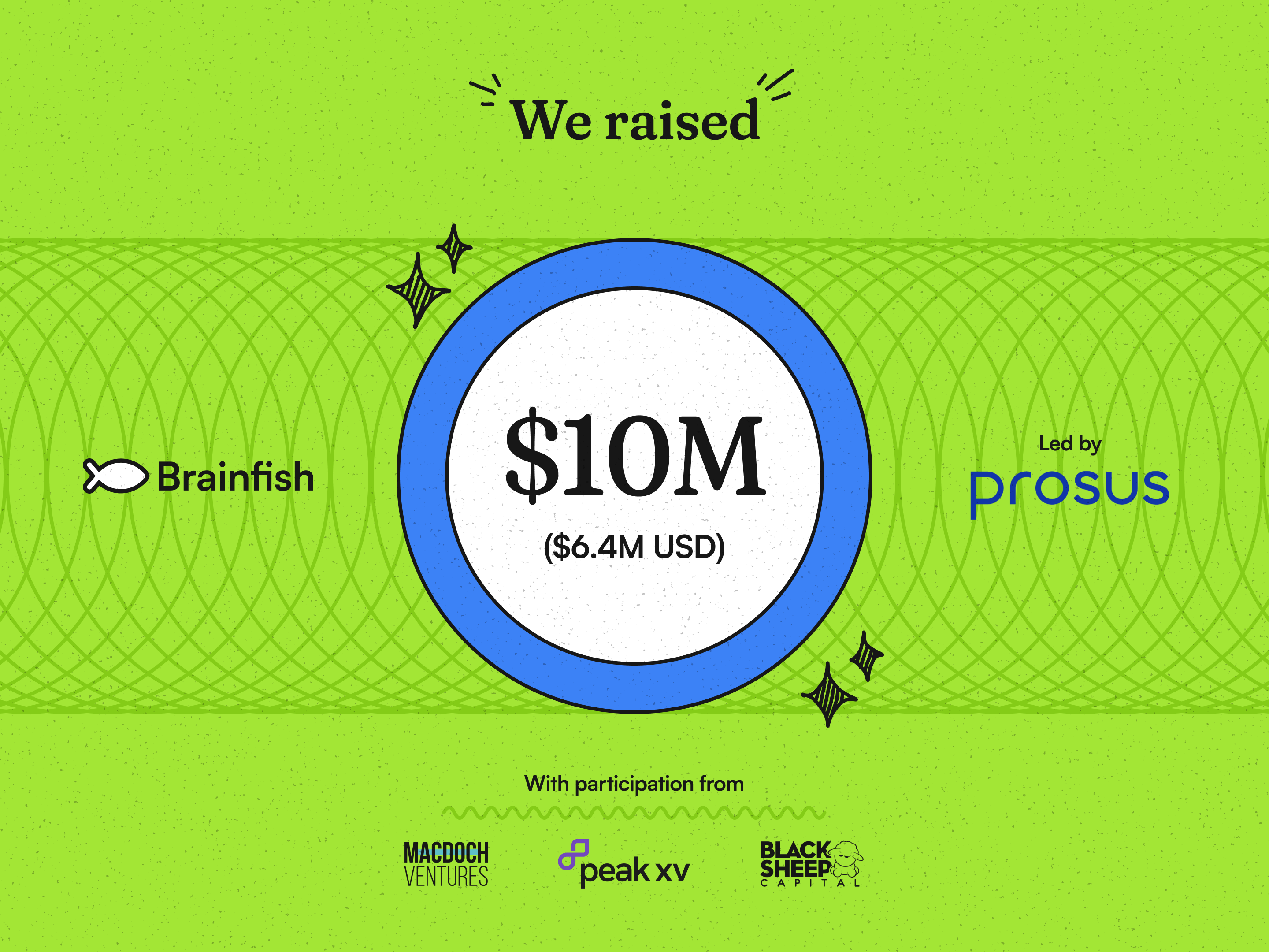
- $10M raised while helping shape the product and brand from the early days.
- 90%+ AI resolution rate for customer support queries.
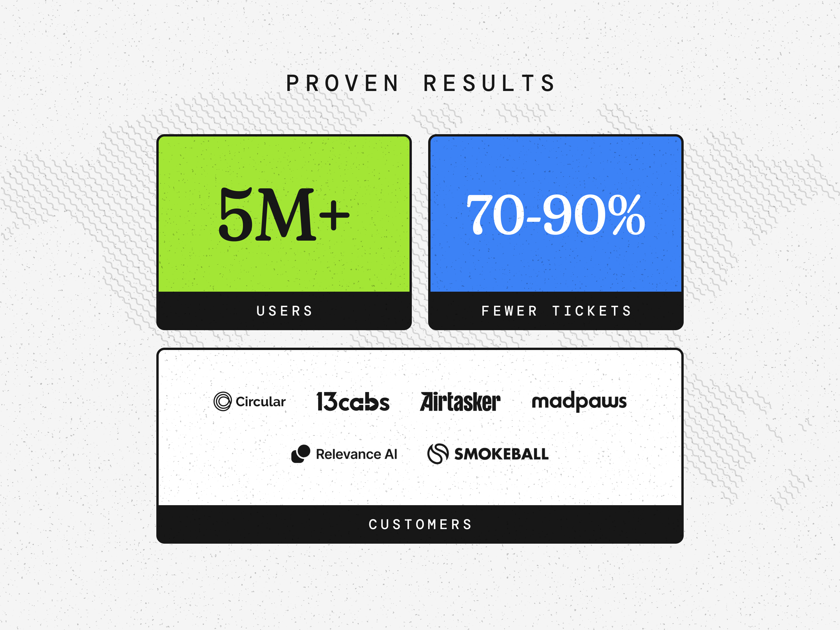
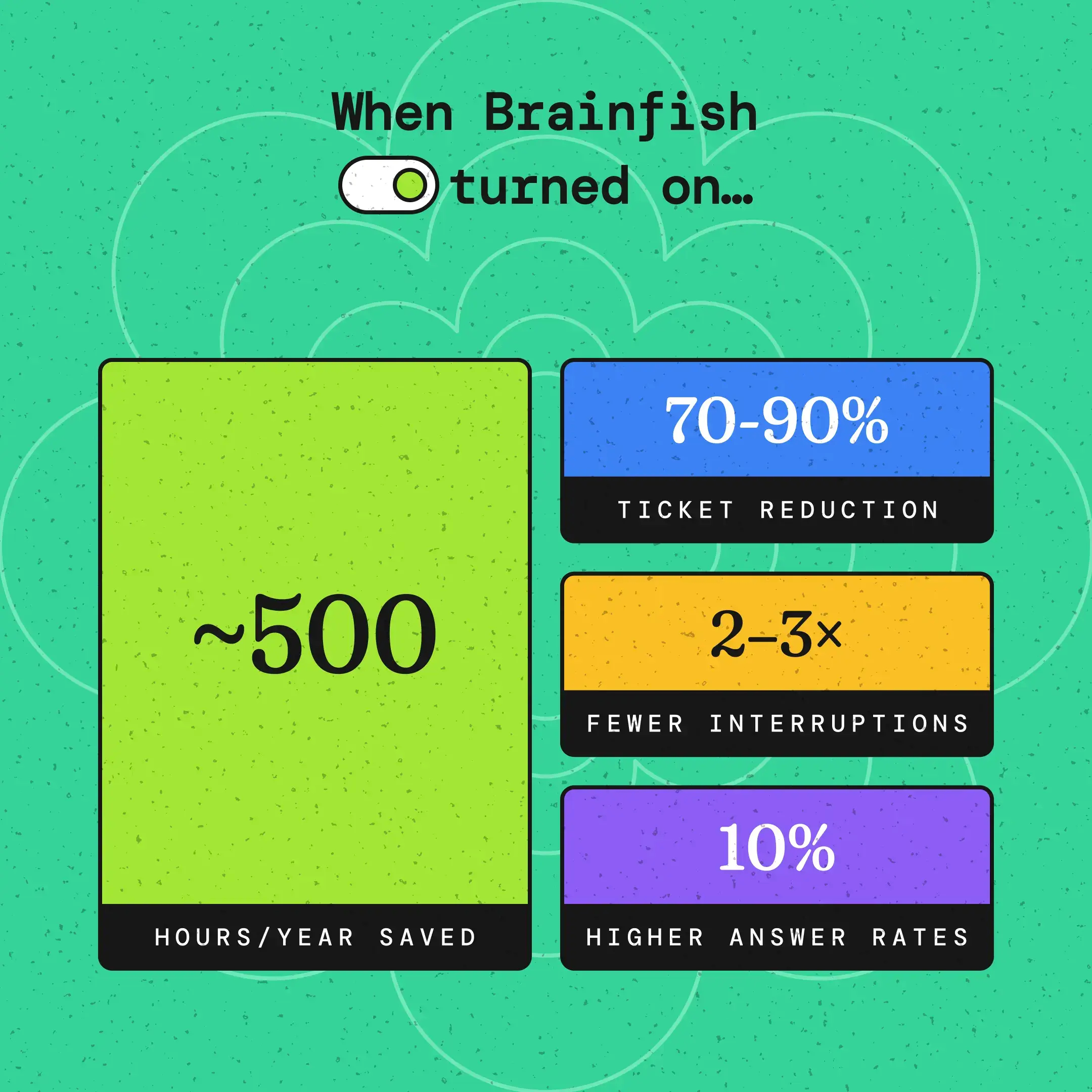
- 70–90% reduction in support tickets for customers using Brainfish.
- 300+ hours saved every month through AI-powered Article Generation.
- Documentation turnaround reduced from 3 days to under a day.
- 500+ hours of human support saved annually through AI automation.
🌱 Every startup has a beginning
December 2022
I joined Brainfish as the company’s first and only designer. At the time the team consisted of a founder, a CTO, and me.
I didn’t come from a traditional design background. I studied Chemical Engineering, taught myself design through books, YouTube, articles, and years of practice. Brainfish became the place where all of that learning finally met the real world.
Looking back, I don’t think I understood how much those next three and a half years would change me.
🎨 Giving Brainfish a face
One of my earliest responsibilities wasn’t designing product screens. It was helping define what Brainfish should look and feel like.
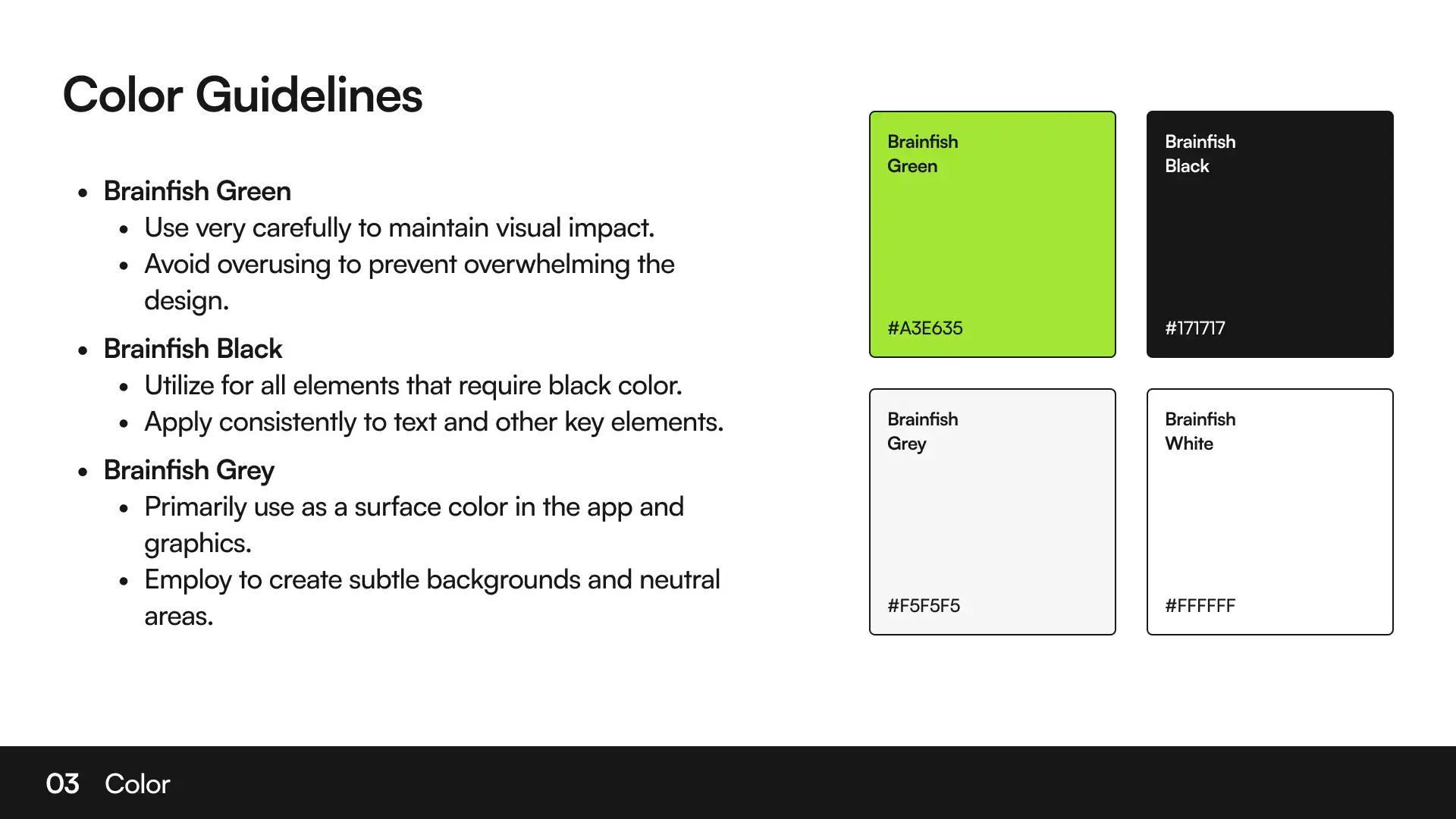
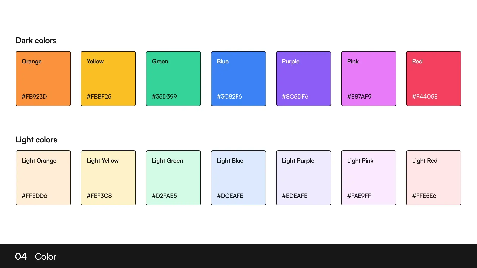
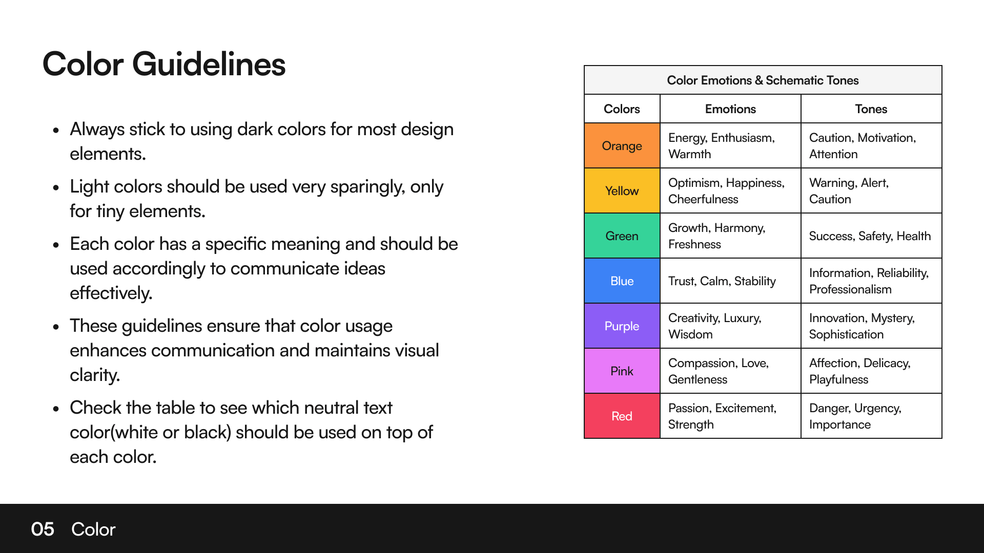
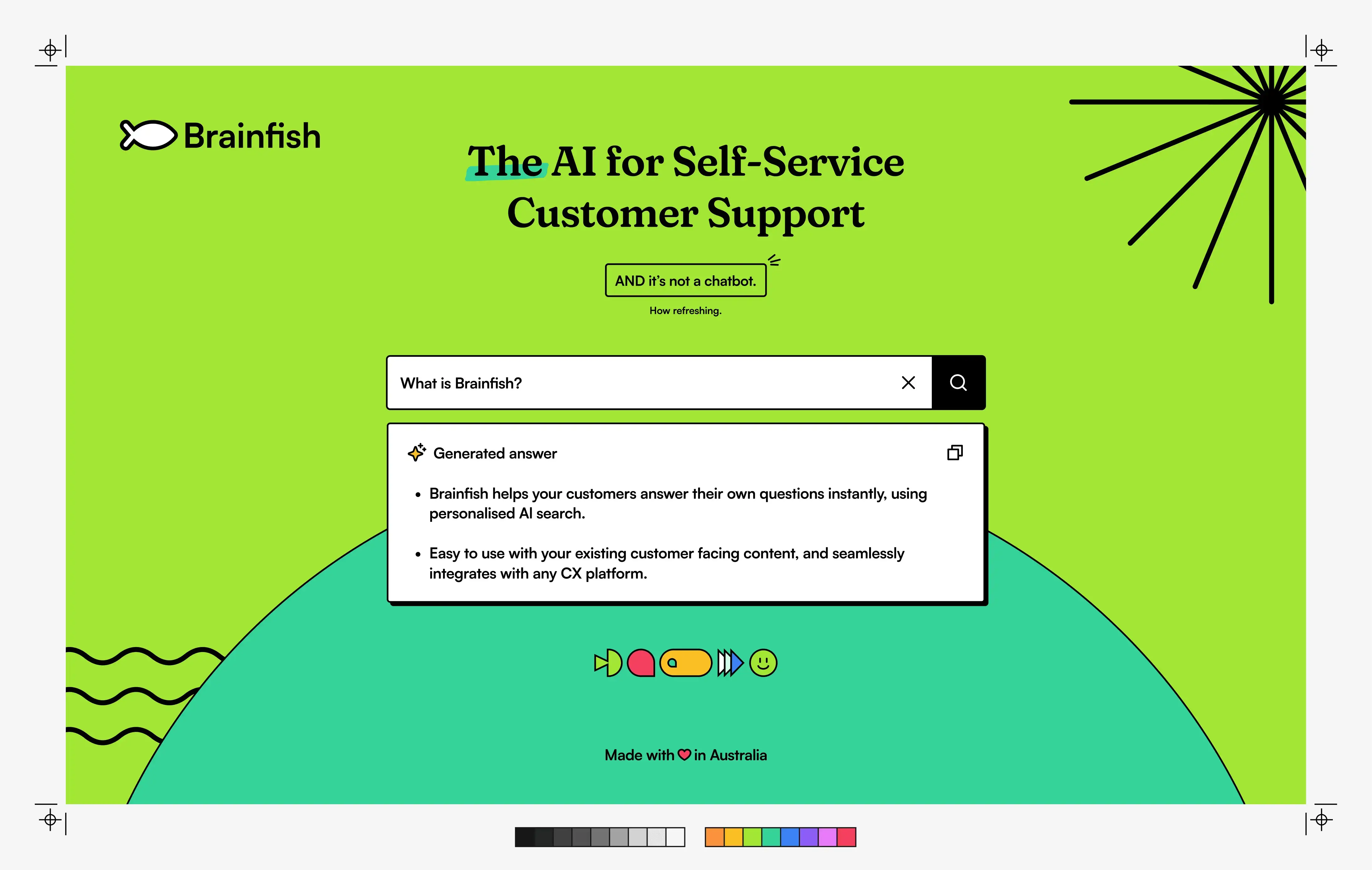
Together with the founders, I helped shape Brainfish’s visual identity from the ground up. We designed the logo, defined the iconic lime green brand colour, chose our typography, established a visual language, and gradually built guidelines that would influence everything from the product interface to conference booths.
These decisions weren’t purely aesthetic. In the early days our CTO was building most of the frontend, so every design decision also had to be practical. We deliberately chose a bold brutalist style because it was fast to build, easy to build, and visually different from the polished SaaS interfaces that dominated the industry.
Almost everything stayed neutral, allowing a single accent colour to become instantly recognisable. Lime green became that colour. While most companies associated AI with blue, clouds, or futuristic gradients, we wanted Brainfish to feel playful, confident, and impossible to miss.
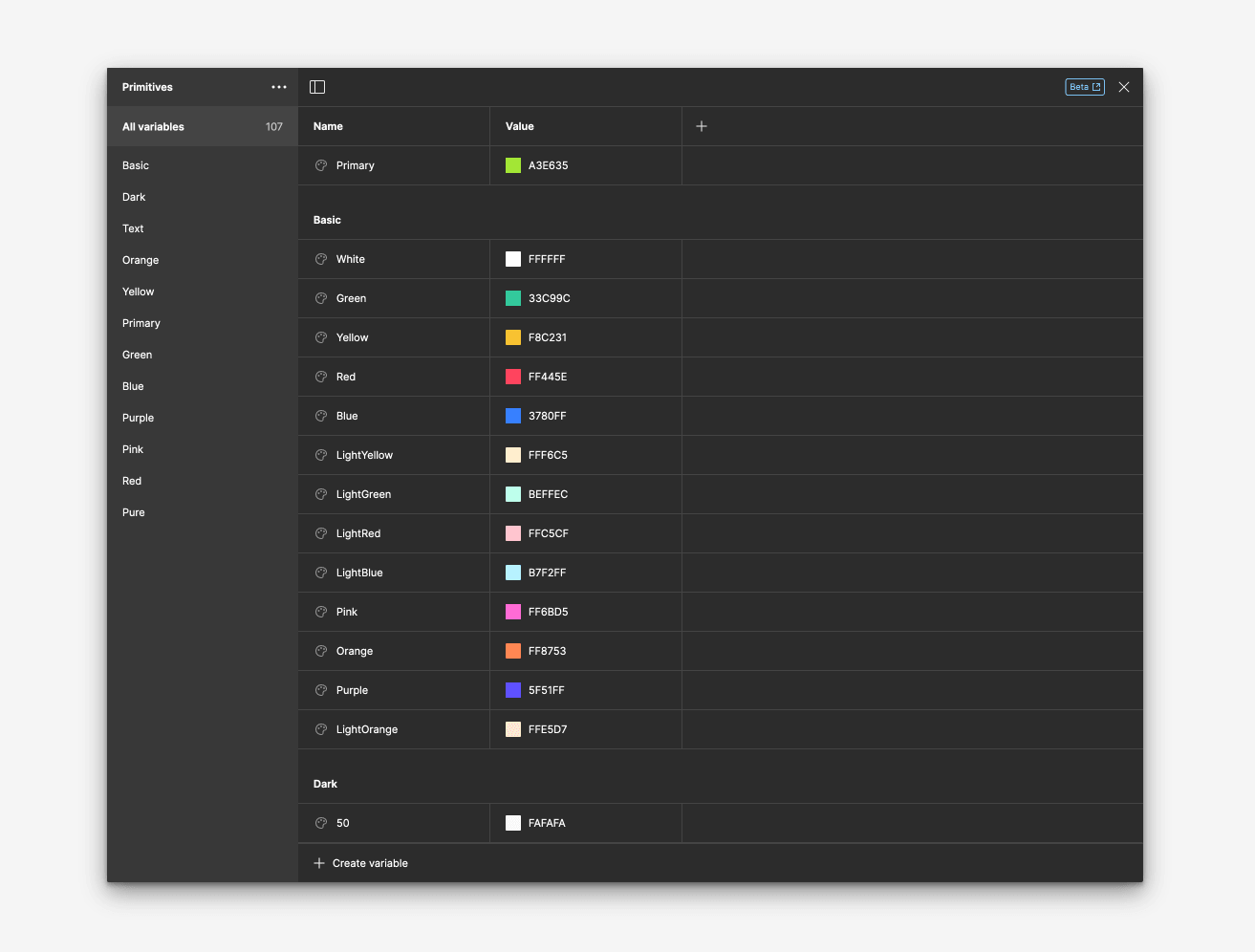
The design system didn’t appear overnight either. We started with the smallest building blocks, tested how the visual language behaved in real product screens, and expanded it only as the company grew. Looking back, I’m glad we resisted the temptation to design everything upfront.
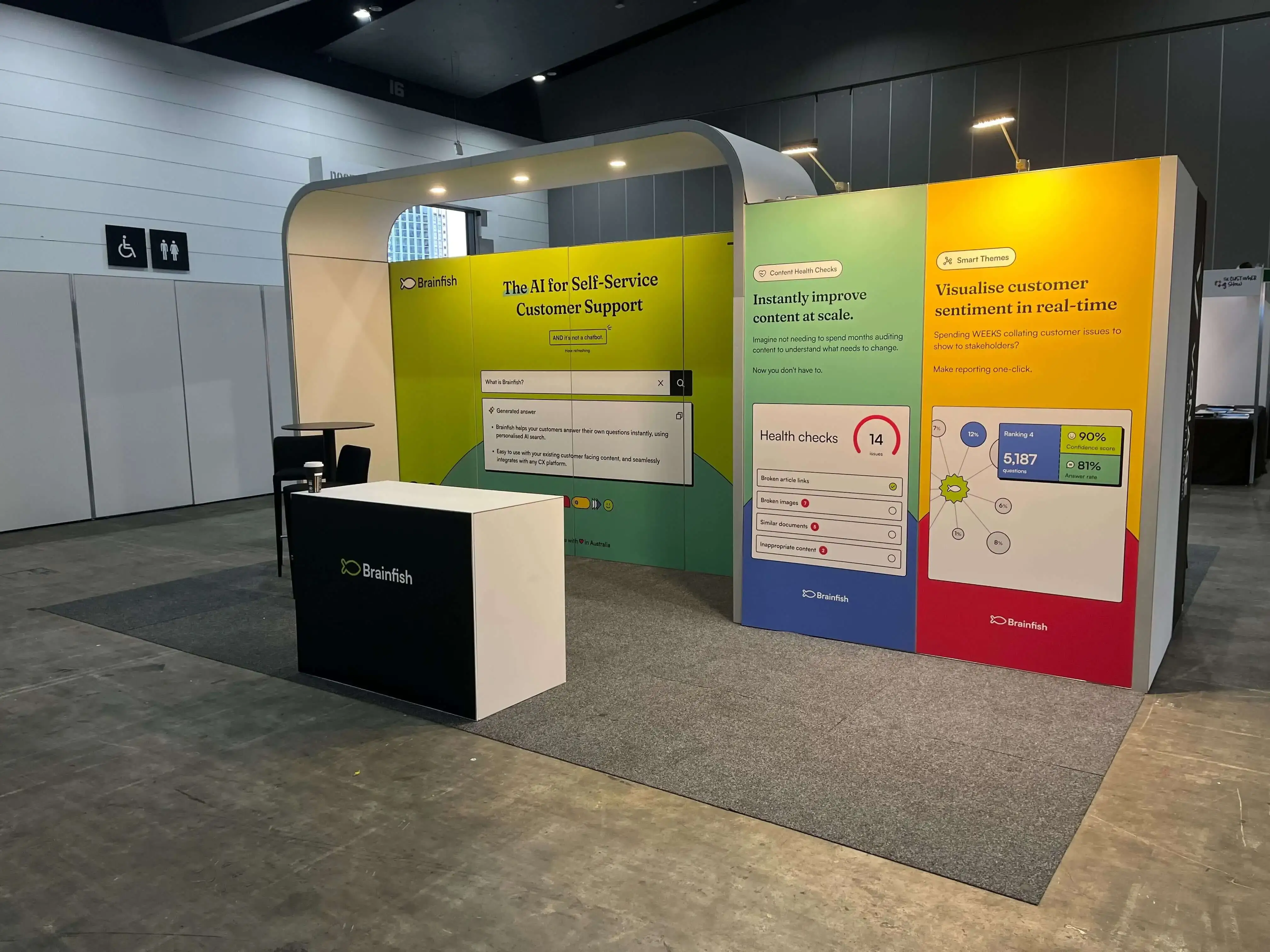
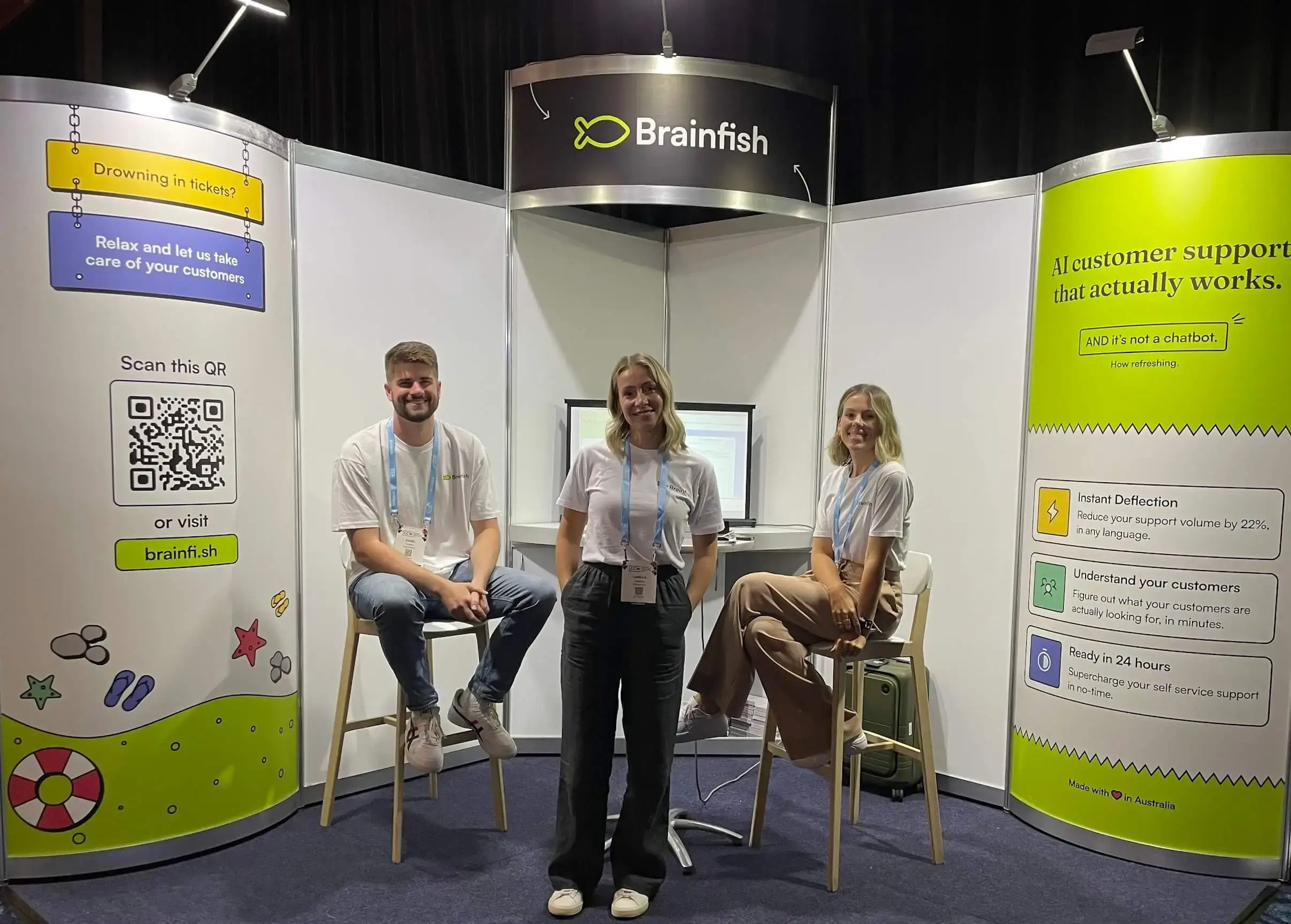
As Brainfish matured, the same visual language naturally extended into our website, marketing campaigns, social media, product launches, and conference material. One of my favourite moments was seeing people recognise our booth from across an event hall before they even noticed the logo.
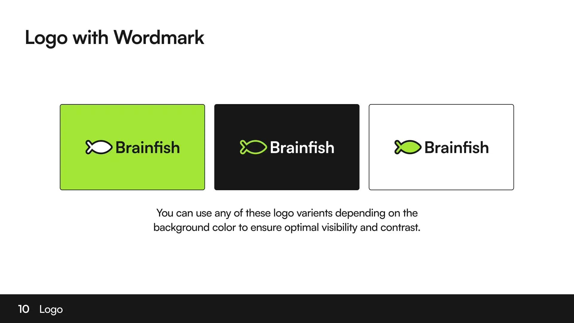
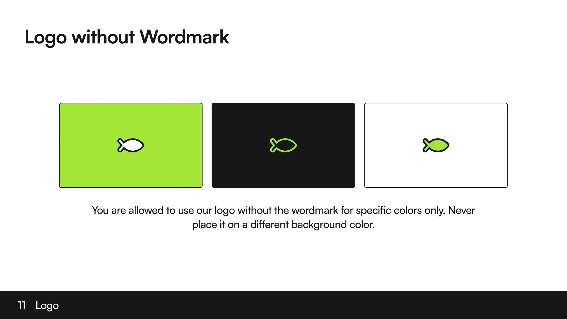
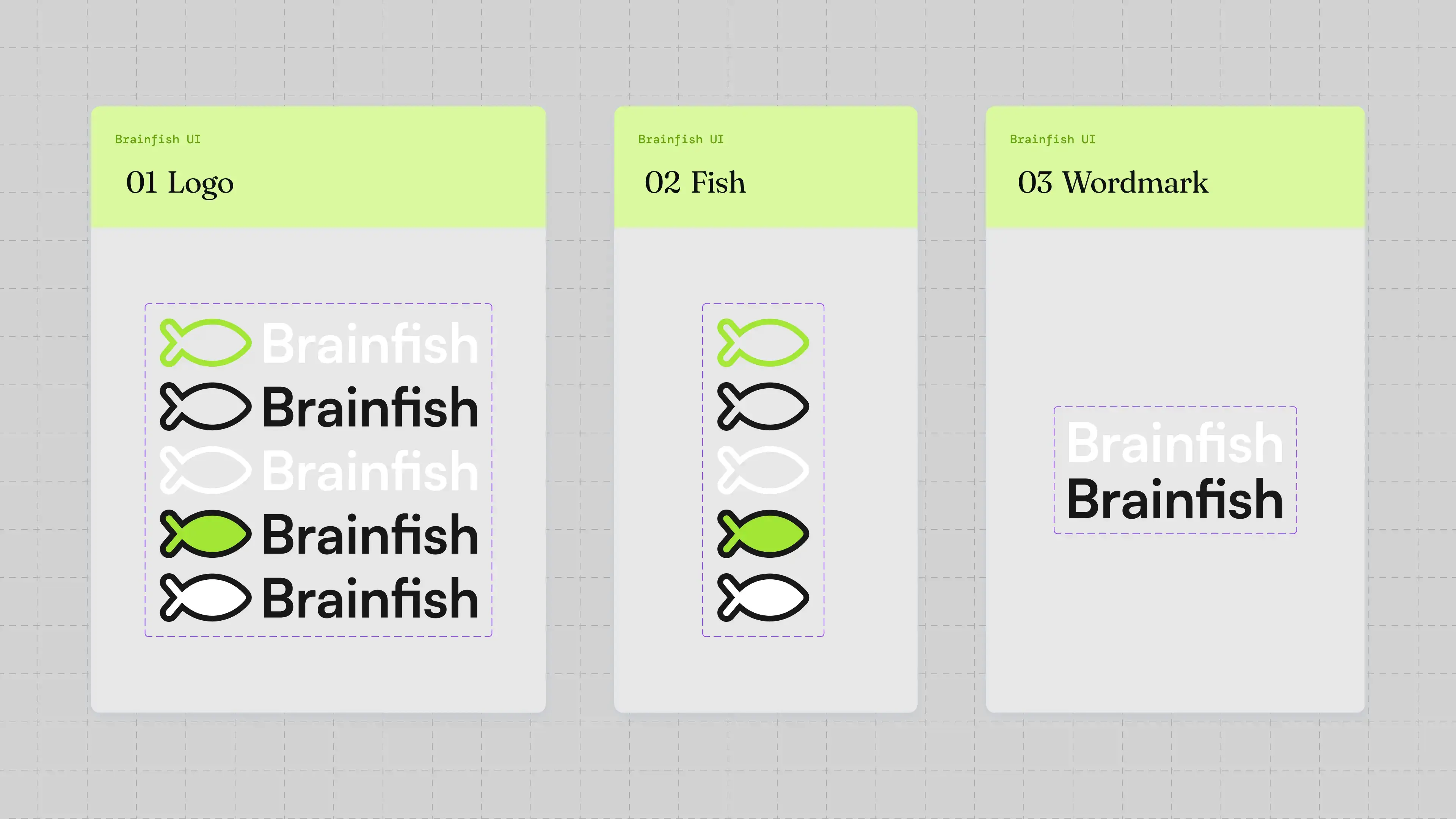
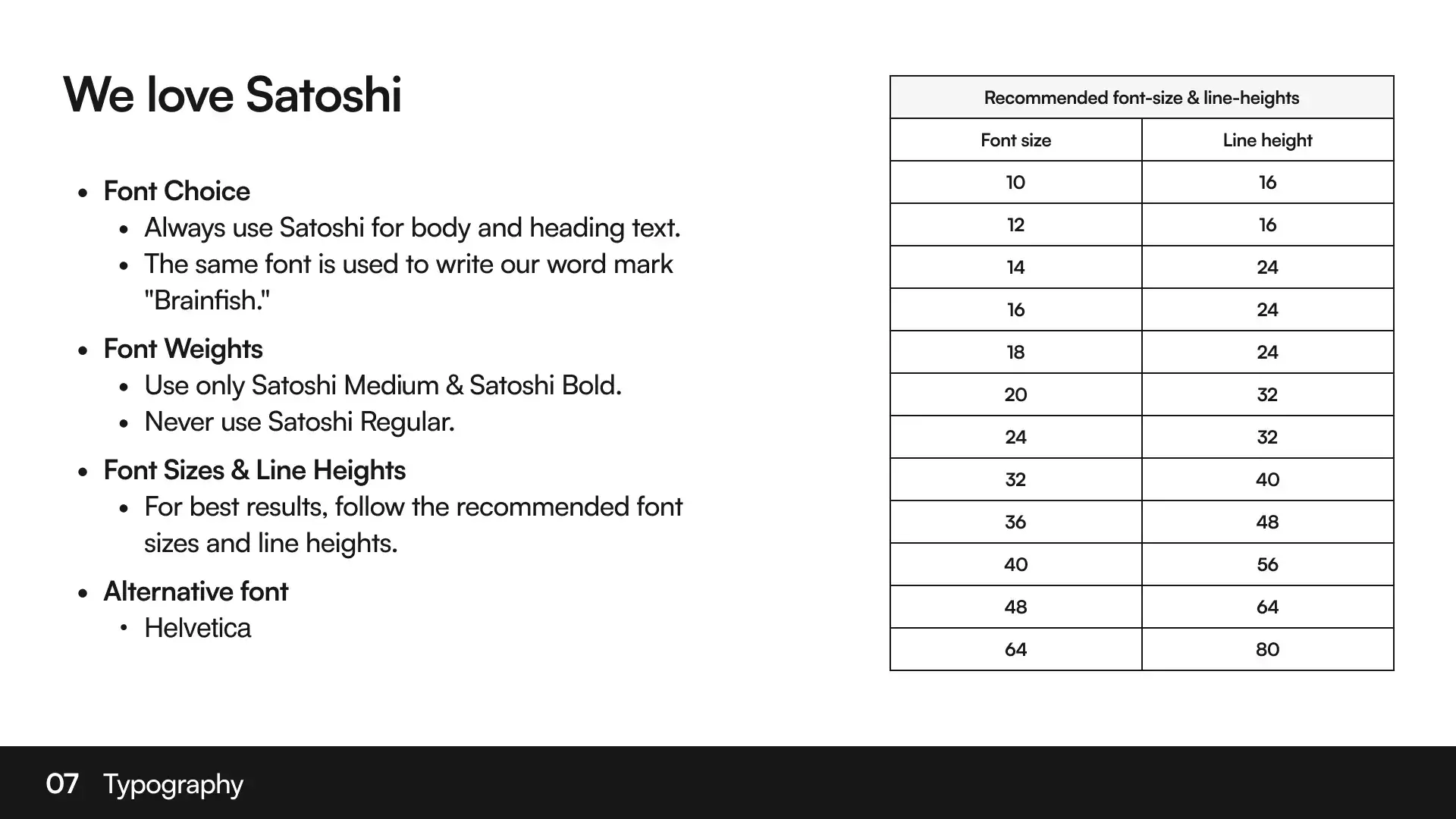
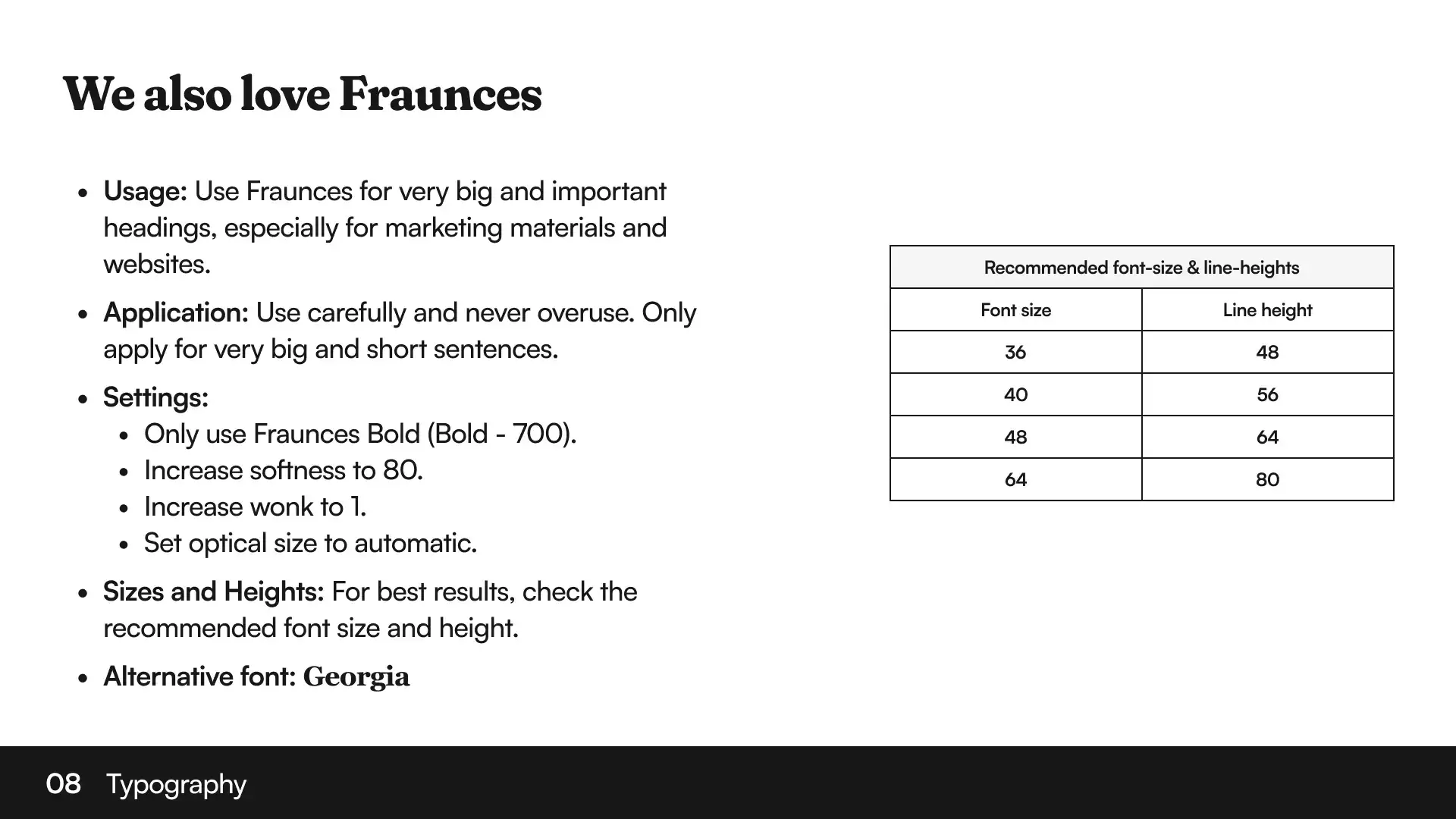
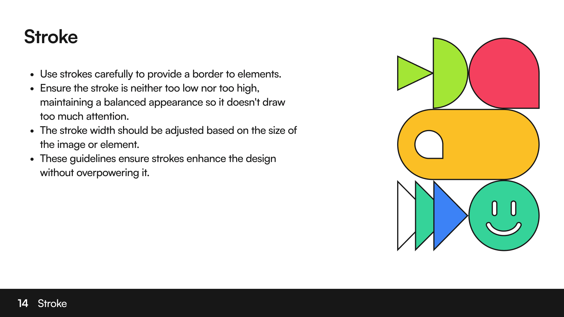
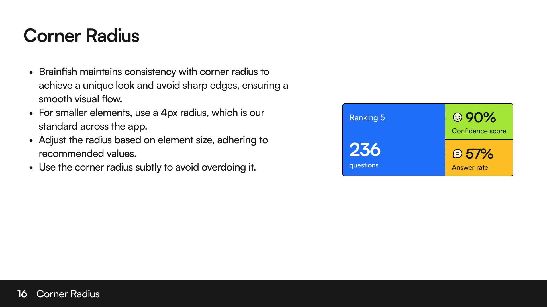
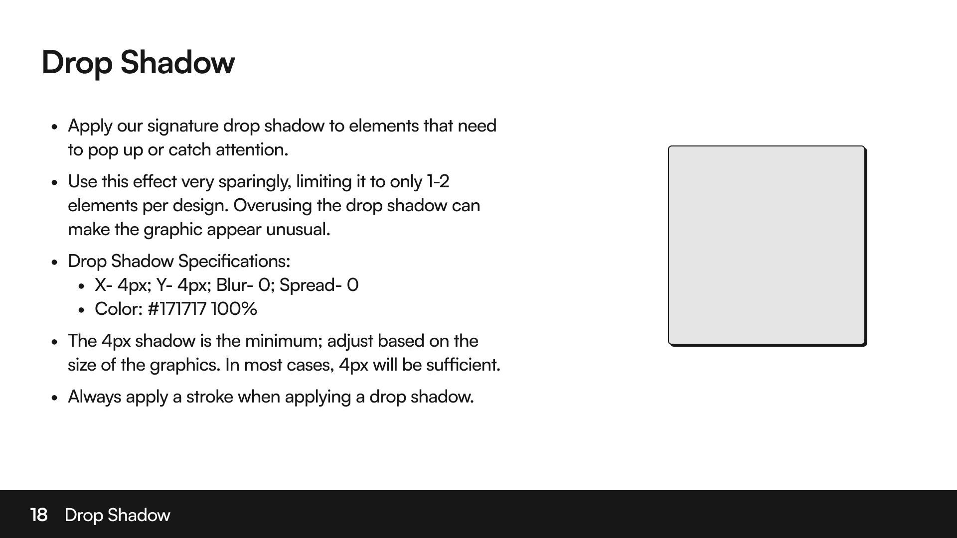
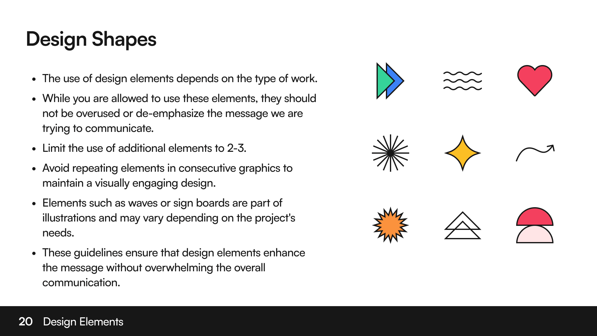
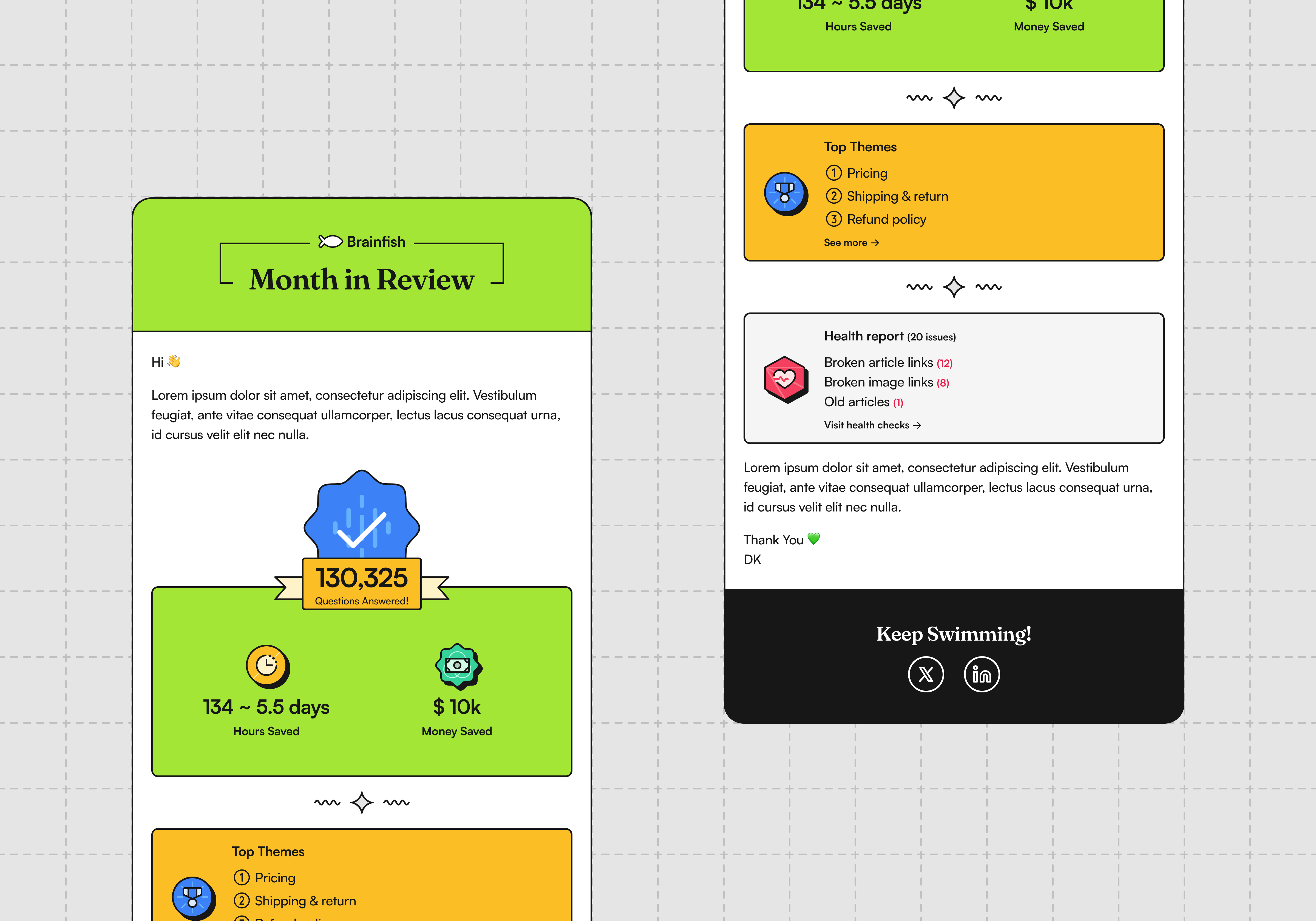
Field Note: Building a brand isn’t about making something beautiful. It’s about making something recognizable.
🤖 Designing AI experiences
The product evolved constantly, and so did my thinking.
When I joined Brainfish, AI products were rapidly changing. Every few months there was a new model, a new trend, or a new expectation from customers. Designing for AI meant constantly questioning assumptions instead of following established patterns.
One belief stayed with me throughout those years: AI didn’t have to look like a chatbot.
Instead of forcing every interaction into a conversation, we explored interfaces that felt like software first and AI second. Sometimes that meant cards, timelines, actions, forms, visual summaries, or contextual suggestions. The goal wasn’t to make AI feel magical. It was to make it genuinely useful.
Article Generation from Video
Article Generation is one of the features I’m most proud of because it completely changed how I thought about designing AI experiences.
When talking with customers, one frustration kept surfacing. Documentation never moved as fast as the product. Every release meant writing new articles, taking screenshots, collecting information from product managers and engineers, waiting for approvals, and eventually publishing. Documentation was always trying to catch up.
Around the same time, vision models were becoming dramatically better. We started asking ourselves a simple question: instead of asking people to describe their product, what if they could simply show it?
One design decision became obvious early on. Recording a screen was already part of most teams’ workflow, while writing prompts or manually uploading screenshots created unnecessary friction. We deliberately designed the experience around uploading a video immediately, without asking users to configure anything first.
Another challenge was waiting. AI generation could take anywhere from a few seconds to several minutes depending on the recording, and we couldn’t reliably estimate how long it would take. Instead of forcing people to stare at a loading screen, we designed the experience to notify them by email when the draft was ready for review.
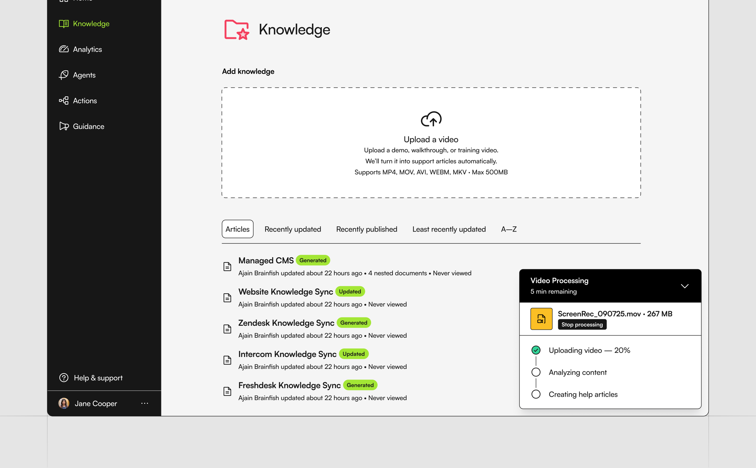
We also deliberately required a manual review before publishing. AI could generate the heavy lifting, but customers should always have the final say.
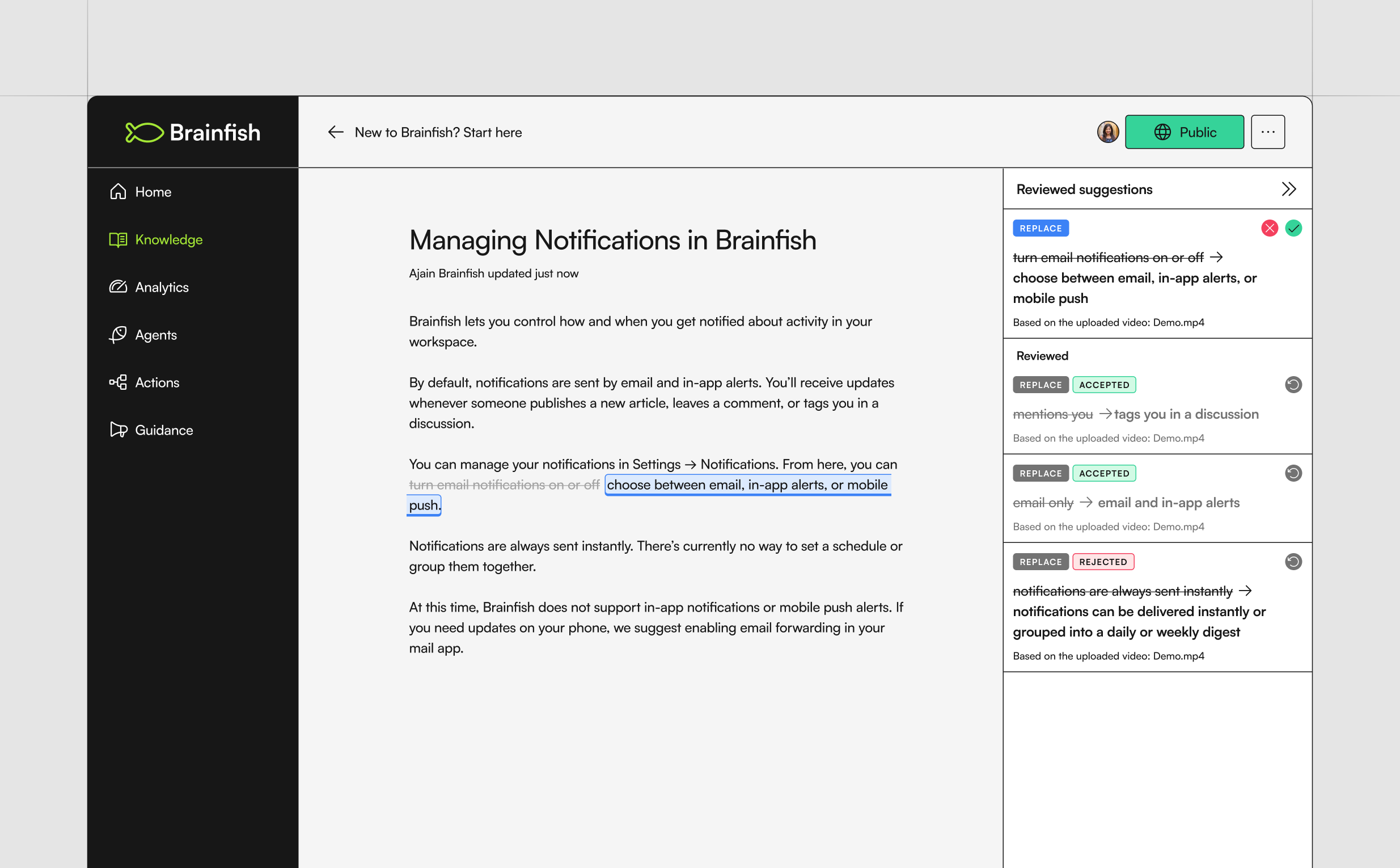
One of my favourite moments was using the feature on myself. I uploaded a recording of our internal branding presentation and watched Brainfish generate a structured branding guidelines articles within minutes. It wasn’t a demo anymore. It became part of my own workflow.
Field Note: The best AI experiences don’t ask people to learn a new workflow. They fit into the one they already have.
Designing this project reinforced something I still believe today: the best AI experiences don’t ask people to work differently. They quietly remove work altogether.
The Widget
The Widget became one of the longest-running projects I worked on at Brainfish.
As we began exploring what the Brainfish AI experience should look like, one thing stood out to me. Nearly every AI support product relied on the same familiar chatbot interface. It had quickly become the industry’s default, but I wasn’t convinced it was the right experience for our product.
Before we committed to that pattern, I kept coming back to a simple question:
Were customers really having conversations with AI, or were they simply searching for answers?
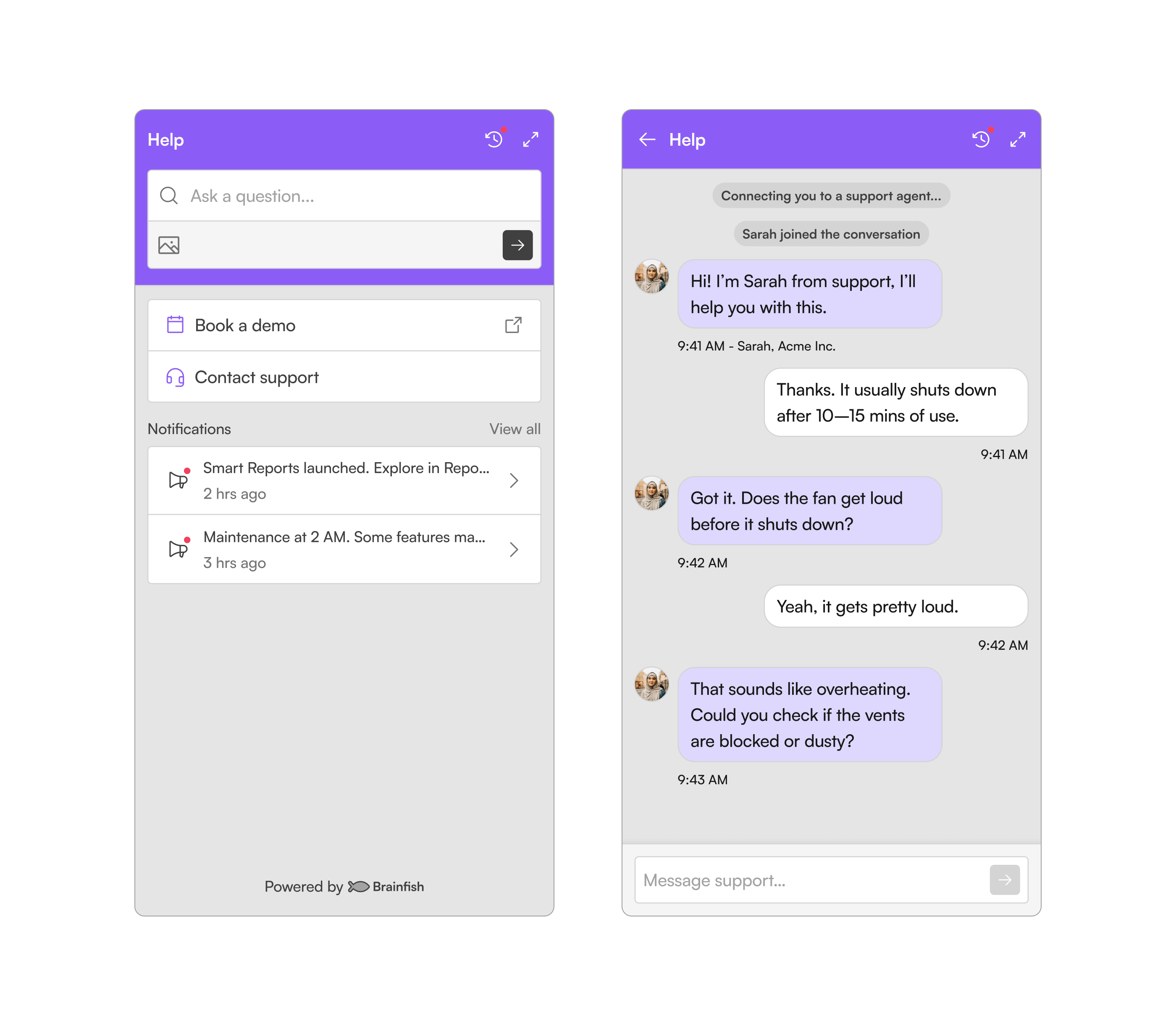
That single question became the foundation for everything that followed.
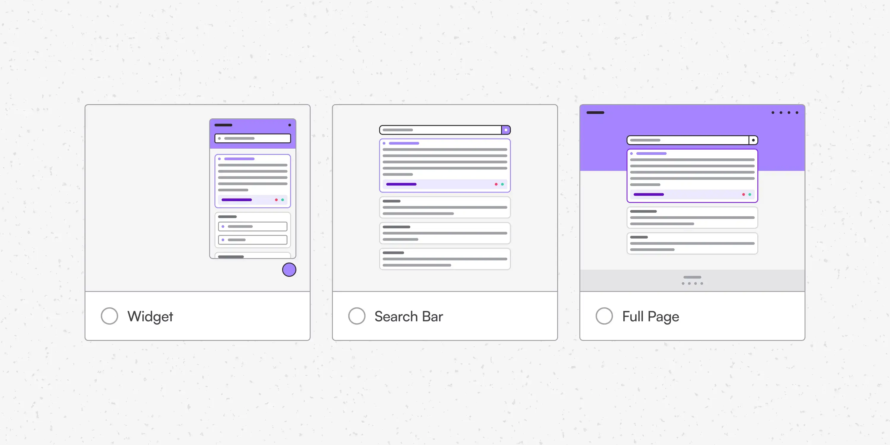
Searching and chatting are fundamentally different behaviours. Search gives people the feeling that they discovered the answer themselves, while conversation implies asking someone else for help. That distinction became the foundation of the experience.
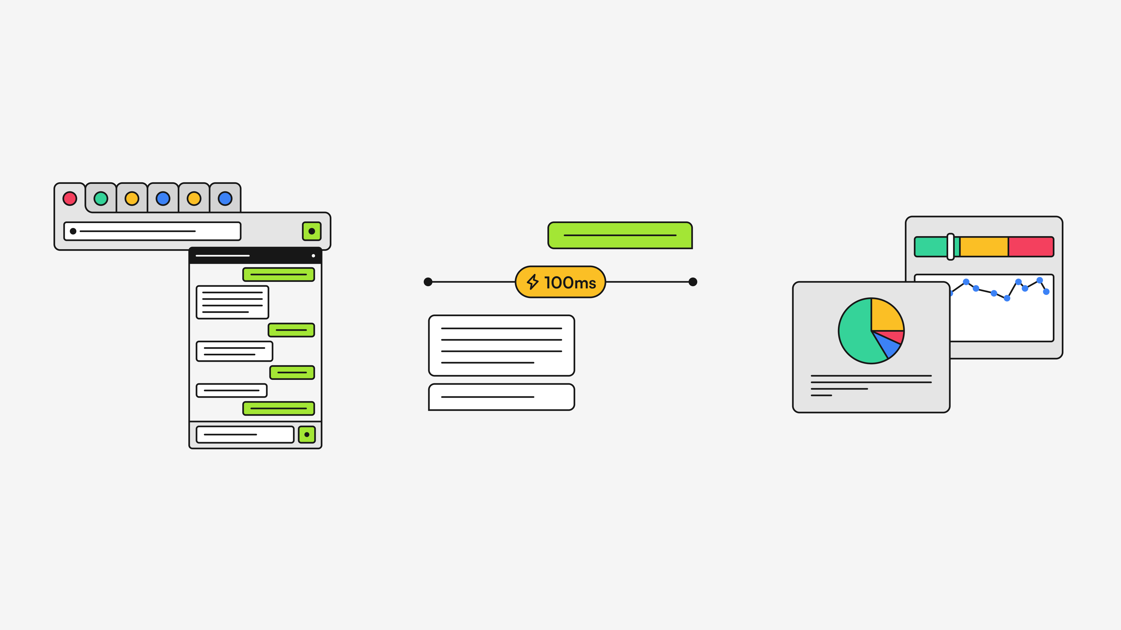
Instead of traditional chat bubbles, I designed each answer as a full-width card where the user’s question became the title and the answer became the body. Keeping them together made the experience feel closer to reading a knowledge base than scrolling through a conversation.
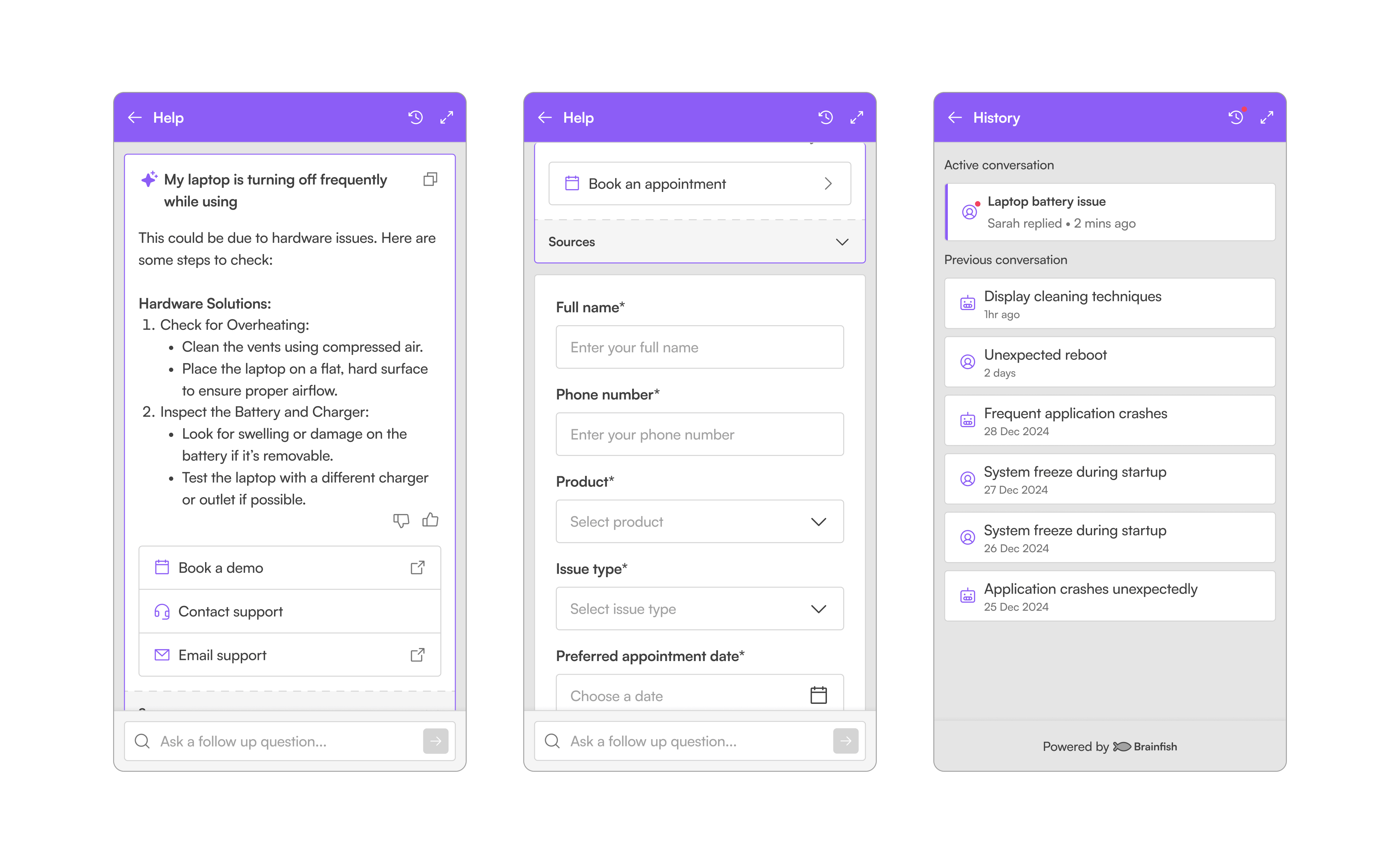
The layout also unlocked possibilities that chat interfaces struggled with. Rich media, long-form answers, citations, forms, large action buttons, and contextual information could all live comfortably within a single response without feeling cramped.
When customers needed human support, the interface intentionally transitioned into a familiar chat experience. AI worked best as search, while human conversations worked best as conversations. Rather than forcing one interaction model to solve both problems, we designed each around its strengths.
Field Note: Sometimes the best way to make an AI product feel different is to stop making it look like AI.
Intent & Actions
Brainfish had become good at answering questions. The next challenge was helping customers actually solve them.
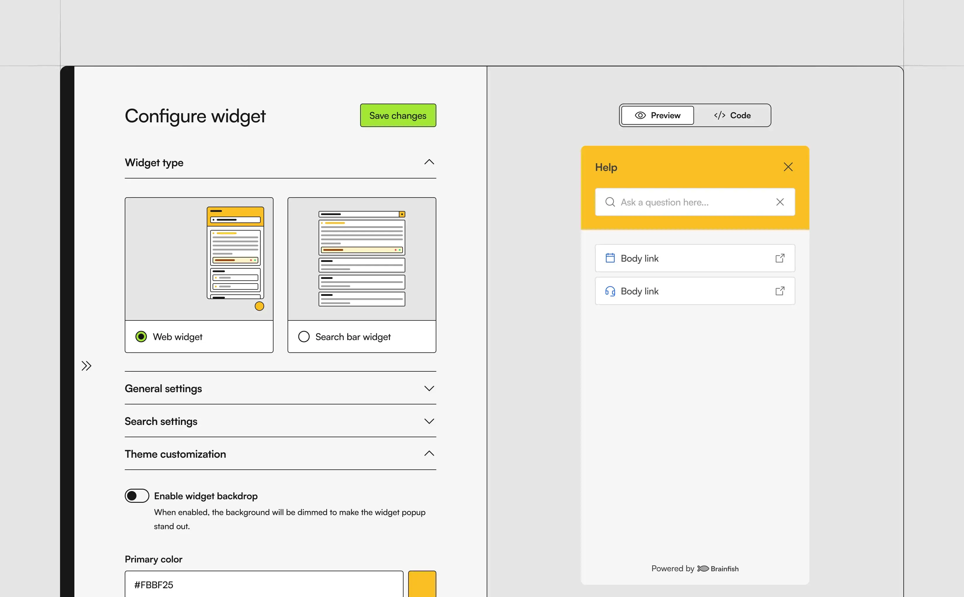
Intent & Actions allowed Brainfish to understand what someone was trying to accomplish and surface the right action at exactly the right moment, whether that meant booking a meeting, tracking an order, requesting a refund, updating settings, or submitting a form.
The design journey went through three completely different approaches.
We started with a drag-and-drop builder because we imagined customers creating complex conditional logic. Looking back, we were designing for future complexity instead of today’s needs.
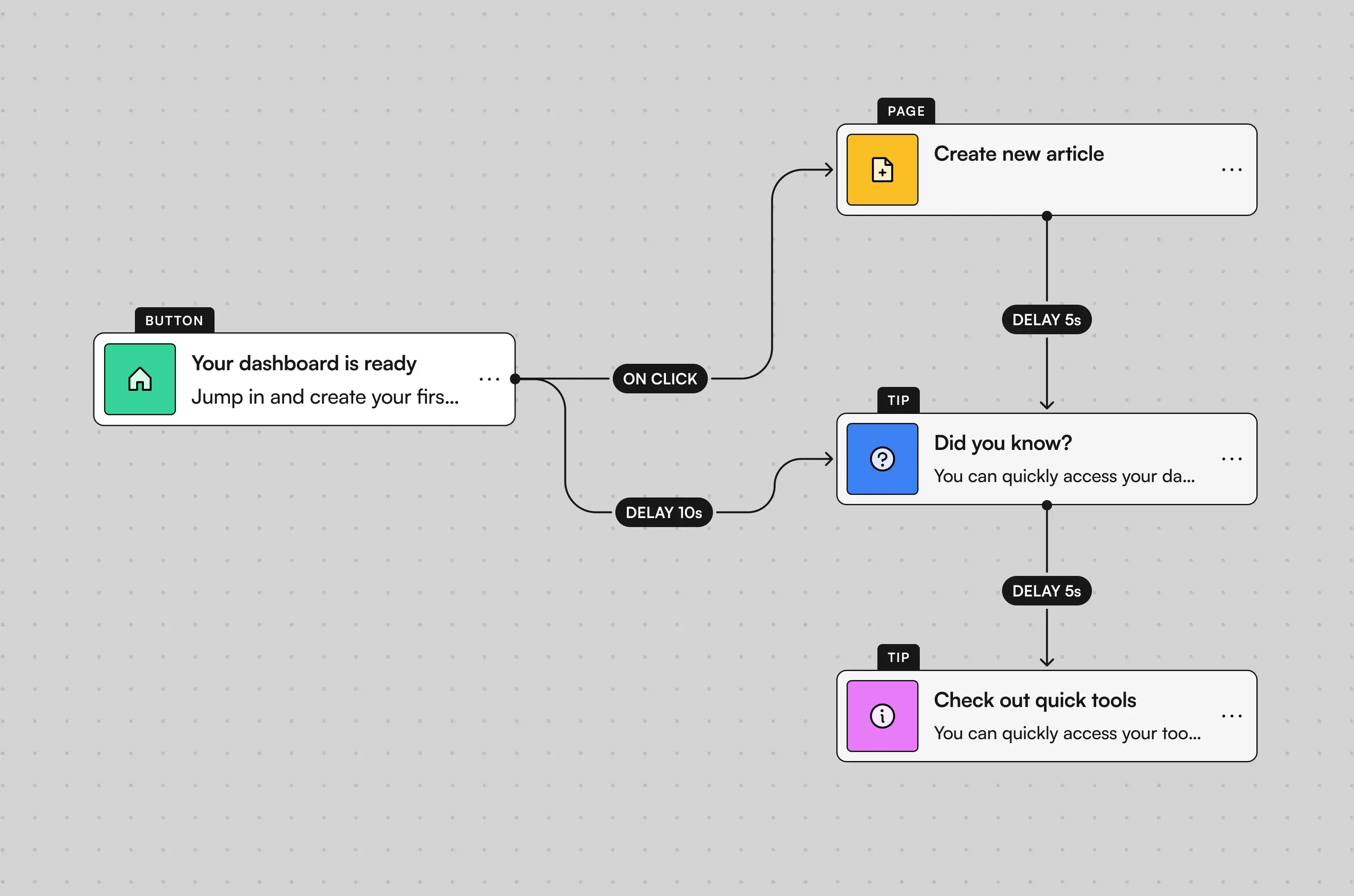
After discussing the experience with the founders, we realised the interaction wasn’t intuitive enough for everyday users, so we scrapped the entire concept.
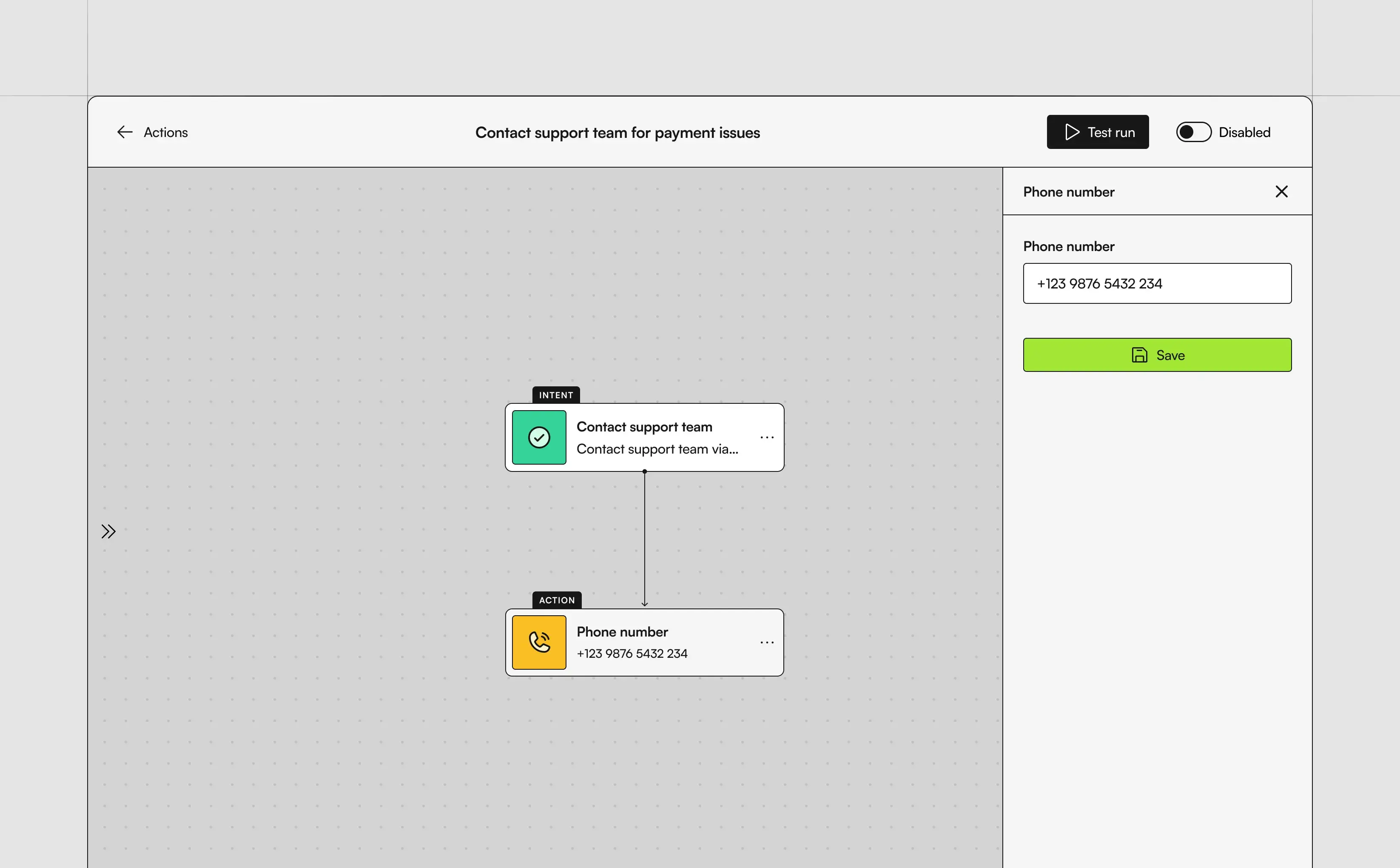
The next iteration introduced a guided wizard. It was easier to understand, but completing simple tasks required too many clicks and too much navigation.
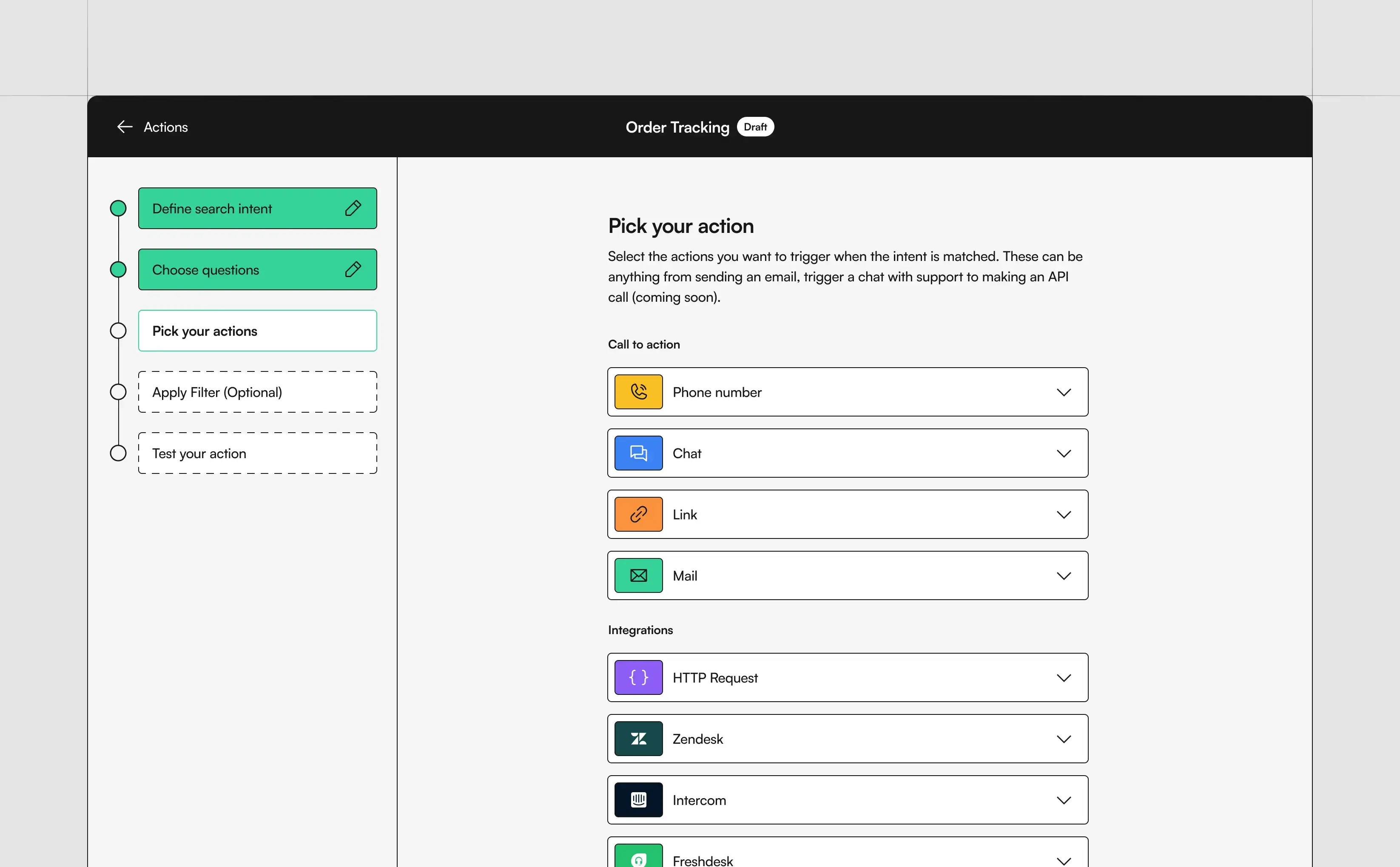
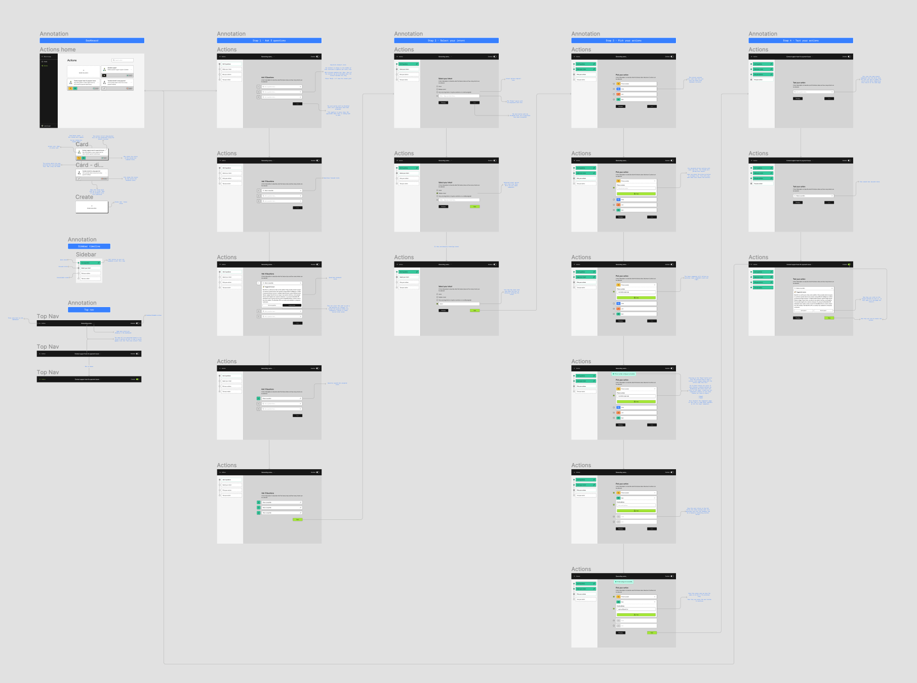
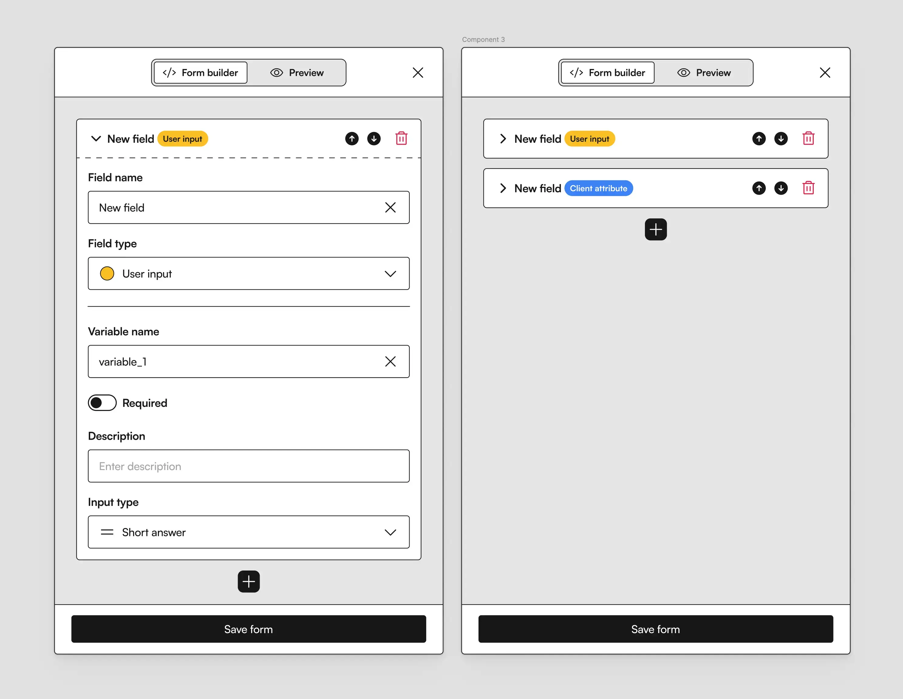
The final solution became a single-page workspace where intent and actions lived side by side. People could edit, test, and refine everything without constantly moving between screens.
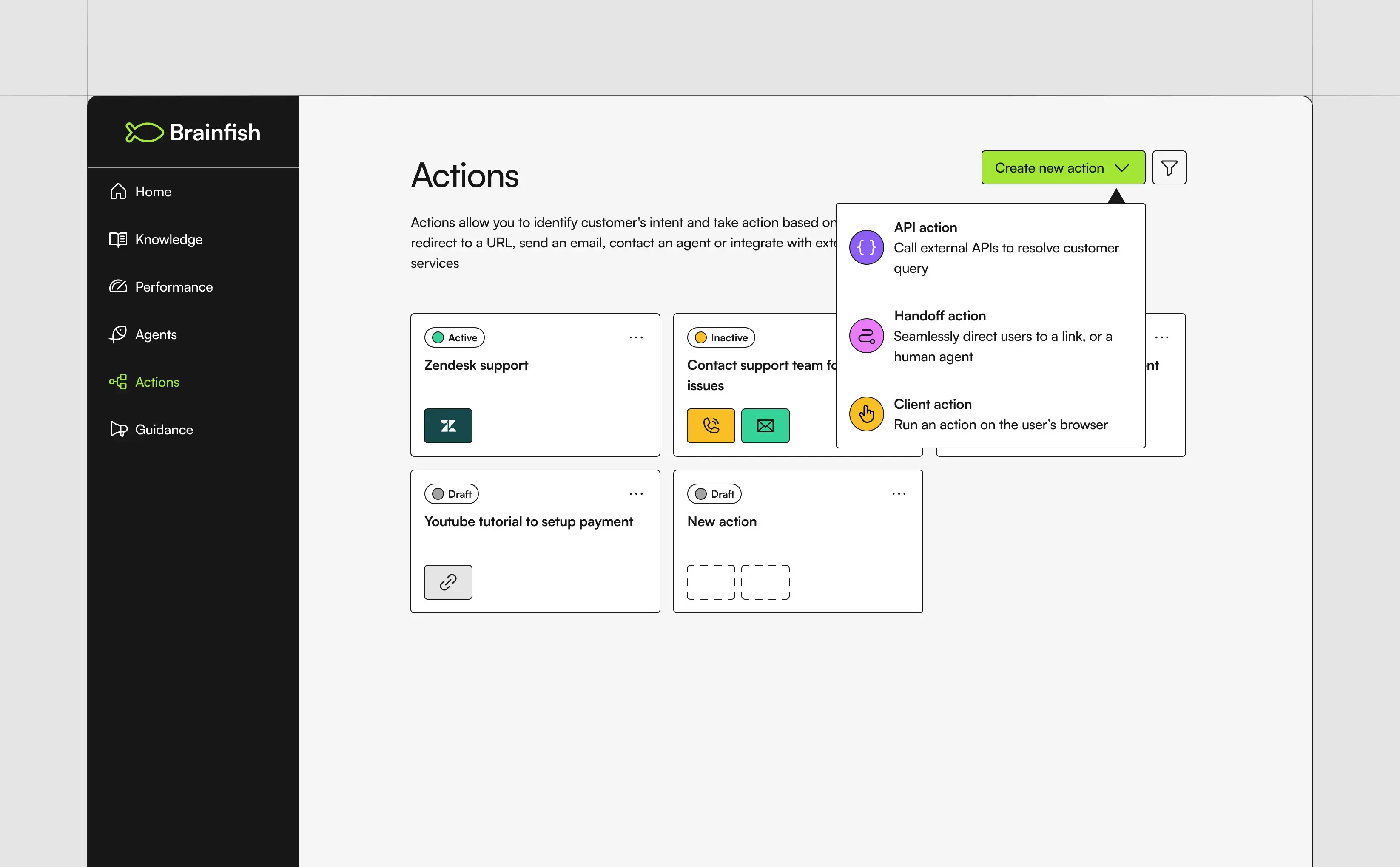
This project taught me one of the biggest lessons of my career: good design isn’t about adding more possibilities. It’s about removing enough complexity that the right path becomes obvious.
Insights
Insights never shipped, but it remains the project that changed how I think about product design.
The idea came from a simple observation. Analytics were excellent at explaining what had happened, but they stopped there. Customers still had to interpret graphs, identify patterns, prioritise work, and decide what to do next.
I wanted to design something that transformed information into decisions.
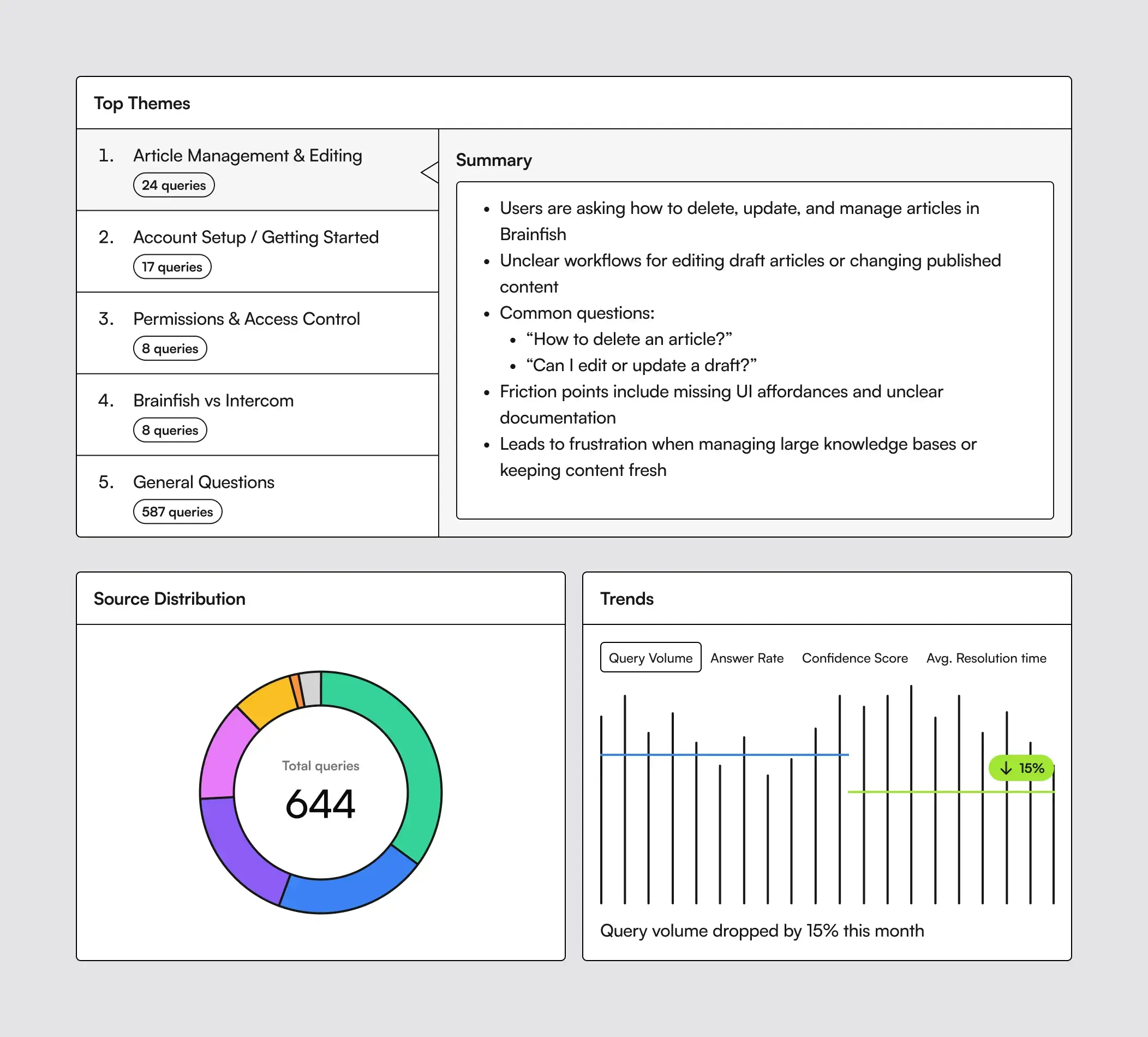
The earliest concepts still resembled traditional analytics dashboards. Over time I intentionally removed more and more graphs until the experience became almost entirely focused on recommendations, suggested actions, knowledge gaps, feature opportunities, and AI-generated summaries.
We deliberately limited the experience to the most important themes instead of overwhelming customers with endless information. The goal wasn’t to show everything. It was to help teams decide what mattered most.
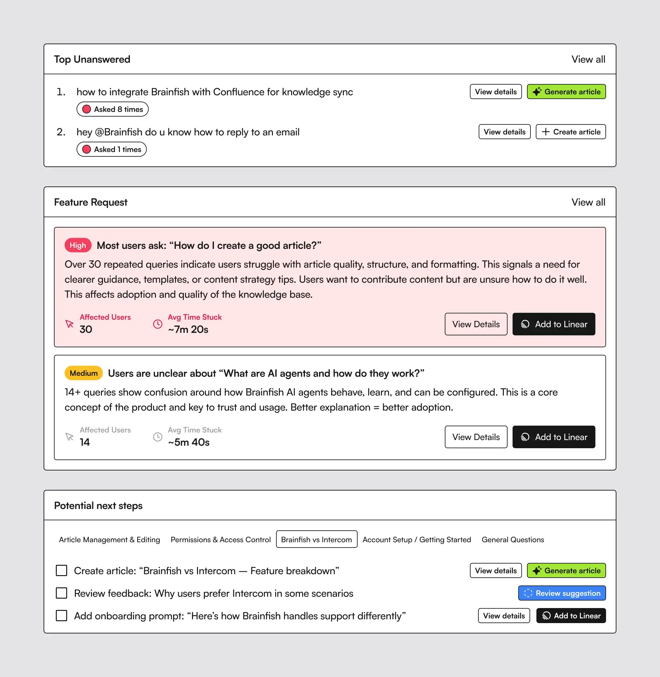
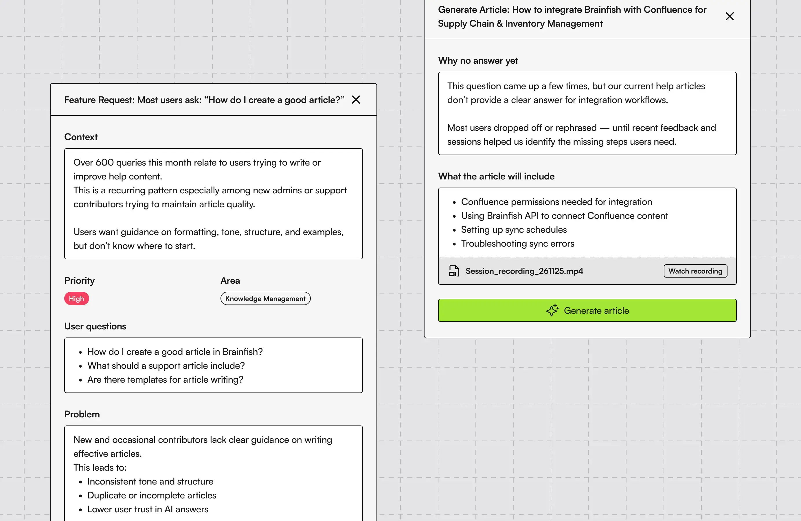
Even though the project never shipped, it fundamentally changed the way I think about AI products. Numbers alone don’t improve products. Better decisions do.
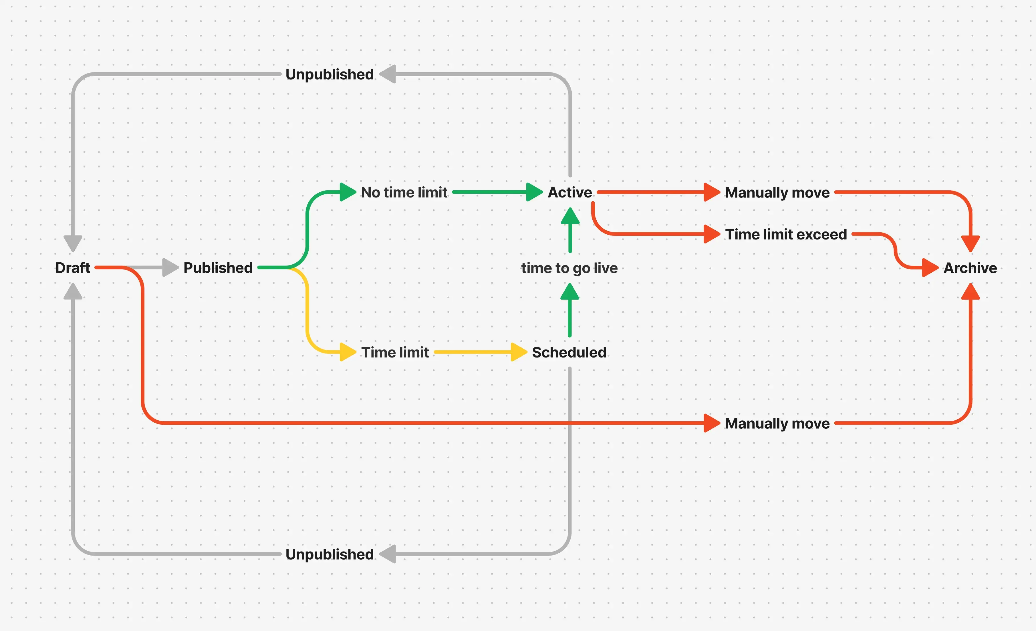
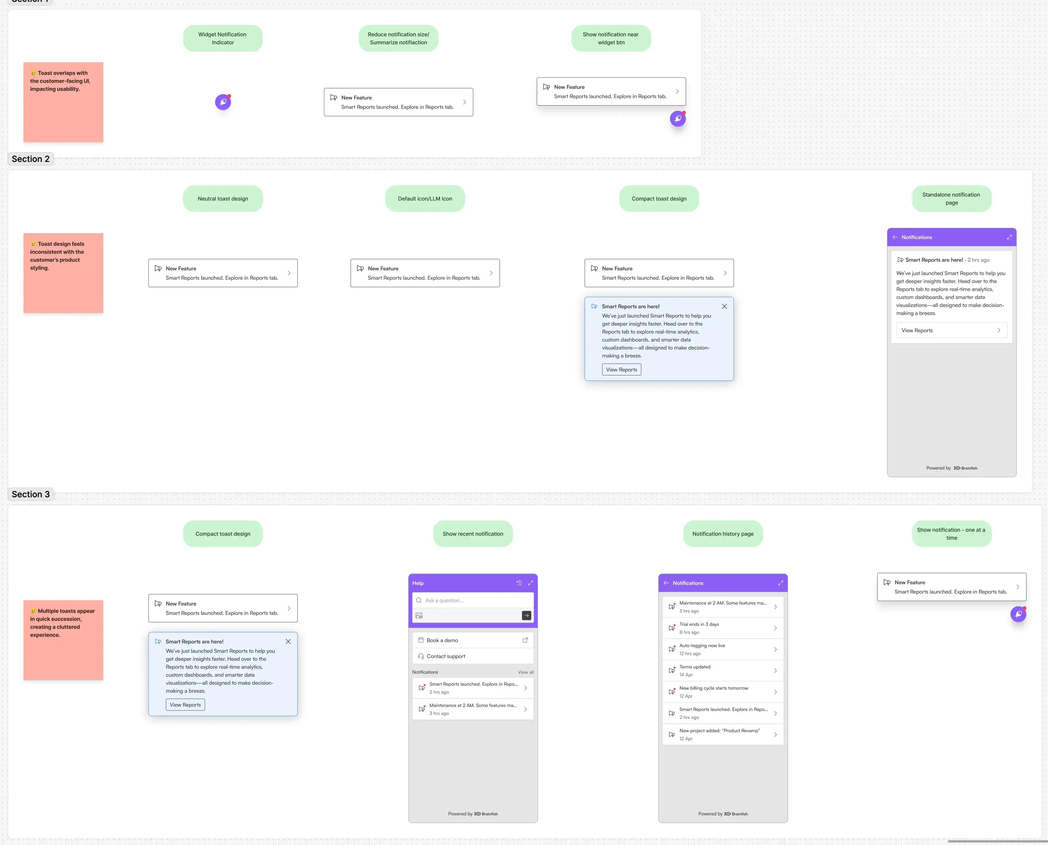
Nudges
Not every feature becomes a success story, and I think that’s an important part of the journey.
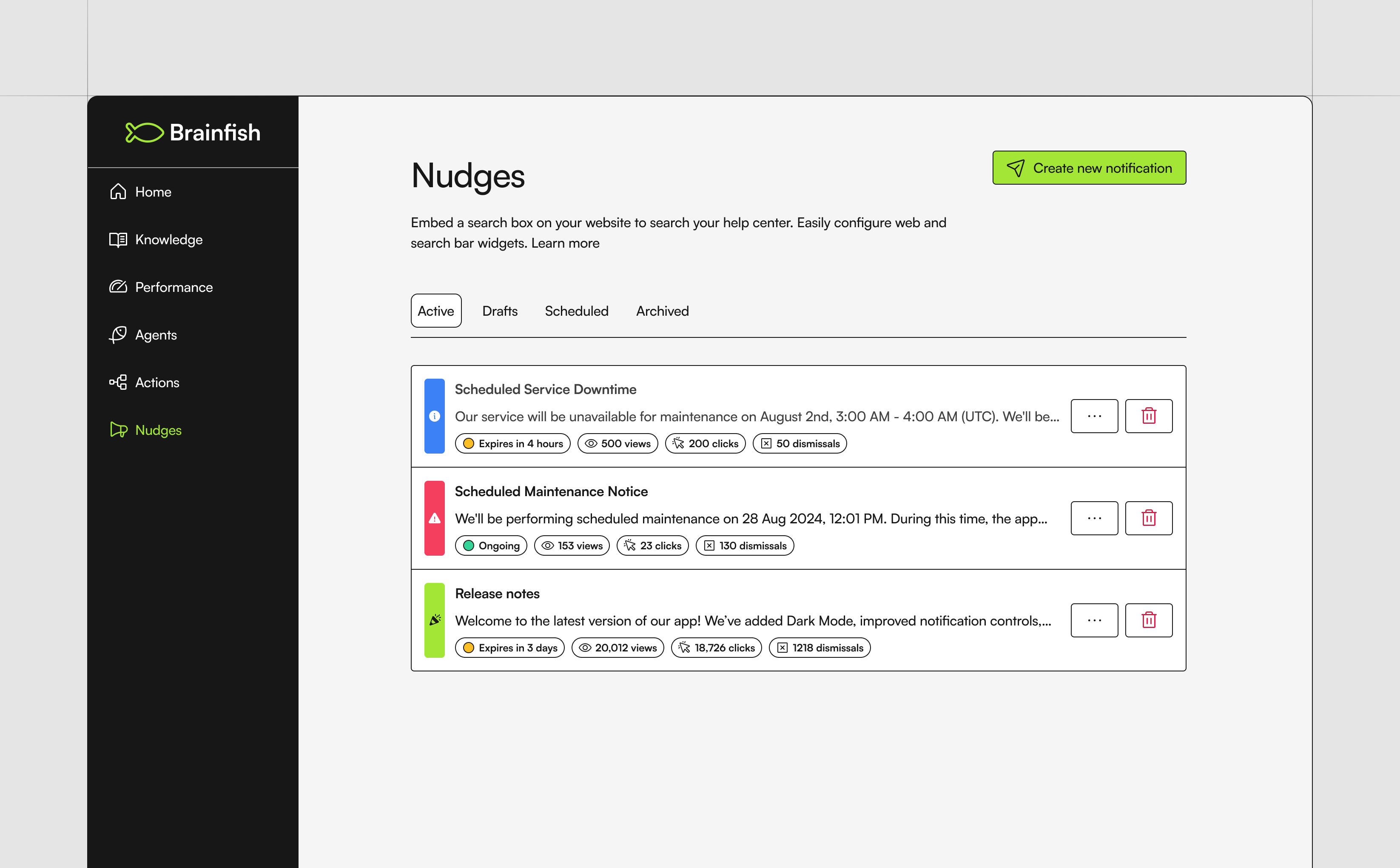
Nudges explored proactive support by surfacing helpful messages before customers became frustrated. While the concept was promising, we learned that good timing and context mattered far more than simply displaying a message.
Some of my biggest lessons came from projects that didn’t fully meet expectations, and I’m just as proud to include those here because they shaped how I approach product design today.
🚀 Growing the product
Not every project deserves its own chapter.
Over three and a half years I designed dozens of features, improvements, experiments, and internal tools. Some were customer-facing launches, while others quietly improved workflows behind the scenes.
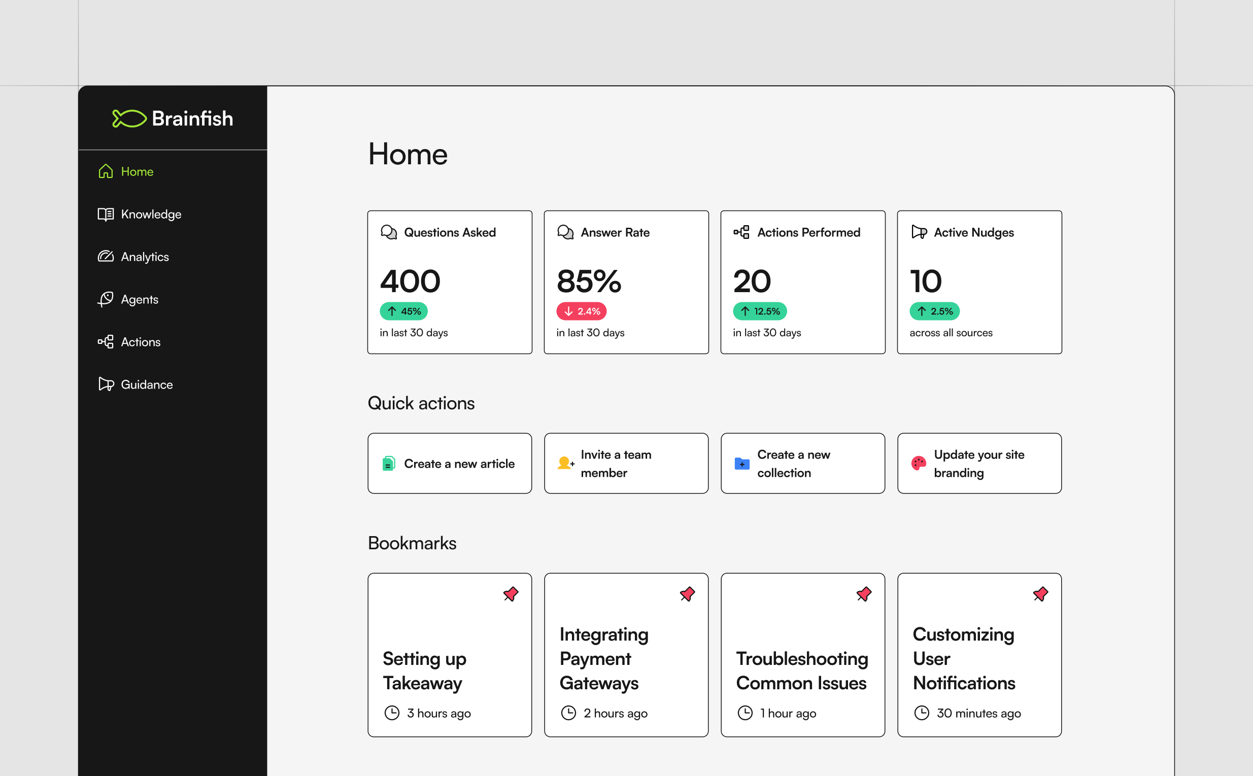
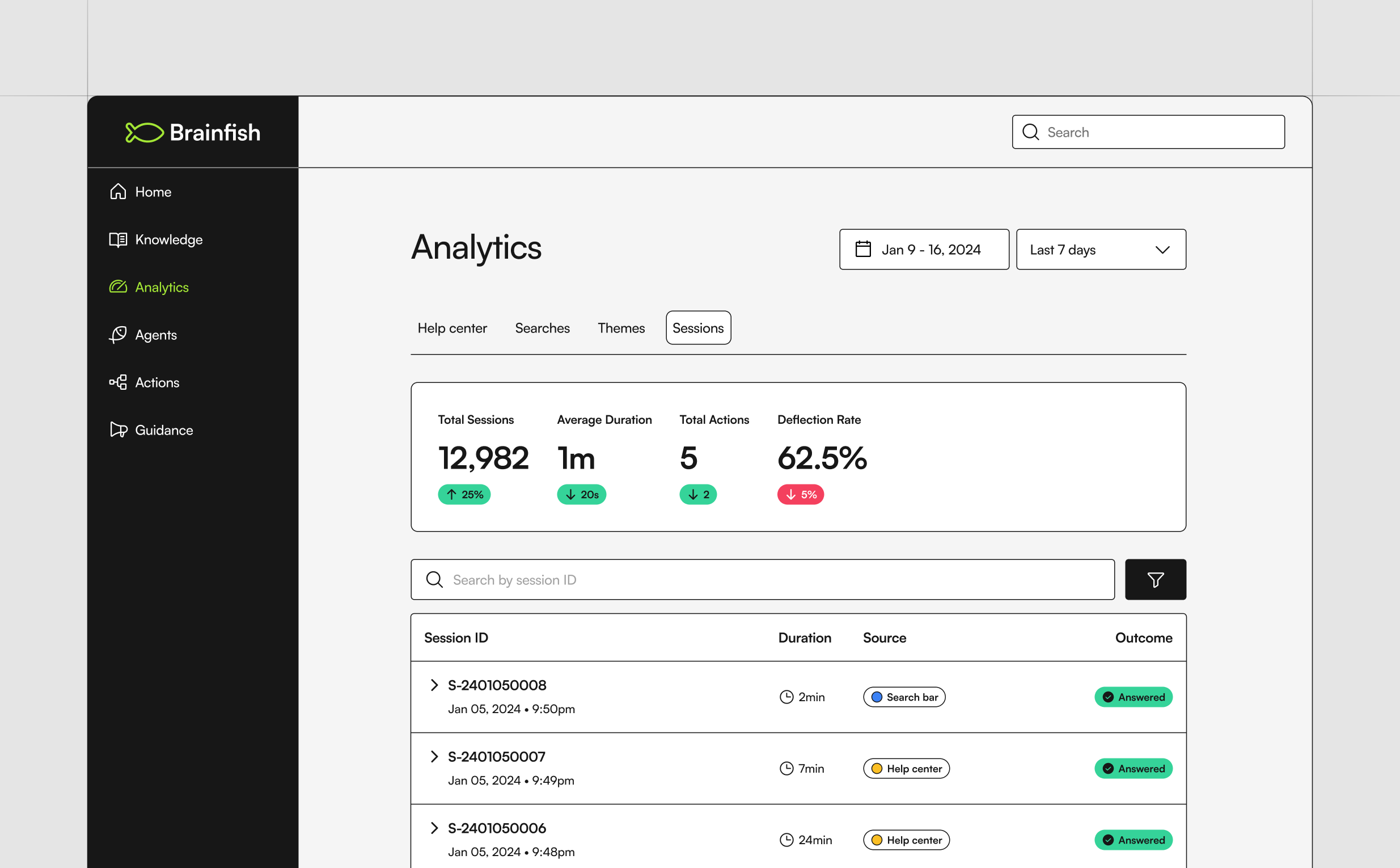
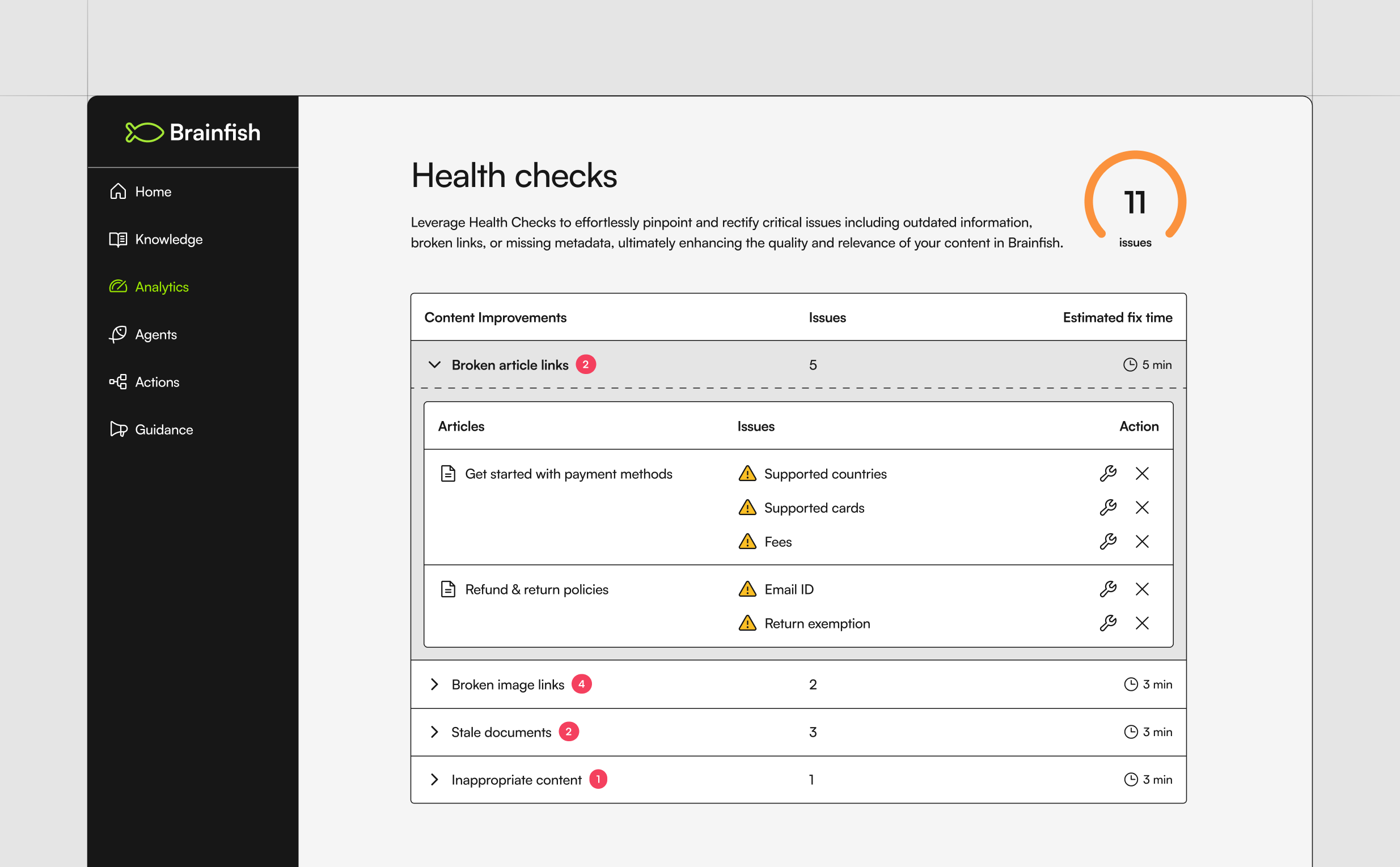
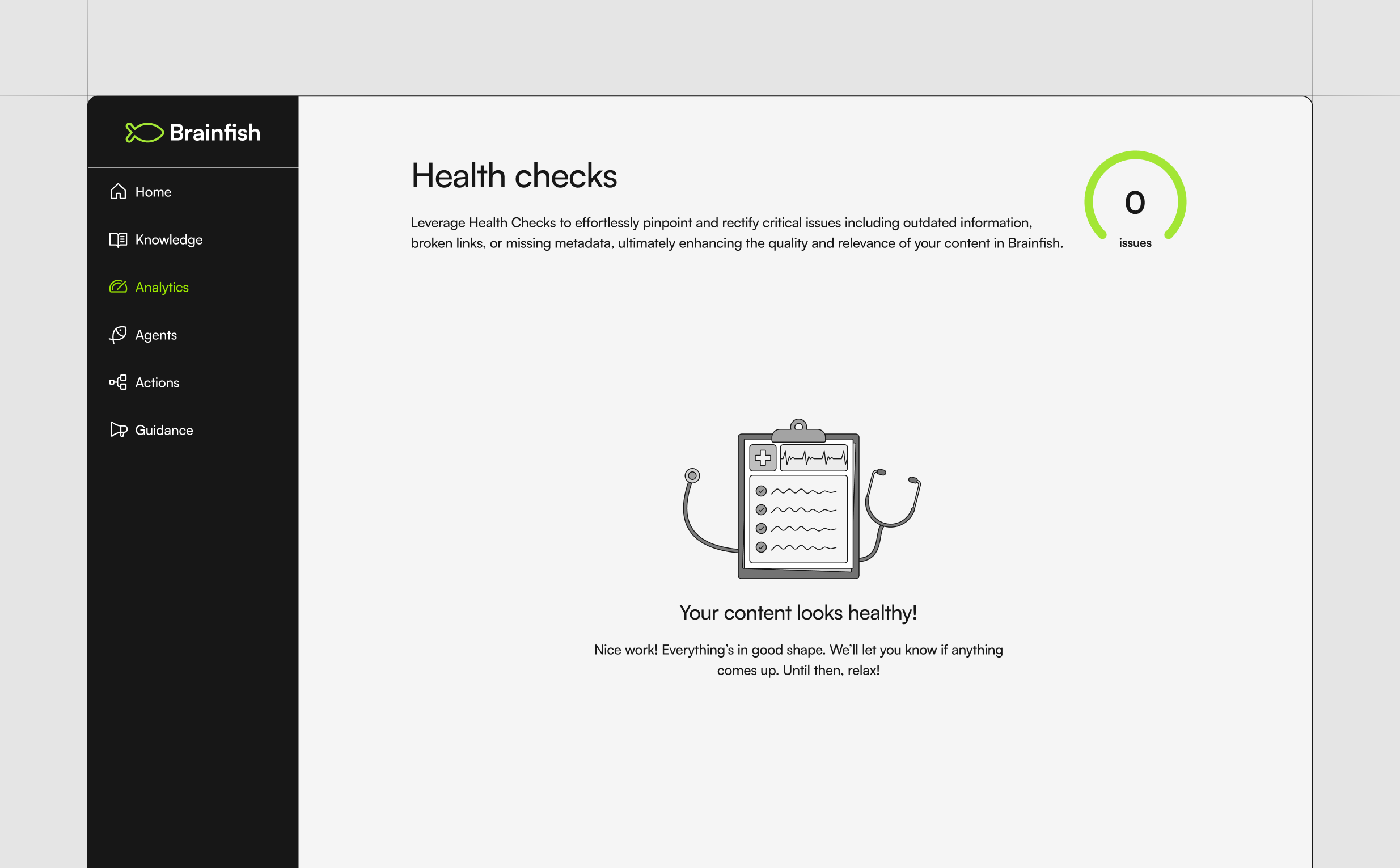
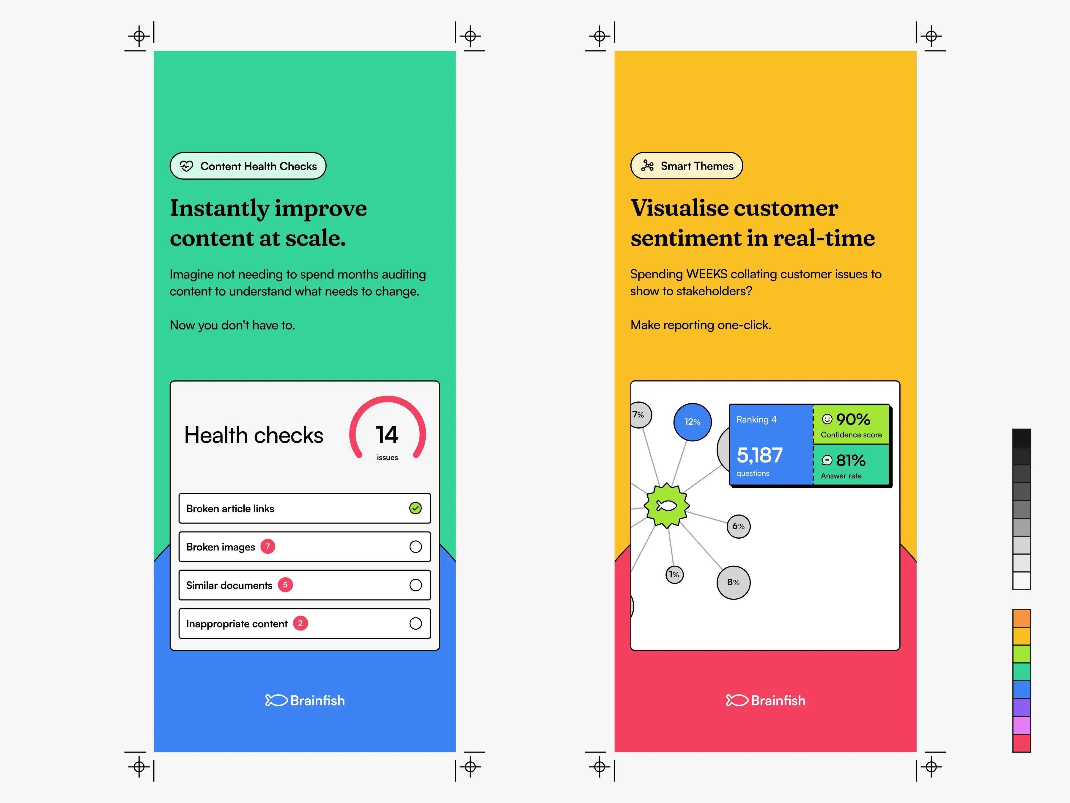
I worked on analytics, knowledge generation, article management, onboarding, health checks, search experiences, AI workflows, empty states, settings, notifications, dashboards, and countless small interactions that collectively shaped the product.
Looking back at this collection, what stands out isn’t any single feature. It’s the consistency of building, learning, shipping, gathering feedback, and doing it all again.
🧩 Building systems
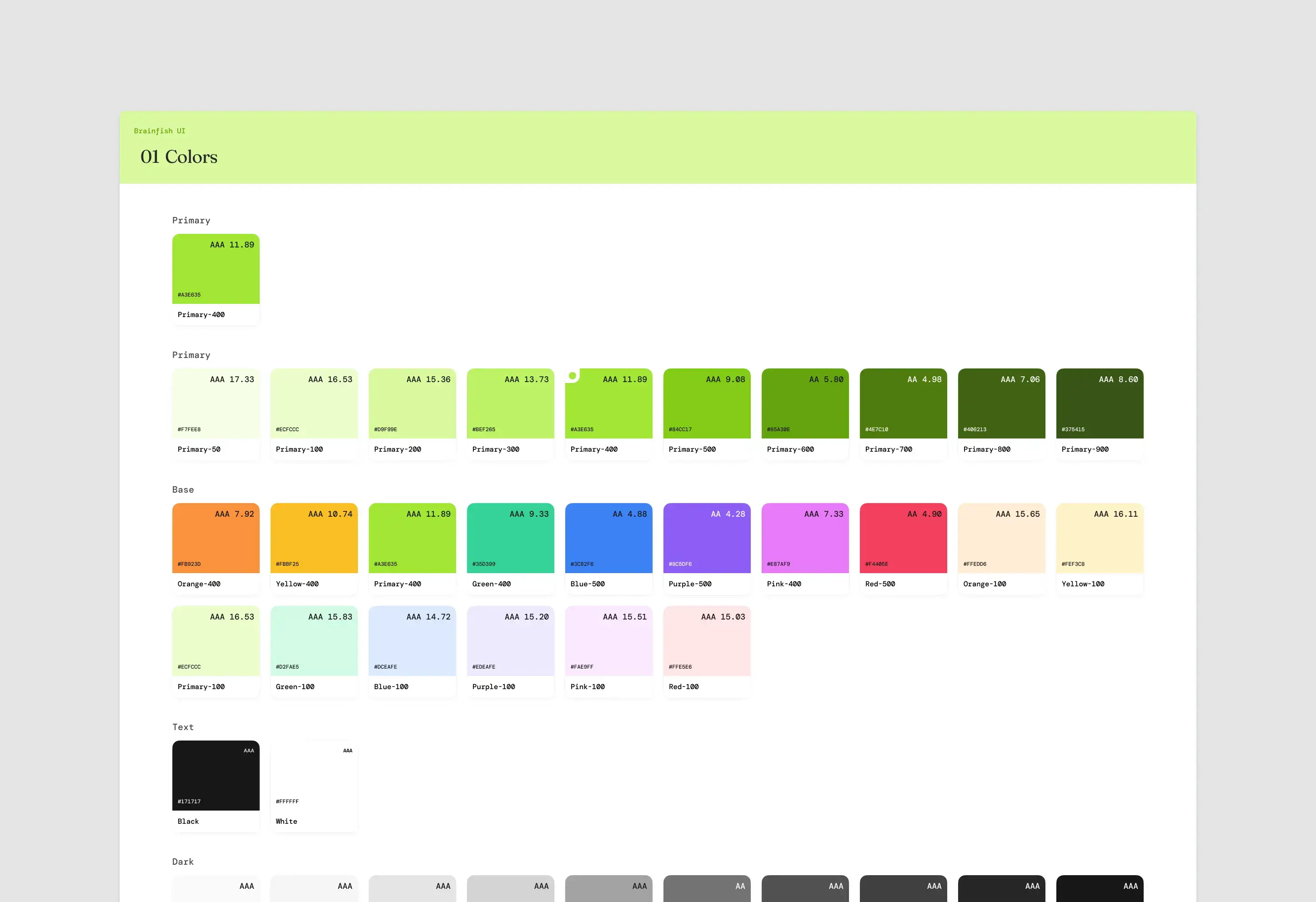
One thing I was excited to build from day one was a design system. Not because every startup needs one, but because I wanted a shared foundation that would help us move faster.
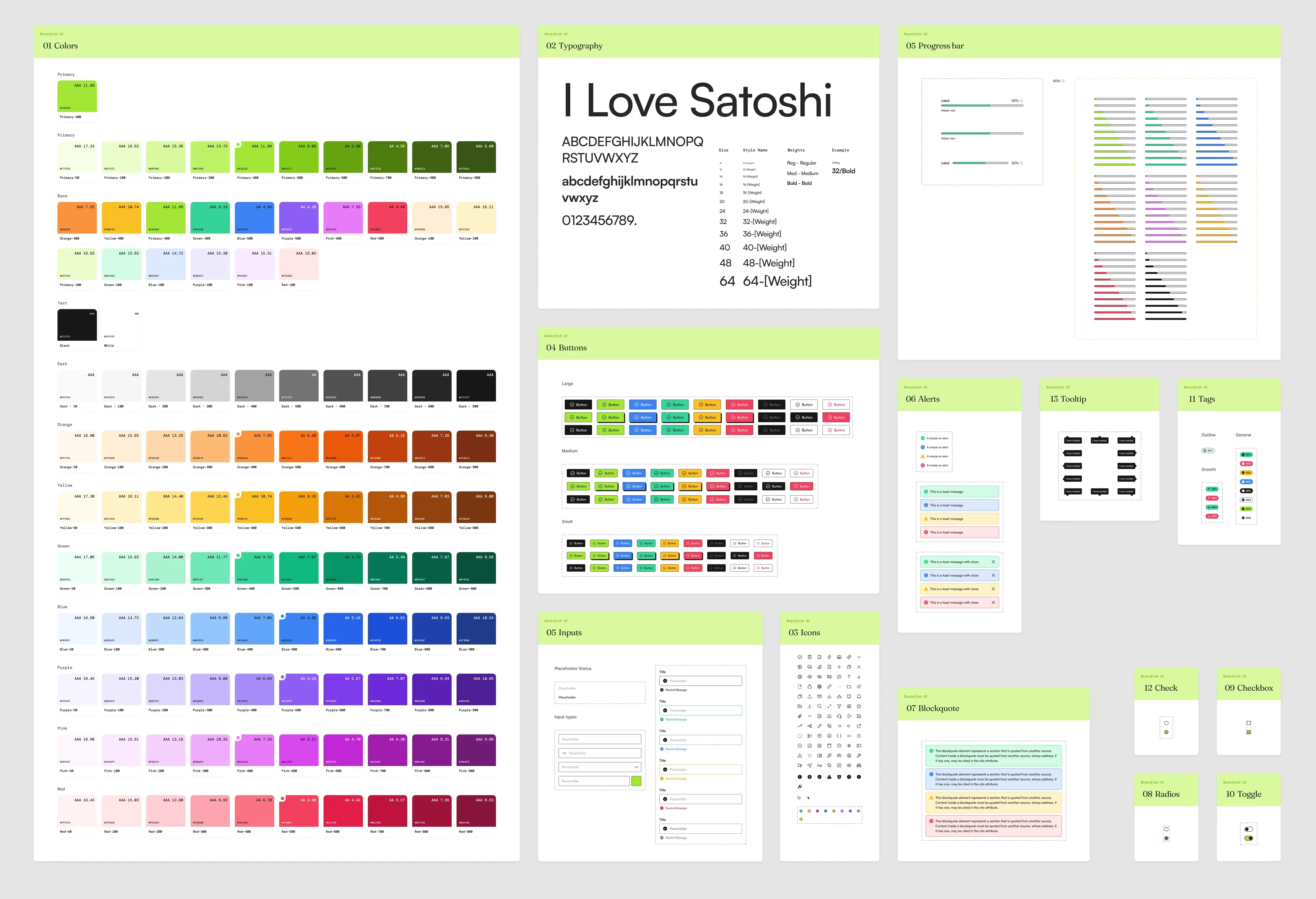
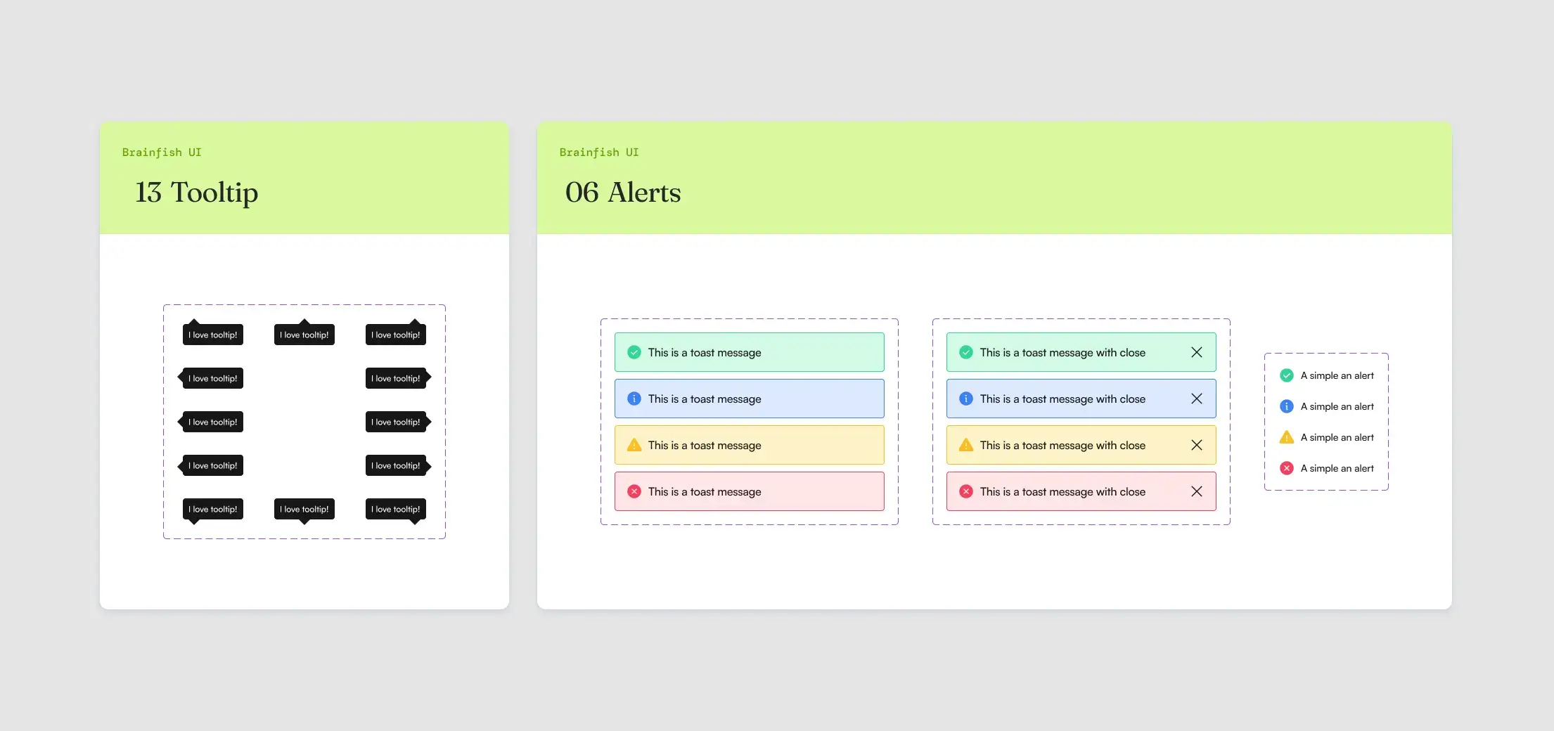
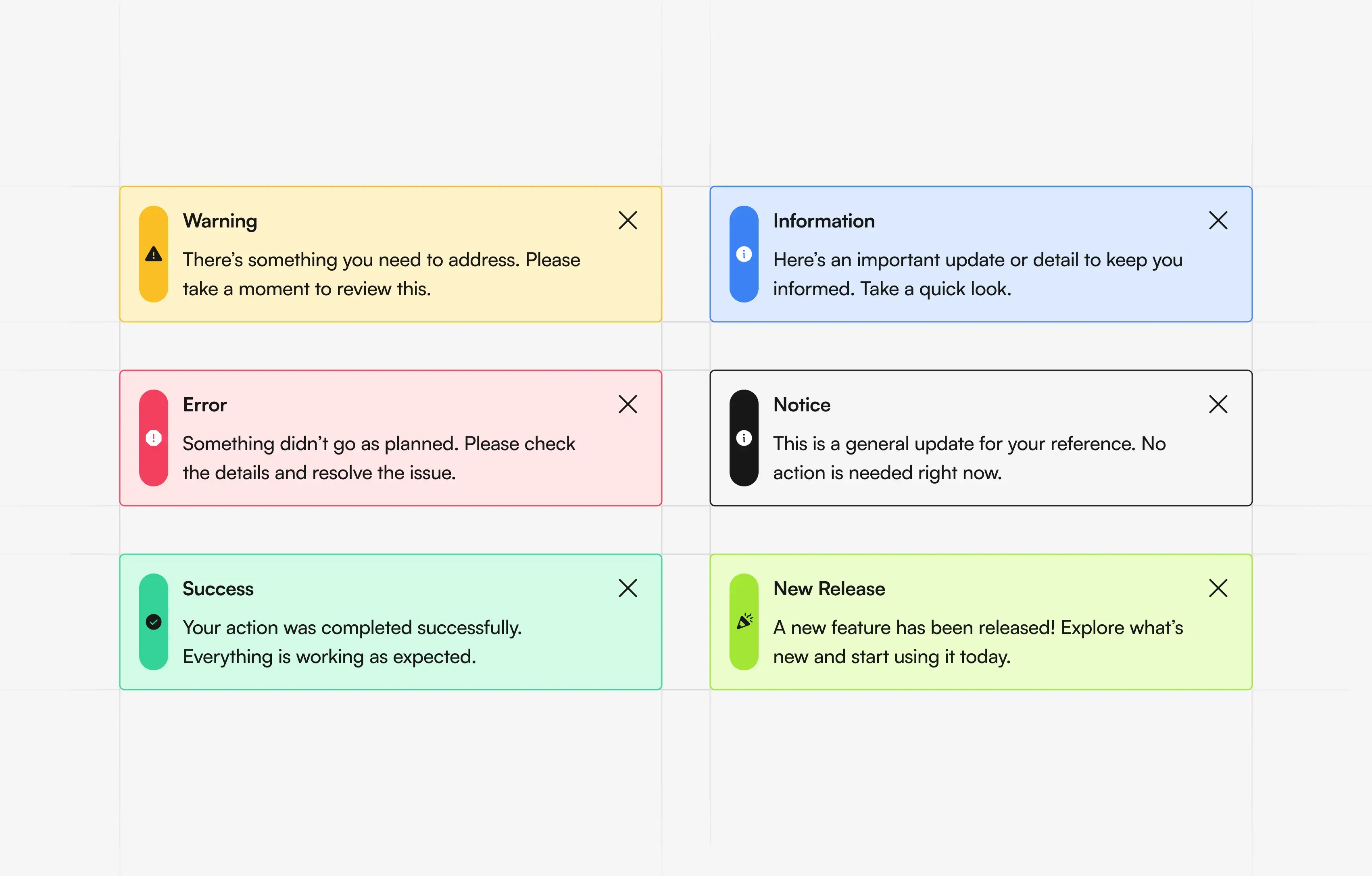
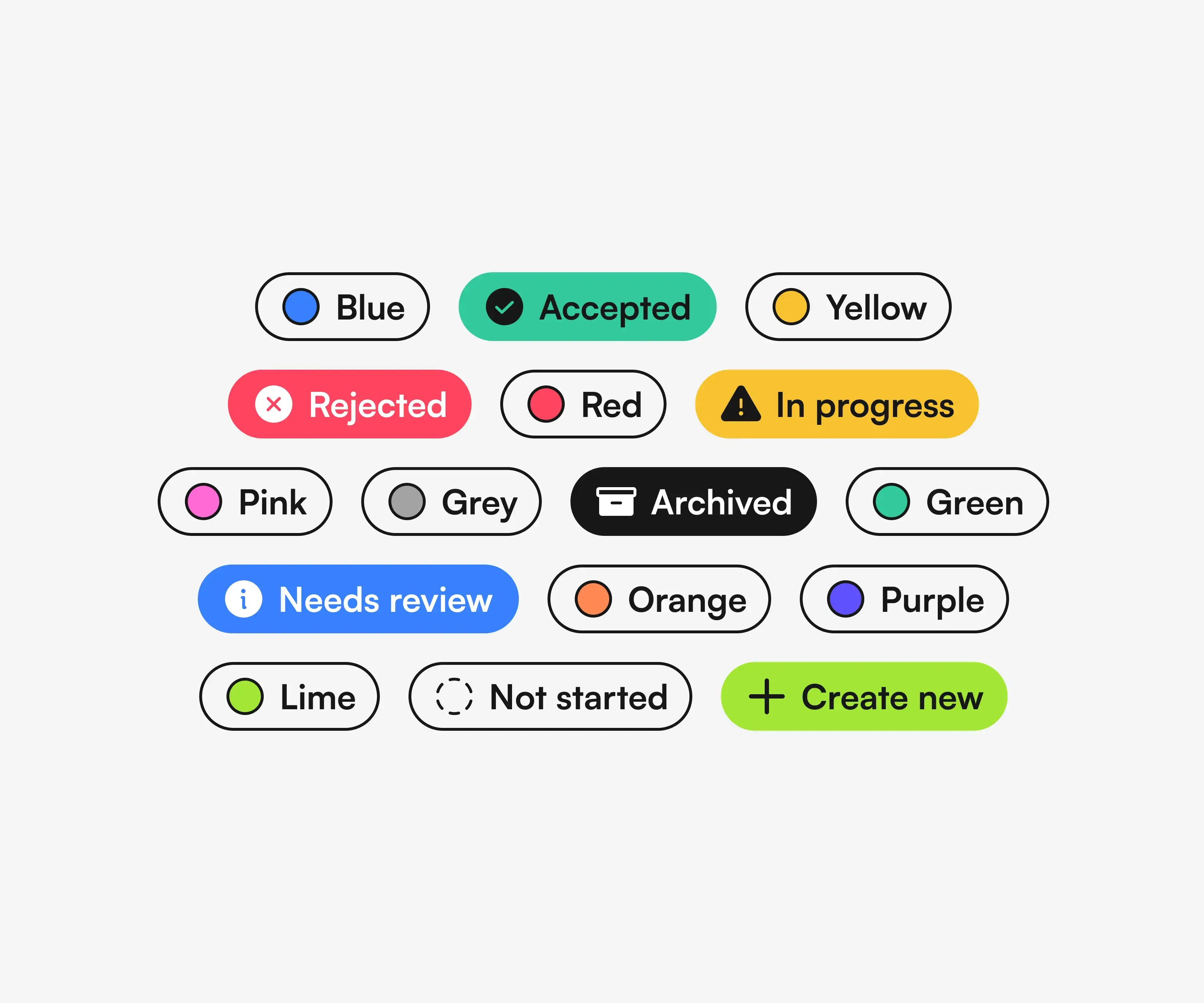
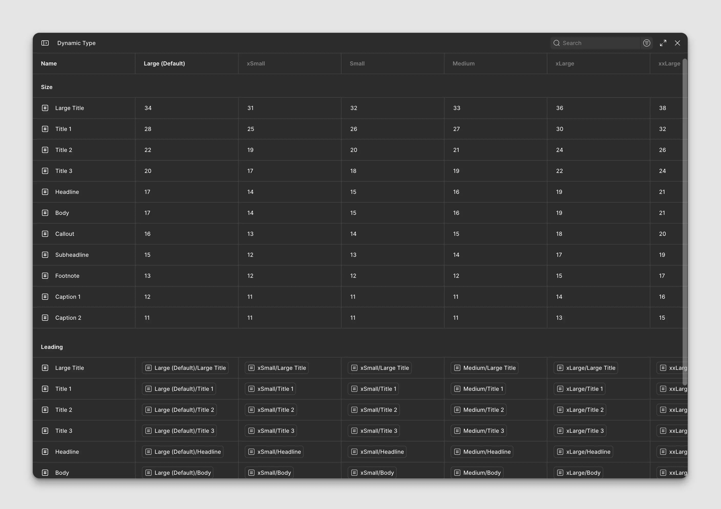
We intentionally avoided building a huge component library upfront. Instead, we started with simple building blocks like buttons, inputs, tags, alerts, colours, and typography. Every time a new feature introduced a reusable pattern, it earned its place in the system.
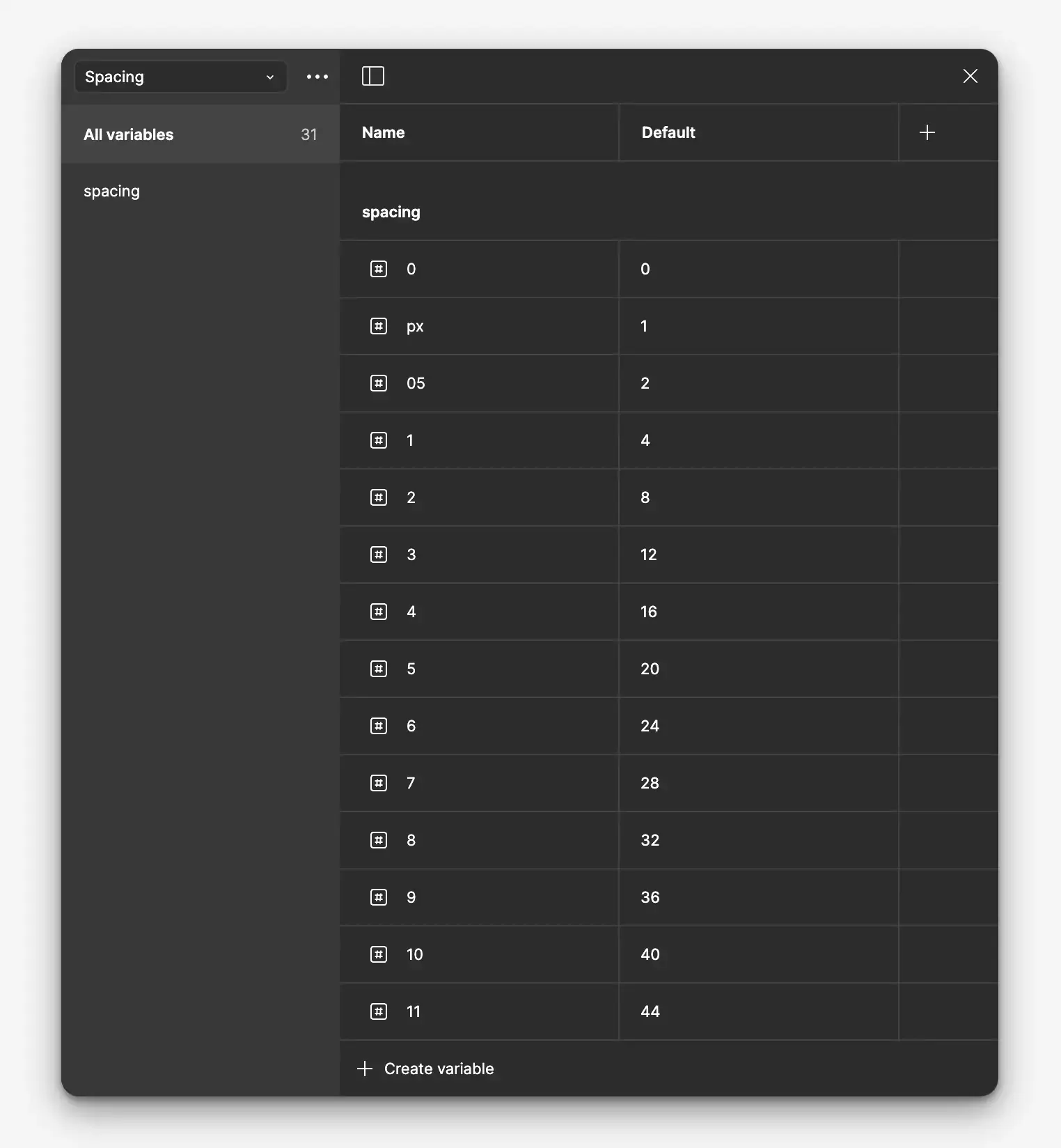
The design system evolved alongside the product. It became a place to experiment with our brutalist visual language, refine spacing, introduce design tokens, and gradually establish consistency across the platform.
Although it never became a coded component library, it became a shared visual language for the team. Engineers could quickly understand how new interfaces should behave, prototype ideas faster, and maintain consistency without reinventing patterns for every screen.
More importantly, it taught me that a design system isn’t something you finish. It’s something you continuously grow with the product.
Field Note: A design system doesn’t need to be finished to be useful. Sometimes it just needs to help the next screen happen faster.
🎪 Taking Brainfish into the real world
Brainfish wasn’t only experienced on screens.
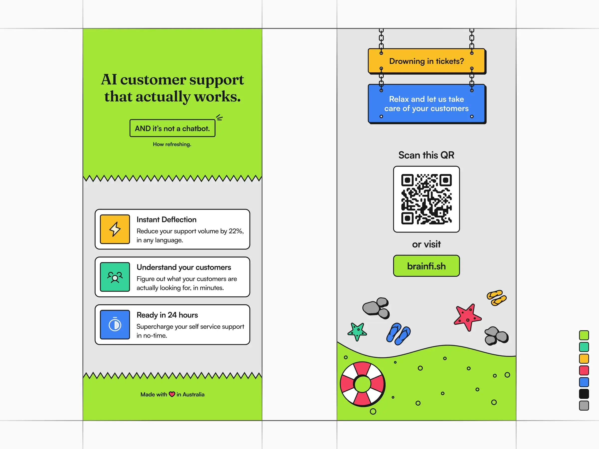
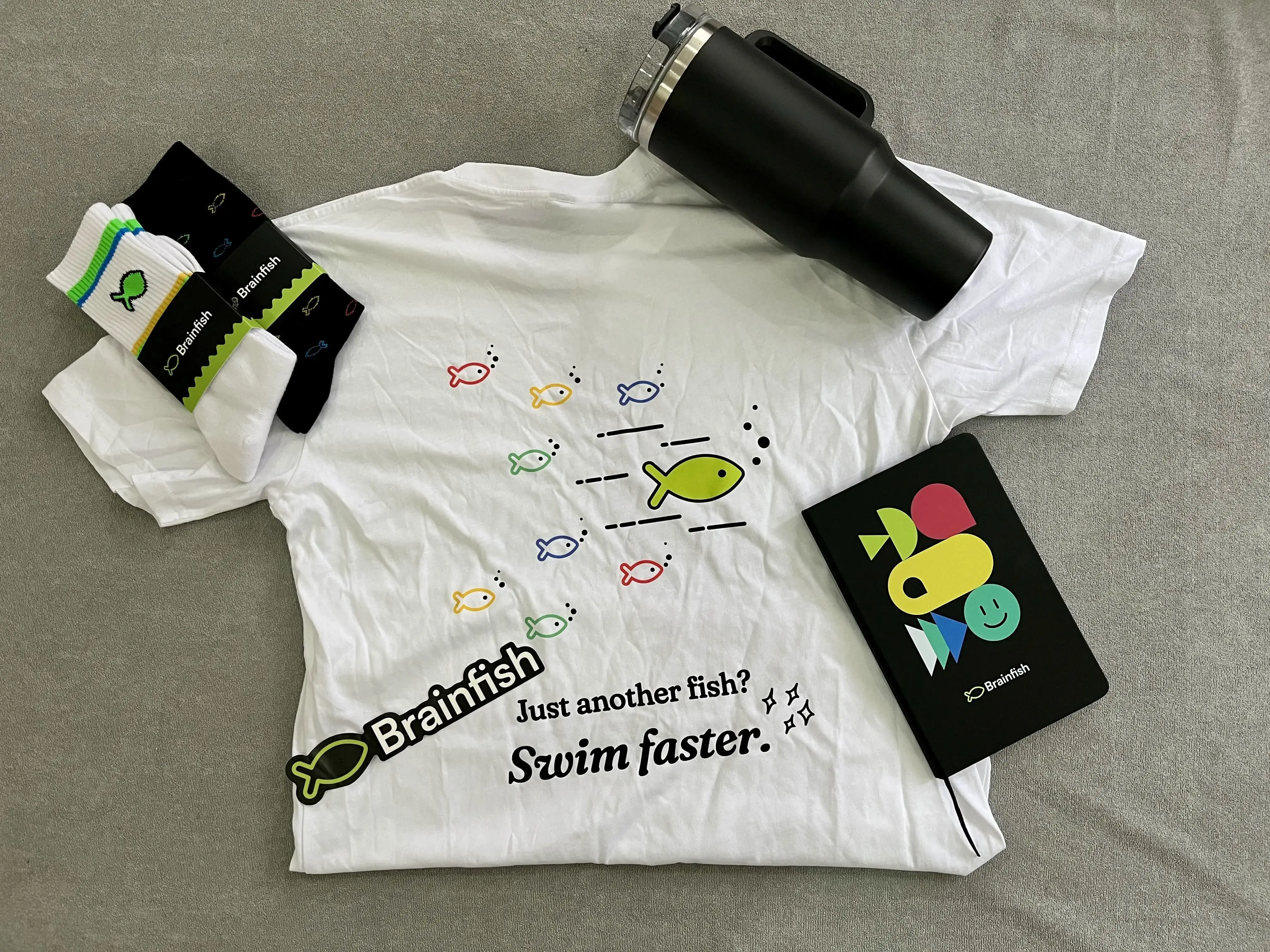
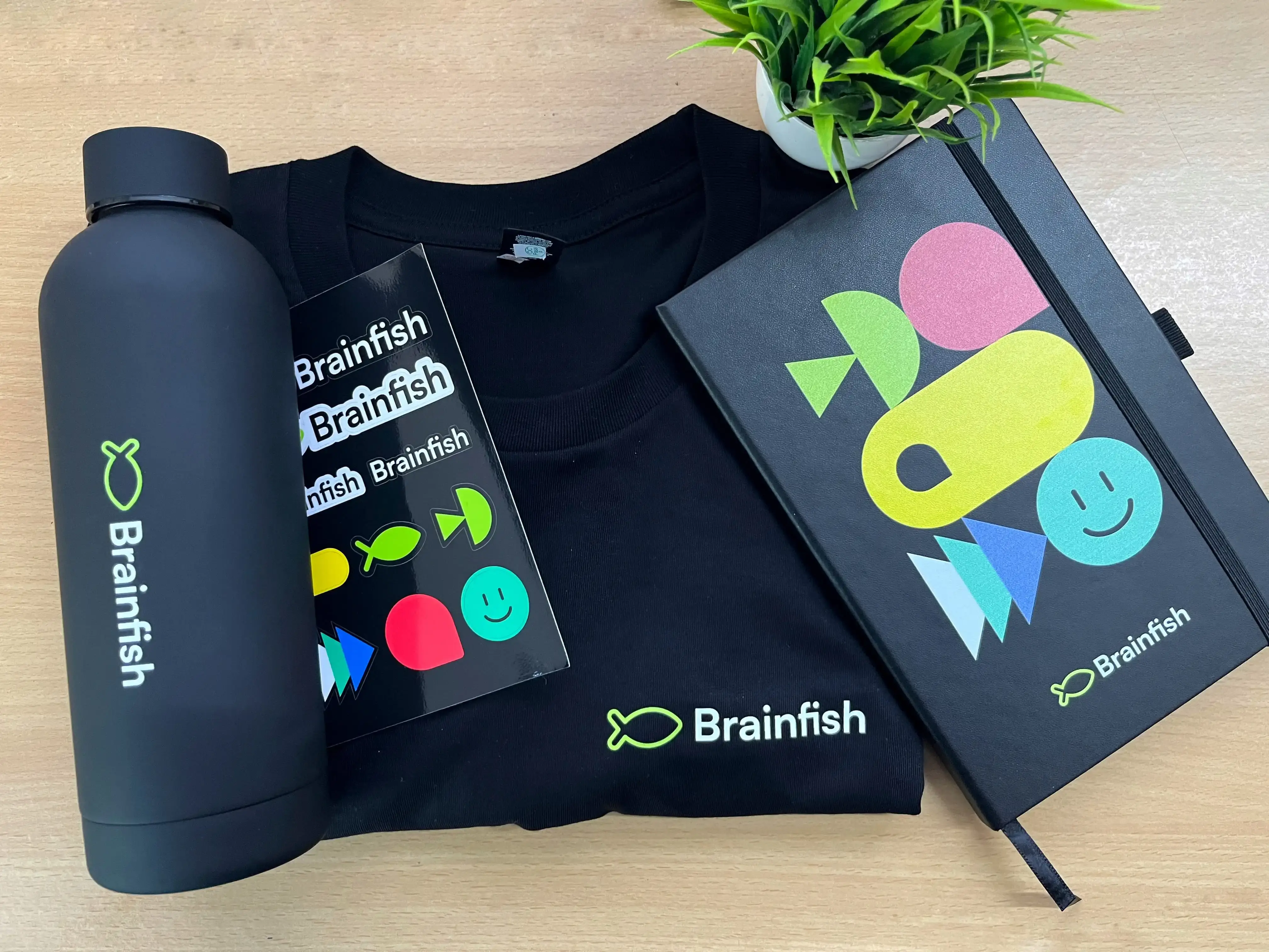
As the company attended conferences across Australia and the United States, I had the opportunity to design booths, banners, apparel, printed material, and event experiences.
Watching the brand exist in physical spaces was one of the most rewarding moments of my time there.
✨ A gallery of favorites
Not everything I’m proud of lives inside the product.
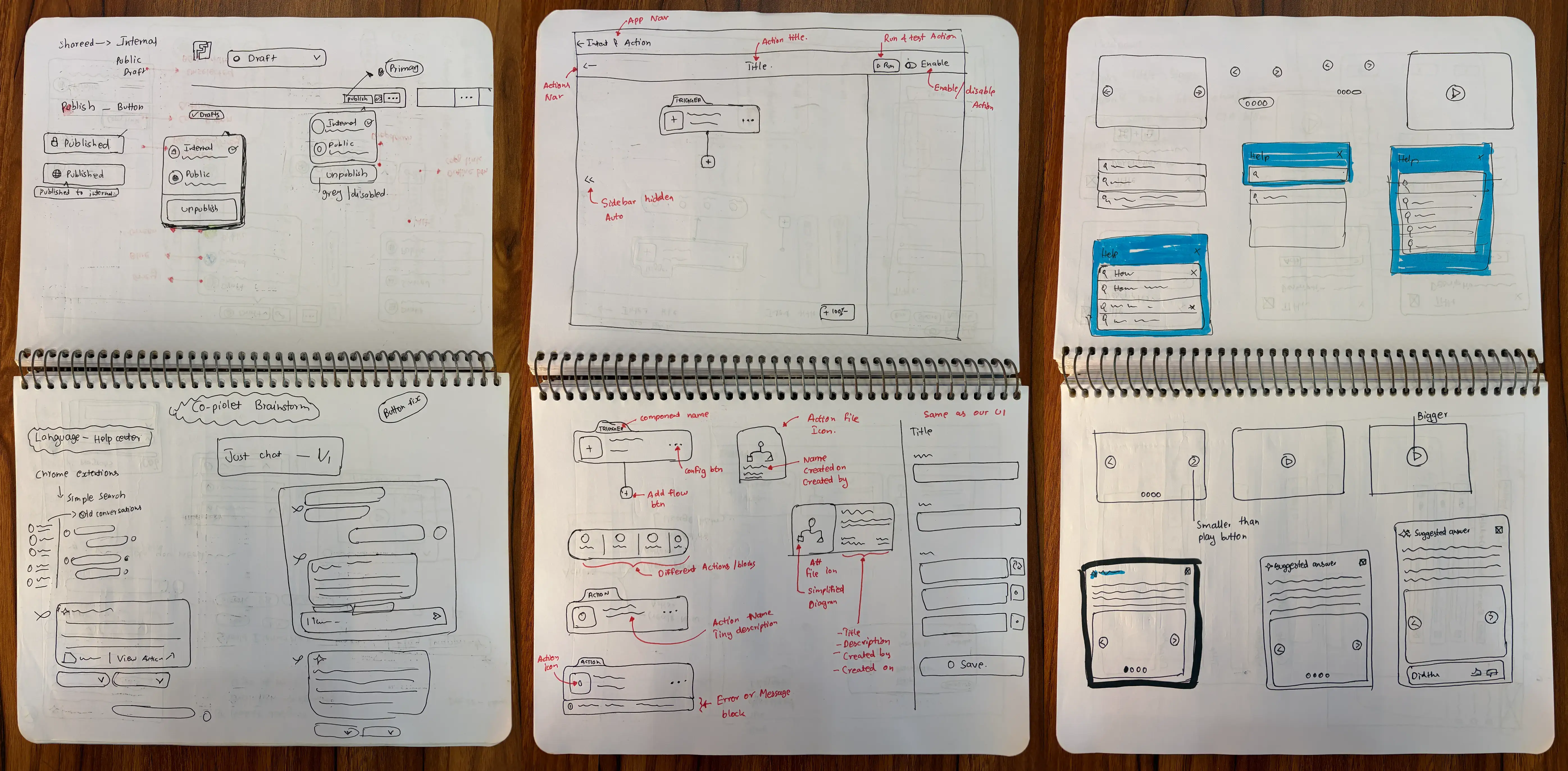
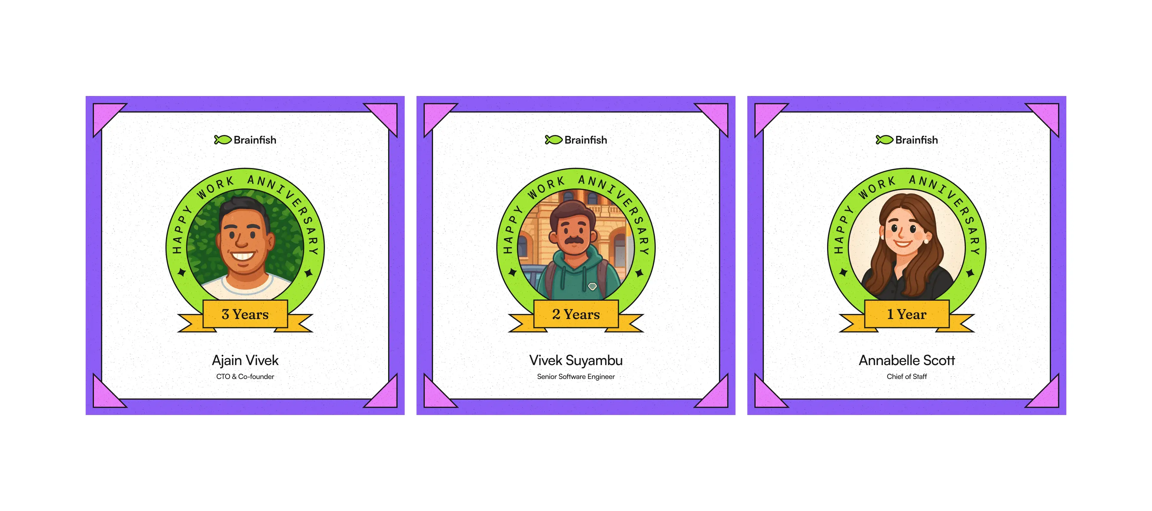
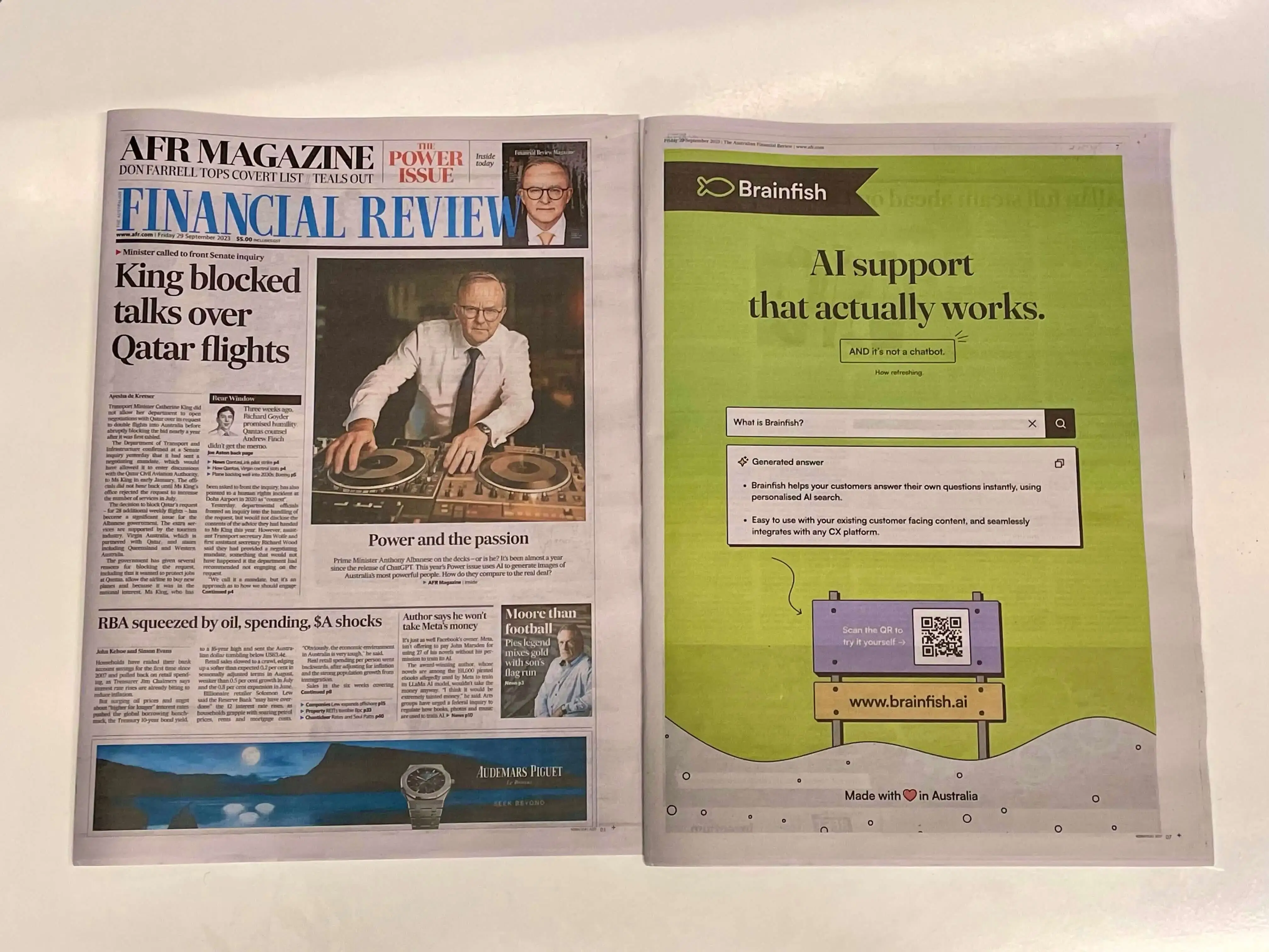
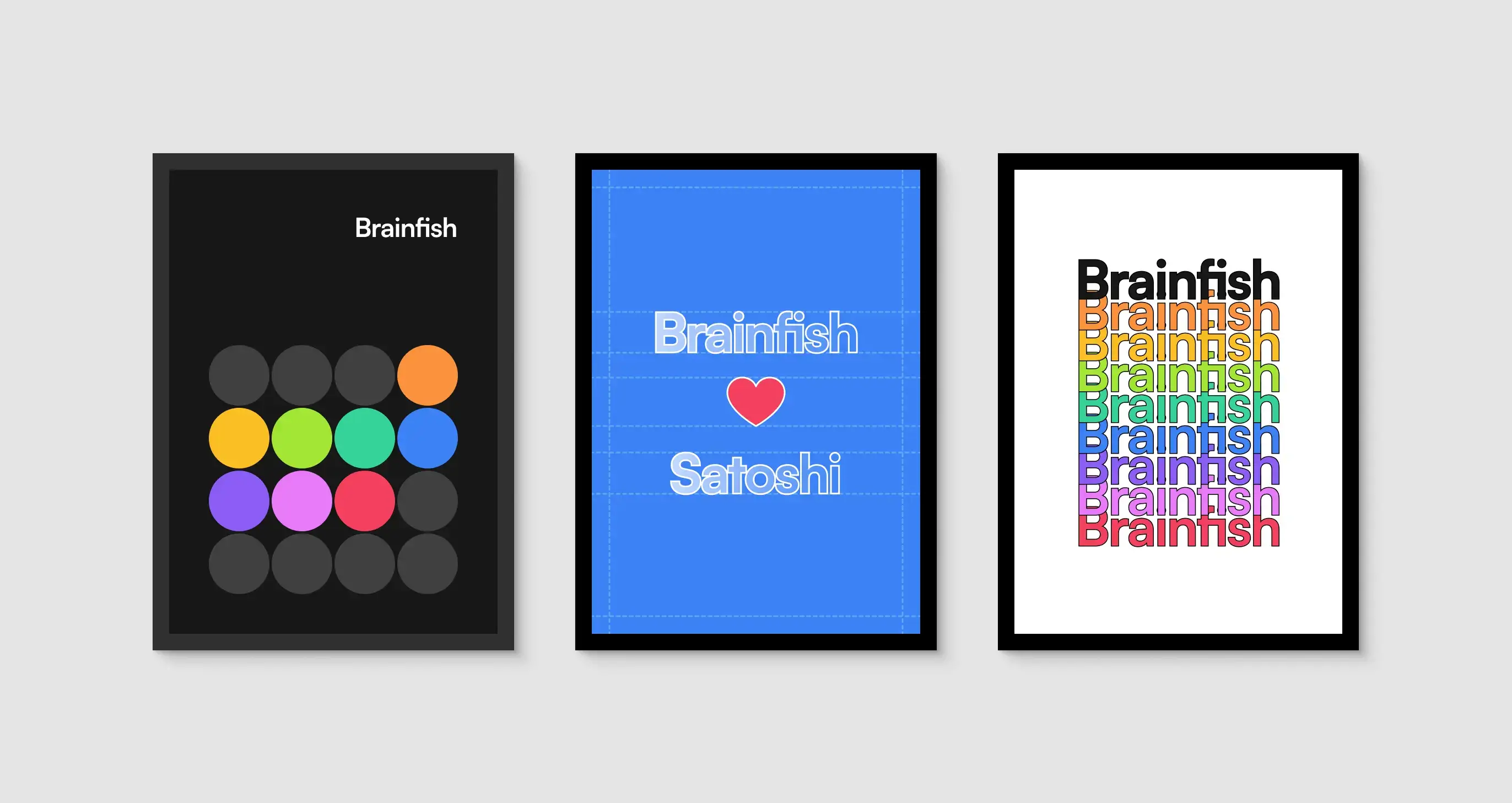
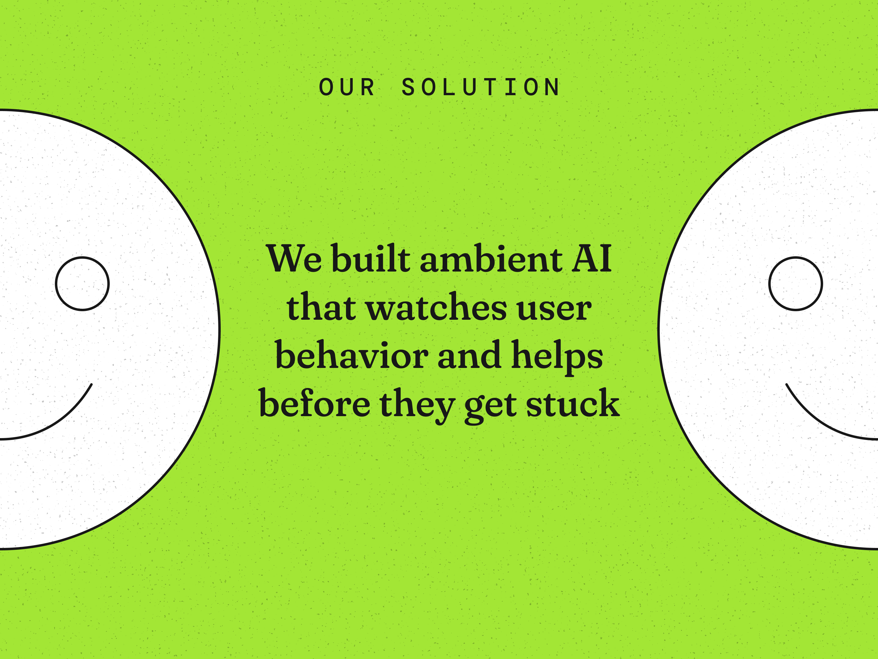
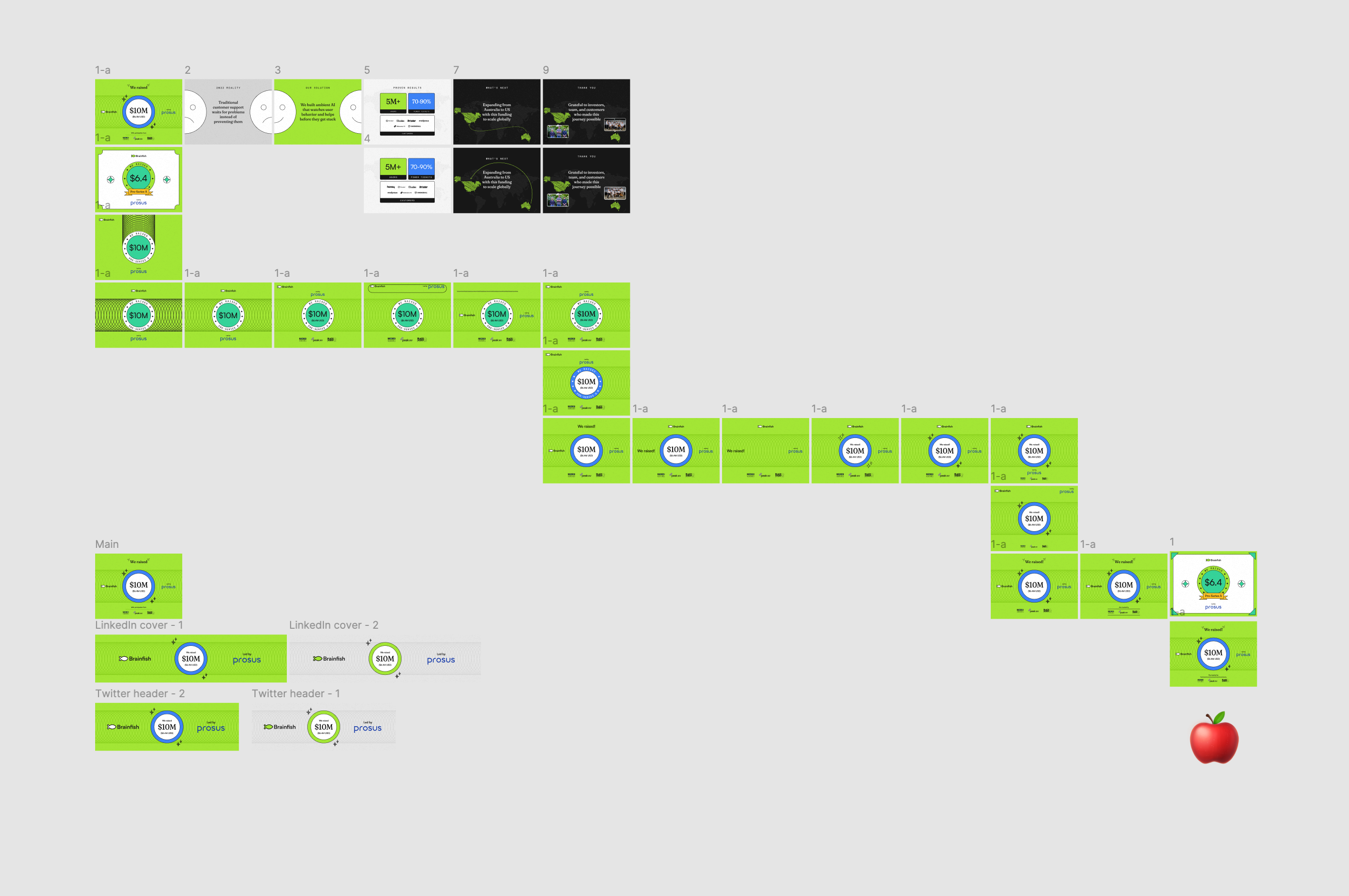
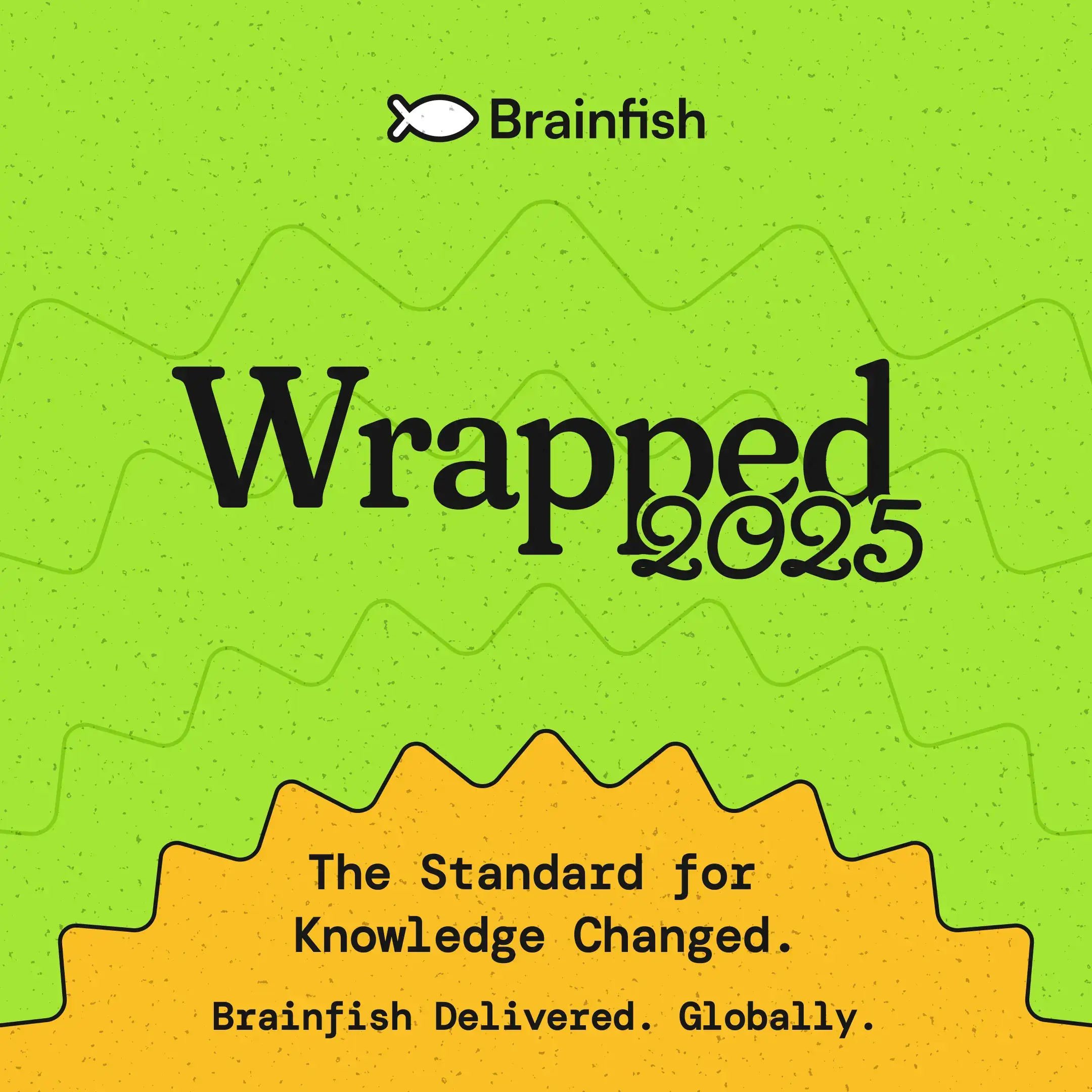
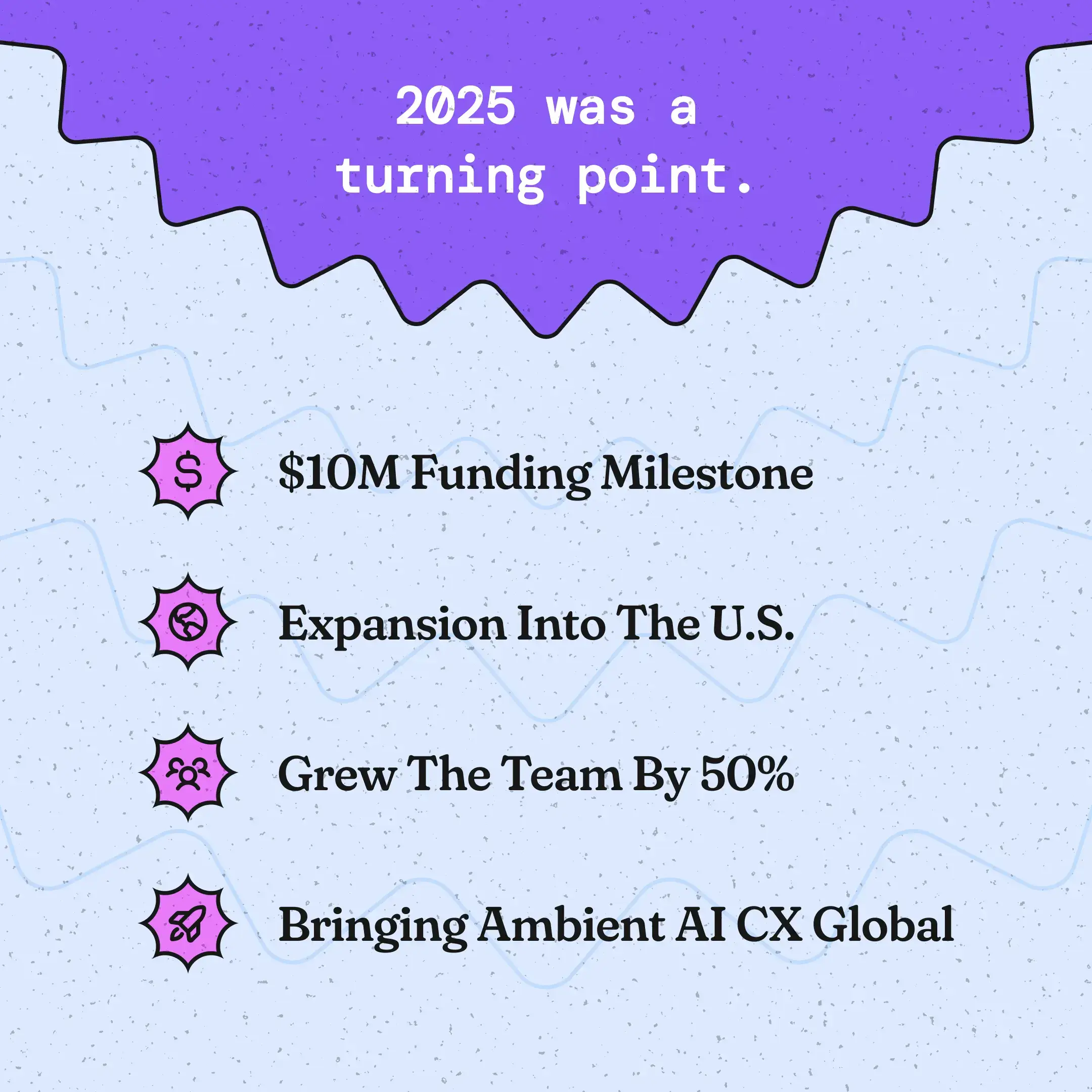
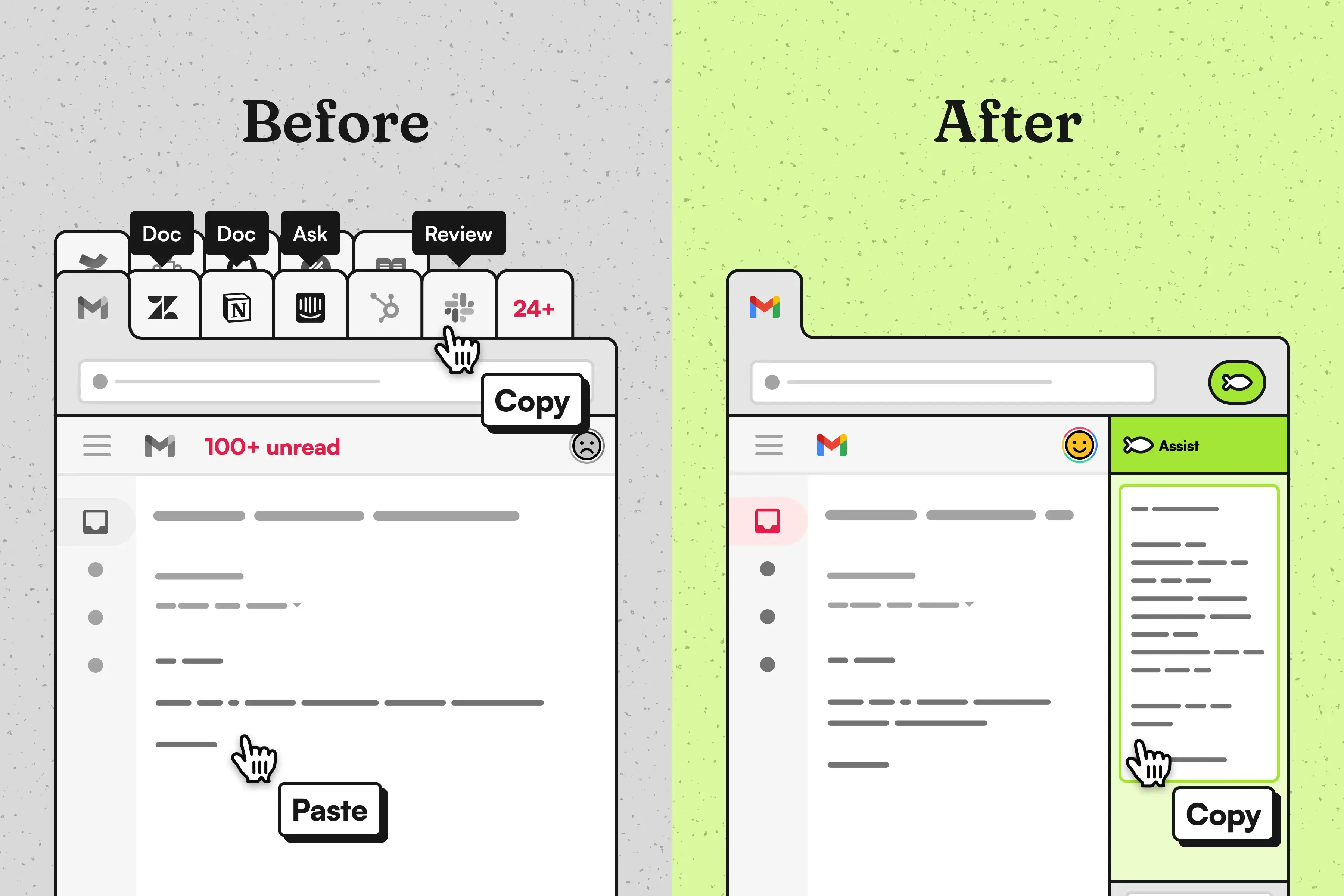
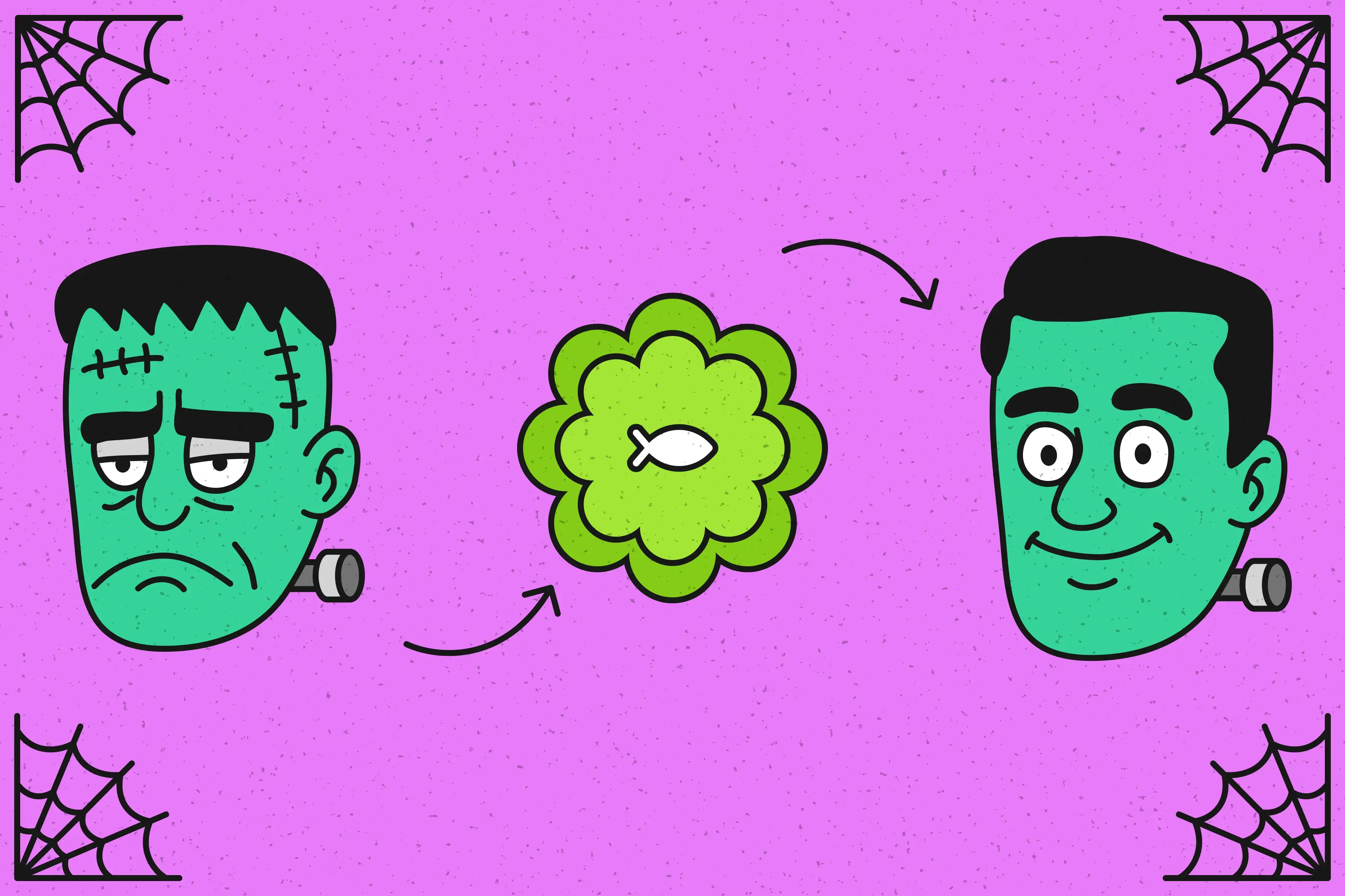
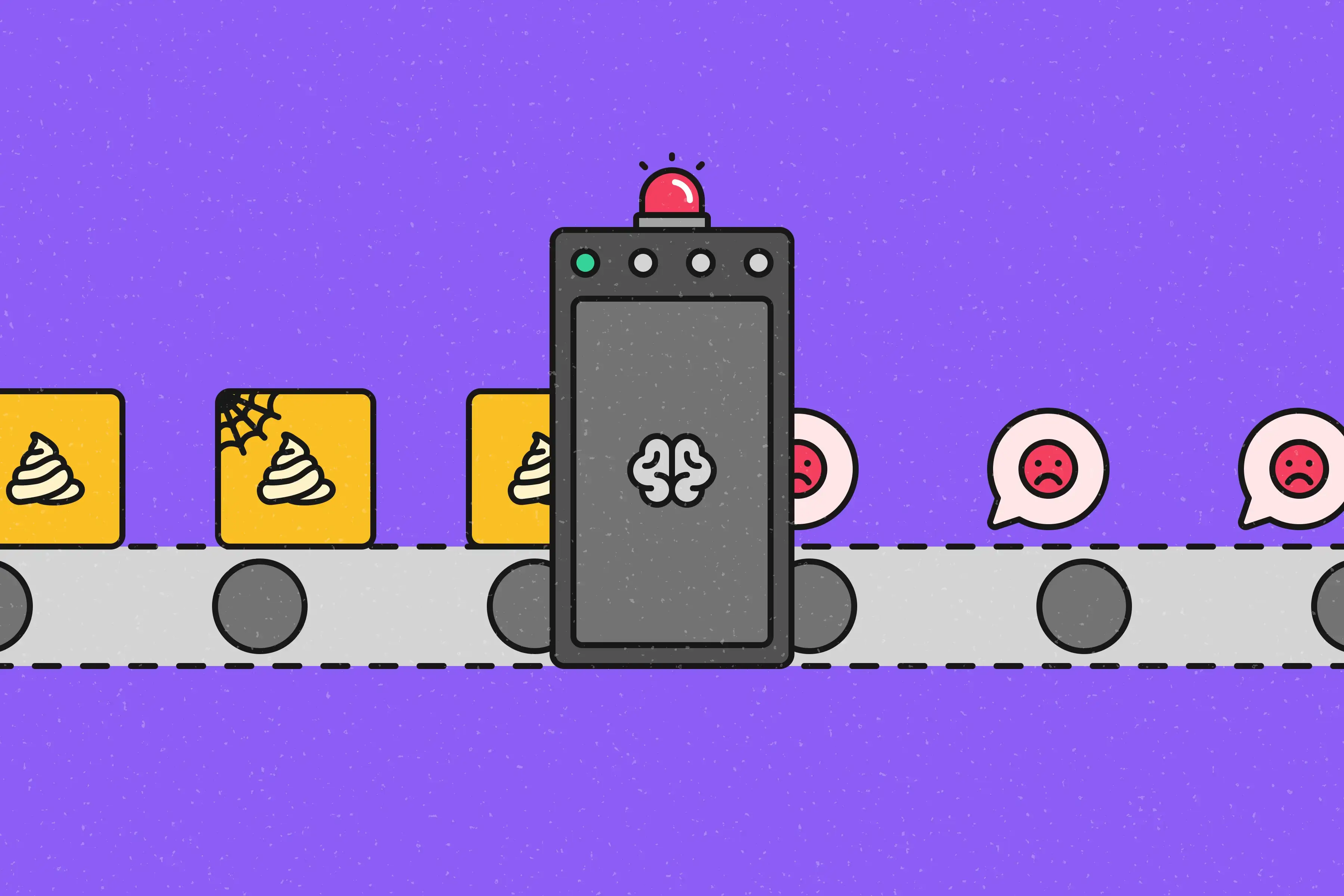
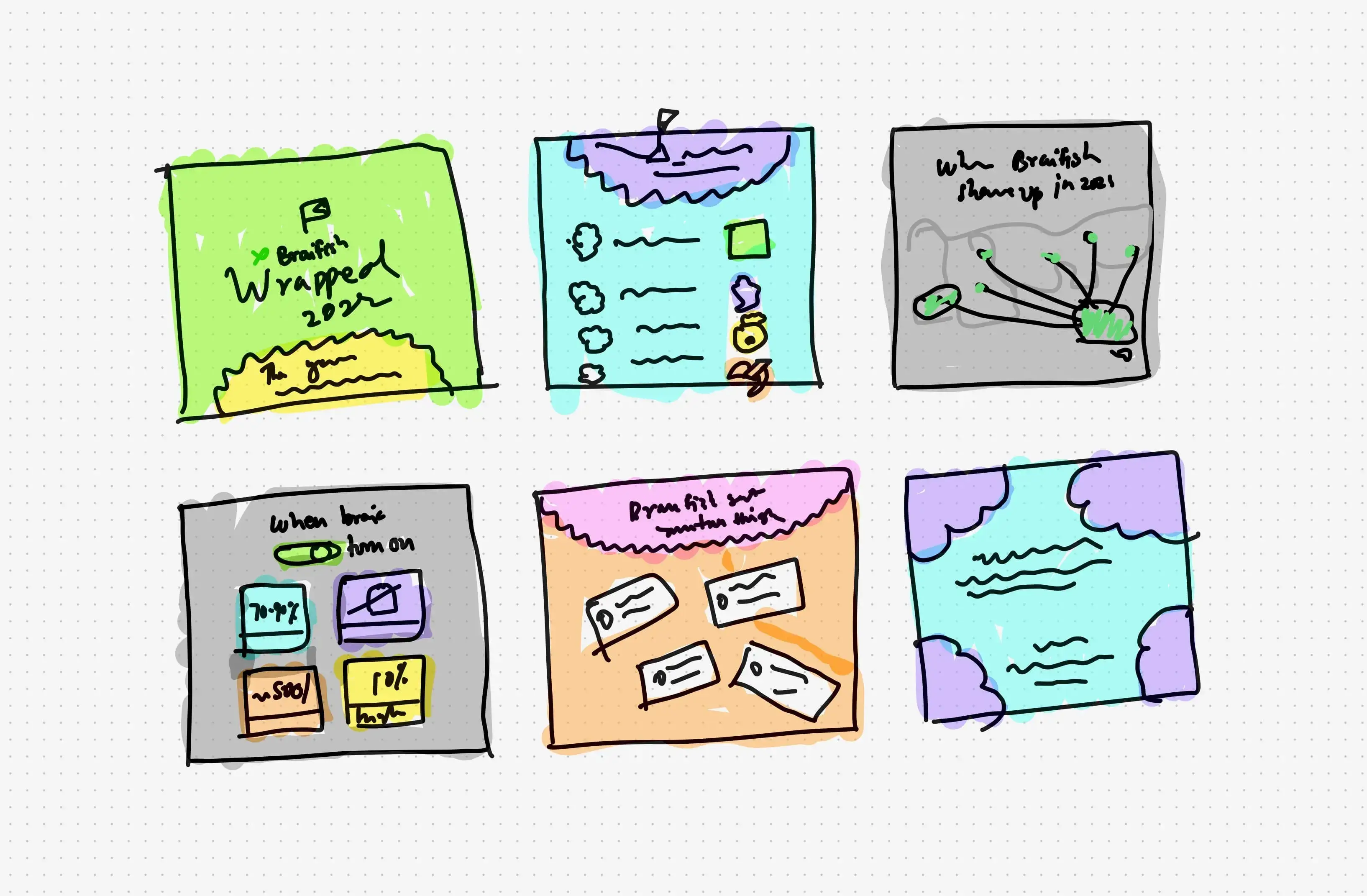
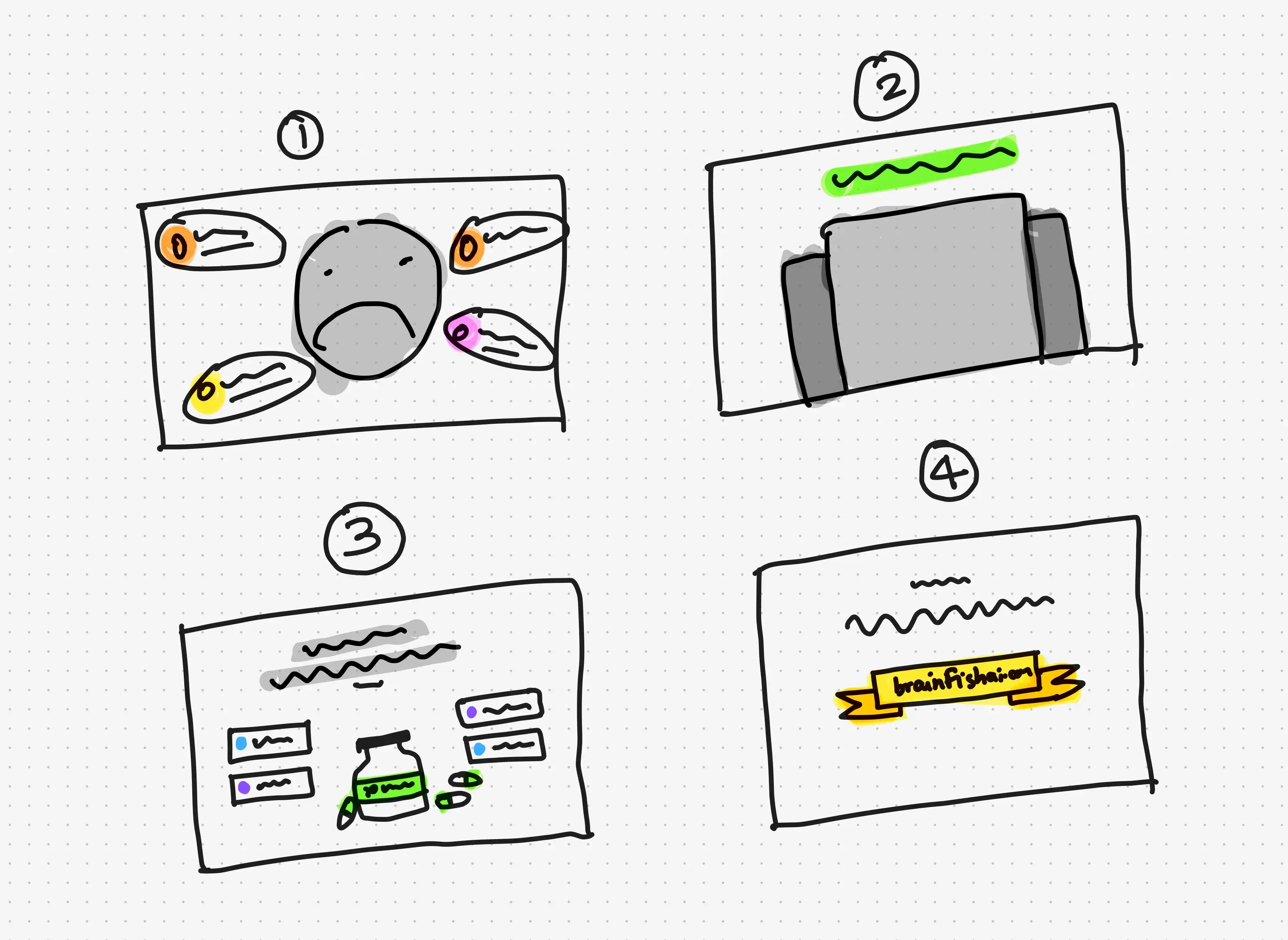
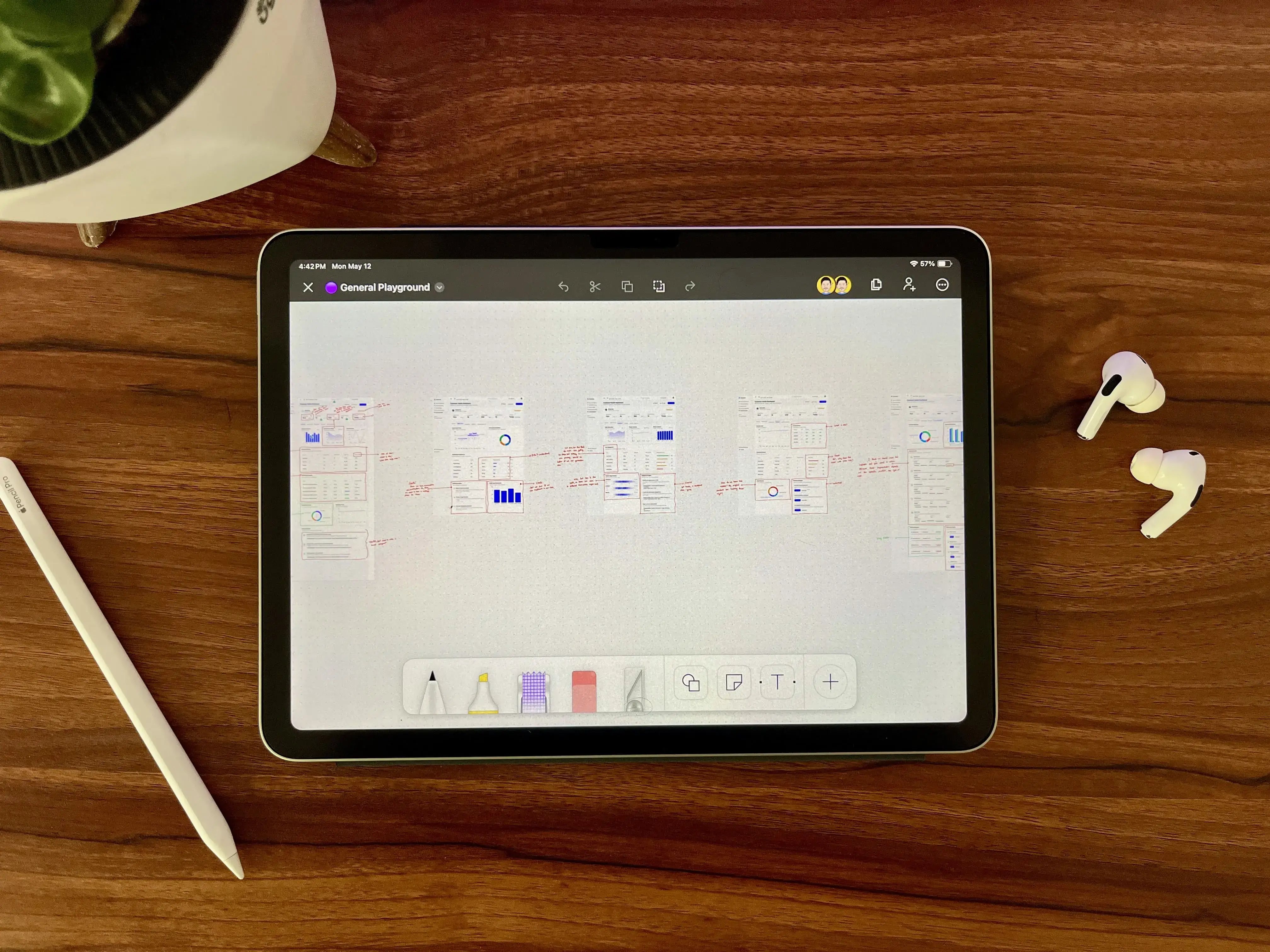
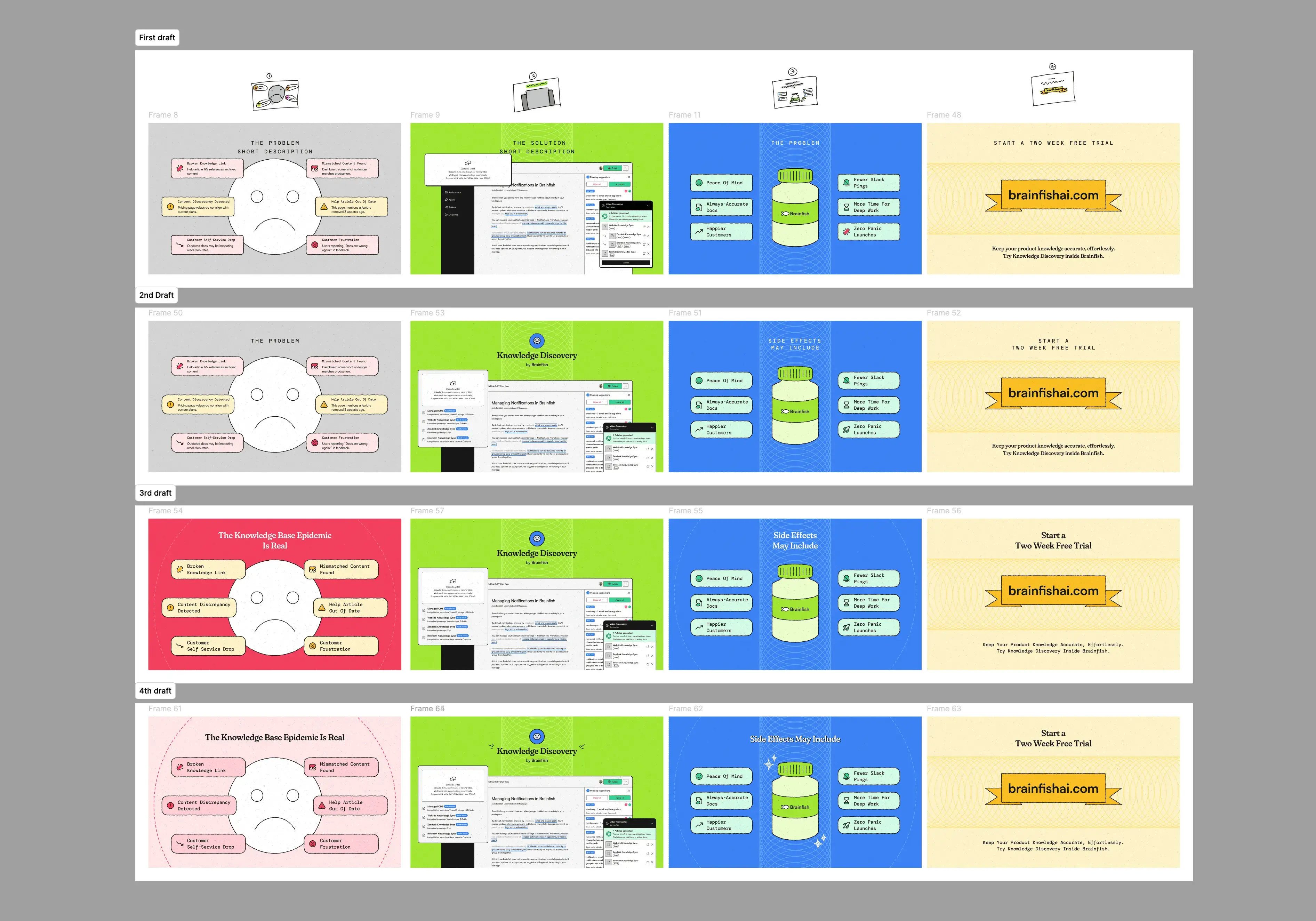
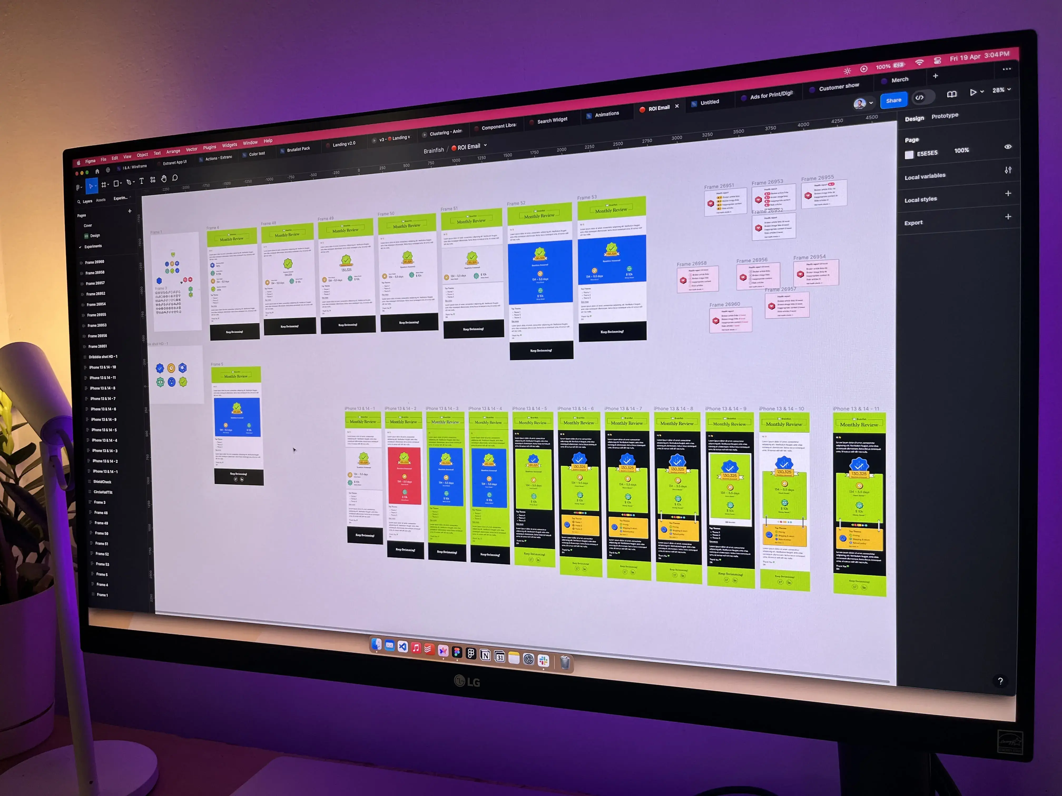
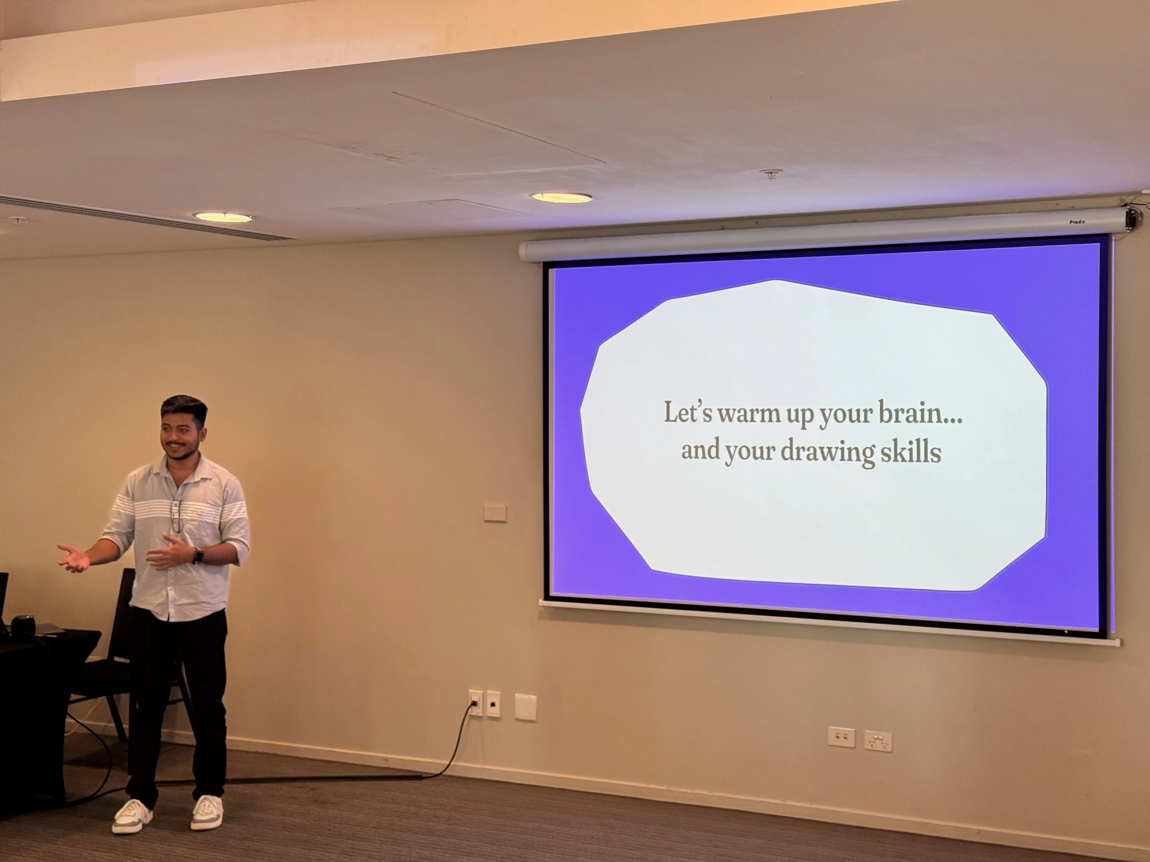
Alongside product design, I also worked on launch campaigns, funding announcements, blog illustrations, social media graphics, Brainfish Wrapped, event material, sketches, and plenty of late-night desk photos documenting the process.
This gallery is a collection of those moments. Some are polished marketing visuals. Others are rough sketches or behind-the-scenes photos that remind me how the work actually happened.
Together they capture the creative side of building Brainfish beyond product screens.
❤️ Looking back
When I joined Brainfish, I thought being a product designer meant creating polished interfaces.
Three and a half years later, I left with a completely different perspective.
I learned that product design starts long before pixels. It starts with understanding people, questioning assumptions, collaborating closely with engineers and founders, and making hundreds of small decisions that shape how a product feels.
I also learned to stop chasing perfection. In an early-stage startup, speed often matters more than polish. Some of the best work happened because we shared ideas early, gathered feedback quickly, and weren’t afraid to throw away weeks of work if a better direction emerged.
If I could give my younger self one piece of advice, it would simply be this: share work earlier, spend more time with customers, and optimise for learning instead of perfection.
Brainfish wasn’t just my first product design job. It became the place where I found my own way of designing. Somewhere along the journey, I stopped asking ‘How should this look?’ and started asking ‘How should this feel?’ That single shift changed everything.
There will be future designers who redesign these screens, replace components, change colours, and rethink experiences. I genuinely hope they do.
Because underneath all those future iterations, there will always be a small part of what I built that continues to live on.
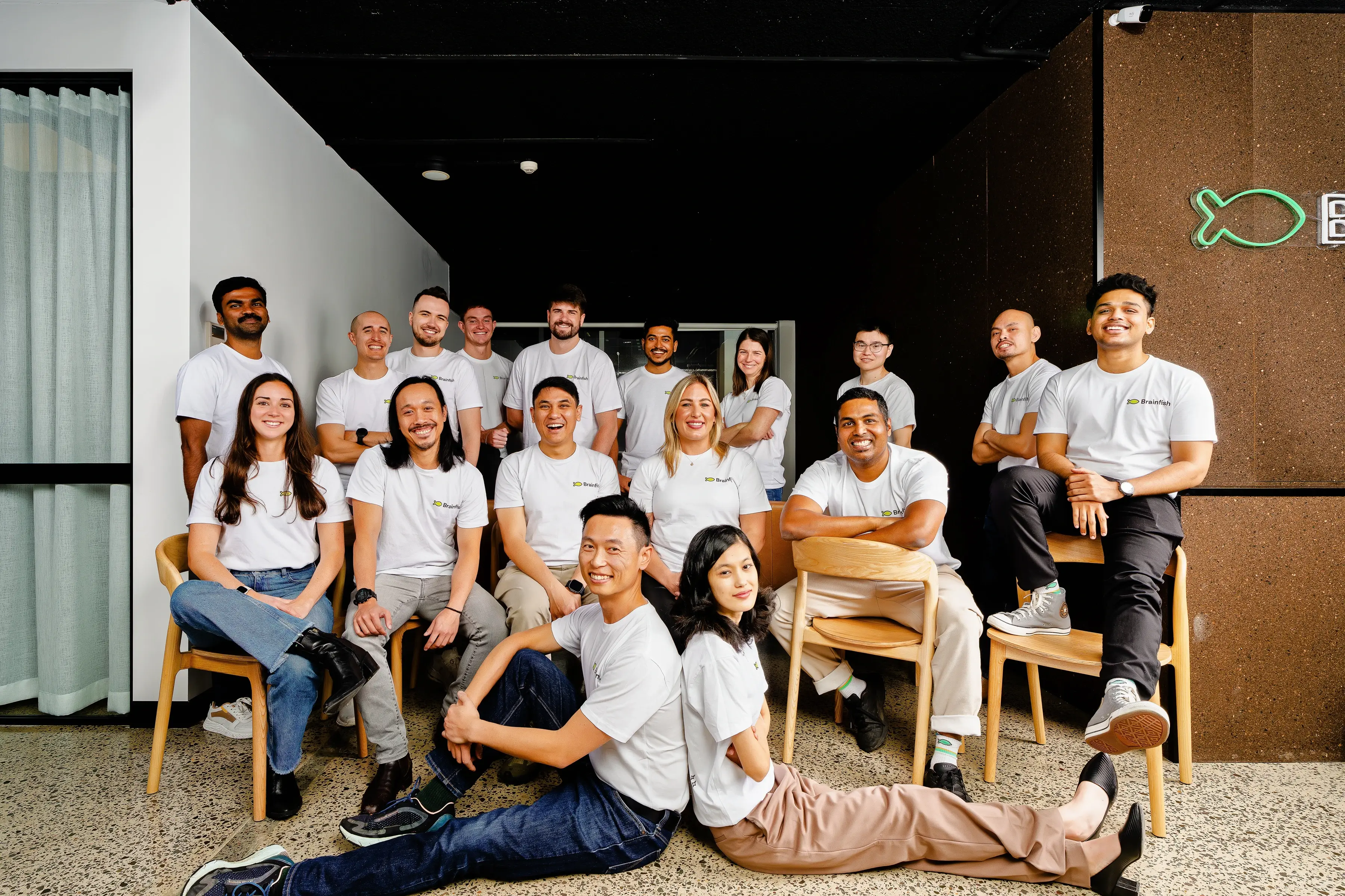
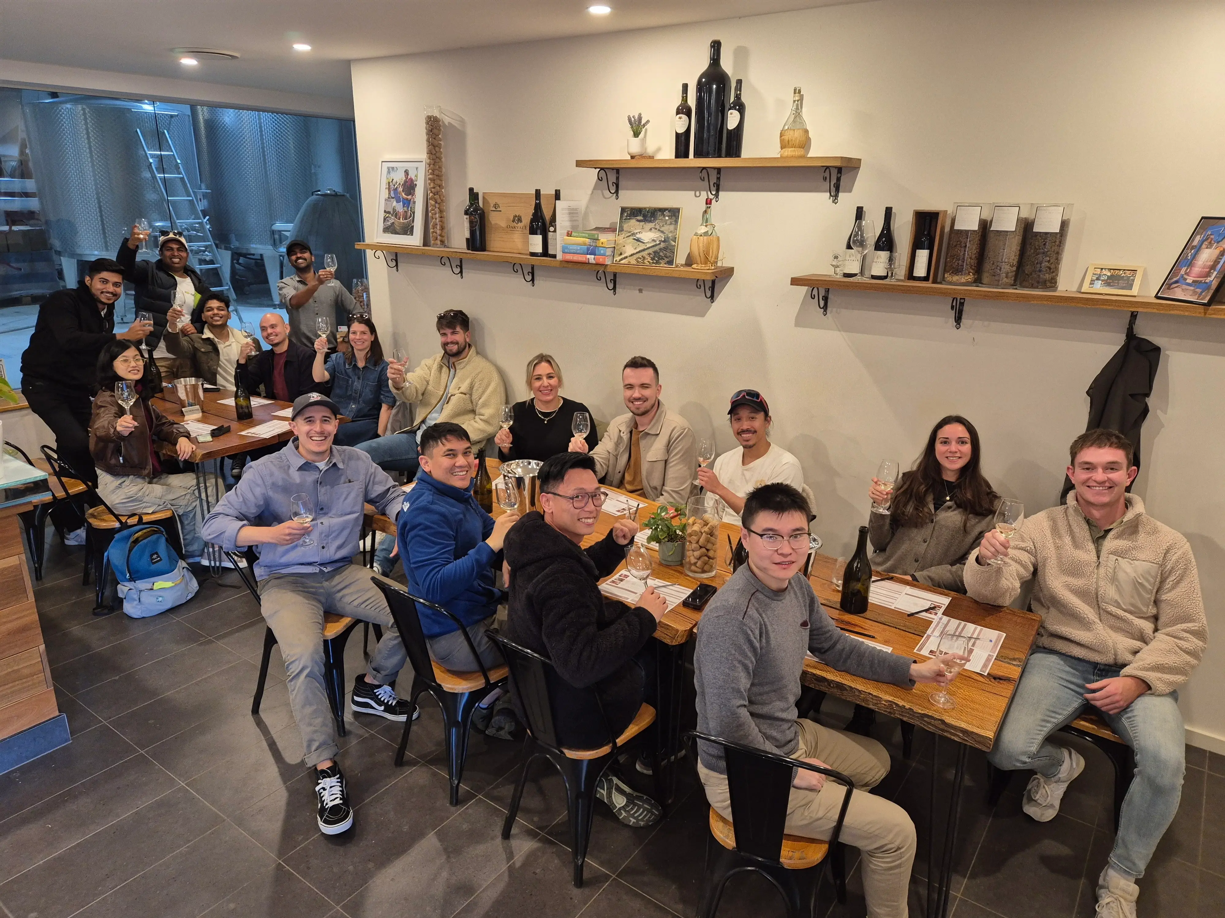
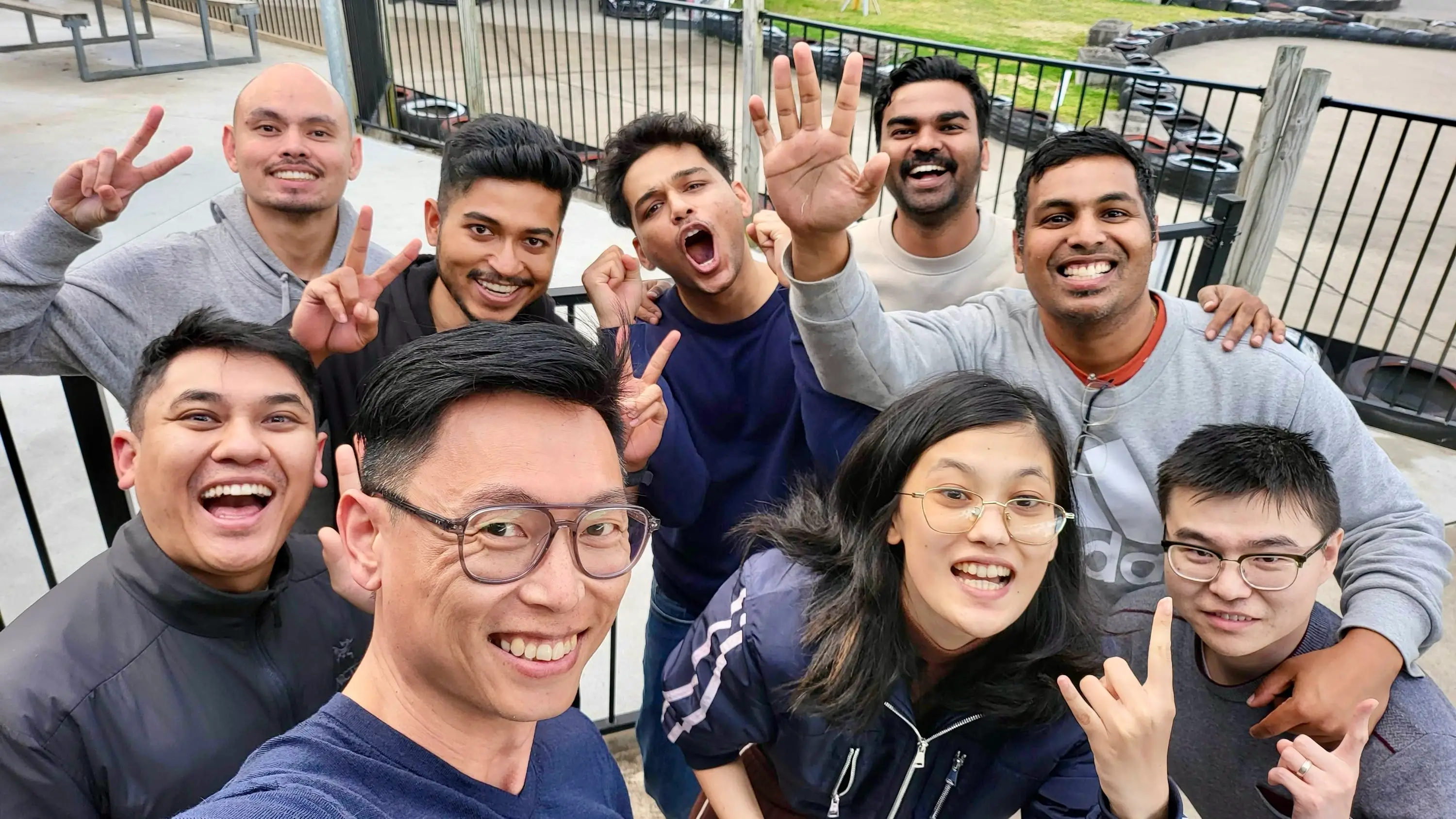
3.5 years. Thousands of frames. Hundreds of screens. Dozens of features. One brand.
My first startup. And the place where I truly became a product designer.